
























Mujosh eyewear brand identity refresh by Grafa
By
Weronika Rafa
Summary
Mujosh, a Chinese eyewear brand, partnered with design agency Grafa to refresh its brand identity and reposition itself for a younger generation. The redesign moved away from the brand's existing visual language toward a sharper, more expressive, and culturally attuned system. The project focused on creating a reduced and confident identity that retains recognisability while introducing a stronger point of view.
Source
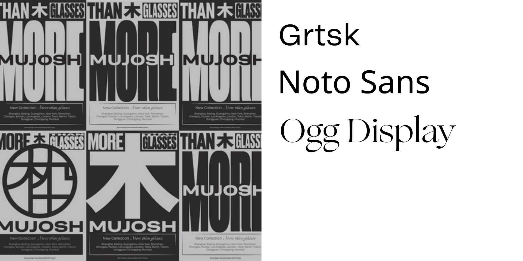
 Fonts In UseMujosh eyewear brand identity refresh by Grafafontsinuse.com
Key quotes
· 3 pulledGrafa partnered with the brand to redesign its identity and reposition it for a new generation of consumers, moving away from its existing visual language towards something sharper, more expressive and culturally attuned.
The project centred around redefining Mujosh's presence through a more reduced and confident system.
Rather than creating disruption for the sake of novelty, the ambition was to retain recognisability while introducing a stronger point of view.
You might also wanna read

Lundgren+Lindqvist designs Janus-inspired visual identity for Inflection venture fund
Lundgren+Lindqvist designed a visual identity system for Inflection, a venture fund backing early engineering moonshots. The branding draws
 Abduzeedo·7d ago
Saint-Urbain's Yoshi Matcha Liqueur Branding Avoids Japanese Stereotypes Through Minimalist Design
The article critiques stereotypical Western branding of Japanese products that relies on visual clichés like cherry blossoms and kanji chara
 Creative Boom·5mo ago
Studio Glass Redefines The New Forest Identity with History and Community Focus
Studio Glass rebrands The New Forest with a new identity rooted in history, community pride, and storytelling, replacing generic tourism bra
Creative Boom·11mo ago
Brand Brothers Redesign Glénat's Visual Identity While Preserving Existing Logo
Brand Brothers, a Paris-based design studio, successfully redesigned the visual identity for French publisher Glénat while working under the
Creative Boom·10mo ago
Zaha Hadid Architects rebrands to ZHA after legal dispute over name usage
Zaha Hadid Architects principal Patrik Schumacher announced the studio is being renamed to ZHA, describing it as a "natural brand evolution.
 Dezeen·16d ago
Lark Design Studio's restrained rebrand for Wottz proves a single letterform detail can carry a brand identity
Lark Design Studio created a restrained, clever rebrand for Wottz, a British manufacturer of customisable EV charging cables. Rather than a
Creative Boom·20h ago
Comments
Sign in to join the conversation.
No comments yet. Be the first.