Saint-Urbain's Yoshi Matcha Liqueur Branding Avoids Japanese Stereotypes Through Minimalist Design
Montreal studio Saint-Urbain has created a liqueur identity that respects Japanese tradition without ever resorting to visual cliché. There's a particular kind of design hell reserved for brands t...
Read the full articleYou might also wanna read

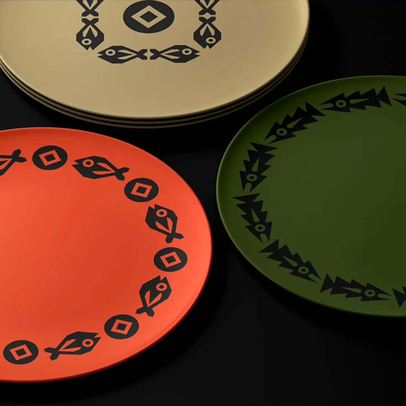
Ebisumaru Sushi Unveils Bold Rebrand with High-Contrast Visual Identity by Moises Visuals
Ebisumaru Sushi launches its new restaurant identity with strategic branding, using high contrast visuals designed by Mo...
 Abduzeedo·8d ago
Ebisumaru Sushi Unveils Bold Rebrand with High-Contrast Visual Identity by Moises Visuals
Ebisumaru Sushi launches its new restaurant identity with strategic branding, using high contrast visuals designed by Mo...
abduzeedo.com·5d ago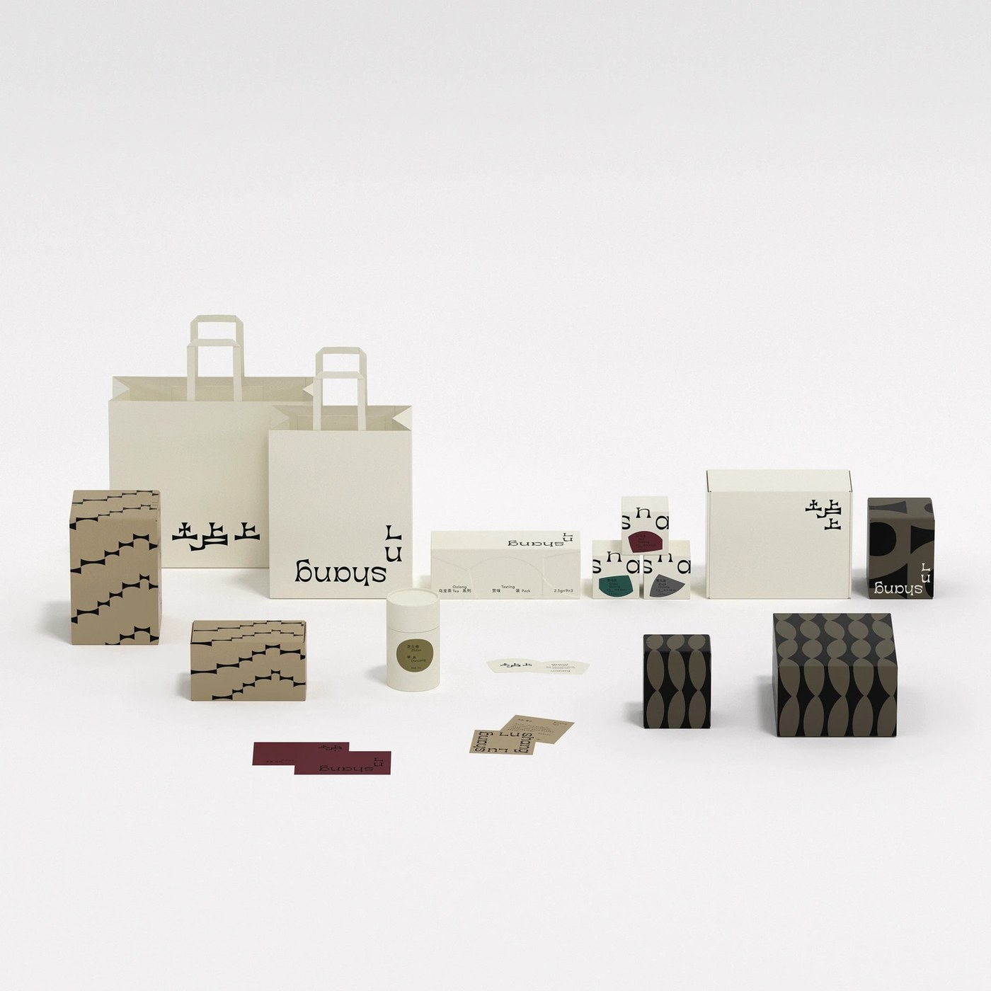
taoSTUDIO Creates Bilingual Packaging Design for Lushang Chinese Tea Blending Heritage and Modernity
taoSTUDIO builds a bilingual packaging design for Lushang Chinese Tea where hill silhouettes and leaf forms merge into a...
abduzeedo.com·26d ago
French studio Ciguë designs green-toned clay interior for 12 Matcha's New York flagship store
Ciguë has outfitted a historic Manhattan storefront with green-toned clay walls and a charcoal wood filtration system for the flagship store
 Dezeen·11mo ago
The Paradox of Japanese Web Design: Maximalist Websites in a Minimalist Culture
in this 2013 Randomwire blog post, the author (David) highlighted an intriguing discrepancy in Japanese design. While the nation is known ab
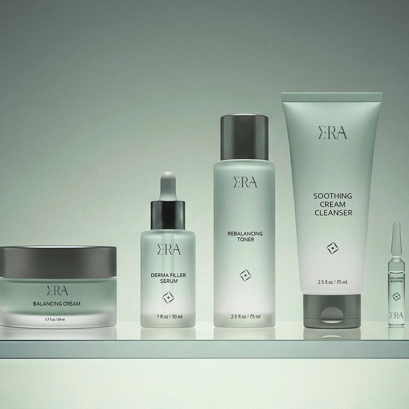
ERA Skincare Branding: Custom Calligraphy Meets Minimalist Packaging Design
ERA skincare branding pairs custom calligraphic script with raw, unadorned structural packaging. This creates tension be...
Abduzeedo·15d ago
Comments
Sign in to join the conversation.
No comments yet. Be the first.