Advanced Icon Design: Optical Balancing of Dots vs. Stroke Weight
By
Helena Zhang
Summary
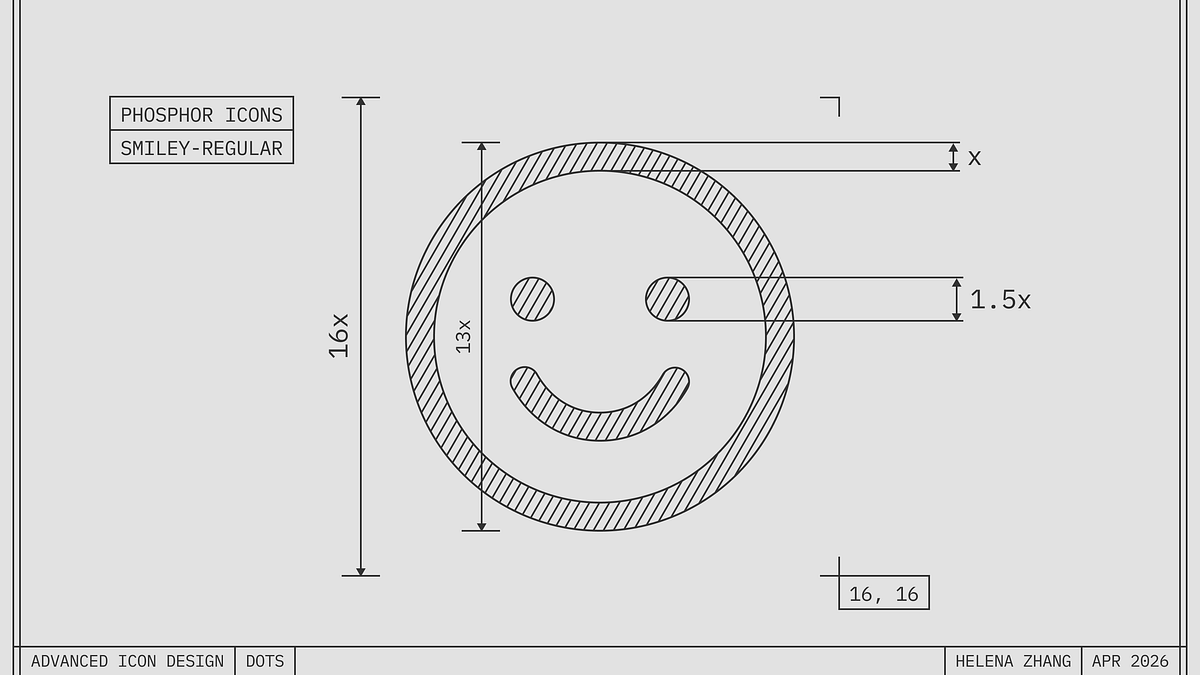
This article is the first in a series on advanced icon design tips, focusing on how to properly size dots (like eyes in a smiley icon) relative to stroke weight. The author explains that dots need to be slightly larger than the stroke weight to appear visually balanced, borrowing principles from type design. A before-and-after comparison demonstrates how a small adjustment makes the icon look much more balanced.
Source
 Twitter / XAdvanced Icon Design: Optical Balancing of Dots vs. Stroke Weightminoraxis.medium.com
Key quotes
· 3 pulledDots want to be a little bigger than the stroke weight to look balanced.
If you just apply the same thickness as the stroke, you'll end up with tiny looking eyes.
This is the first in a series of advanced icon tips. We'll cover optical effects that elevate icons from good to great, borrowing heavily from type design.
You might also wanna read


Implementing Fluid Typography with CSS for Responsive Web Design
This article explains fluid typography techniques in CSS for creating responsive web design. It covers how to implement smooth font scaling
The Enduring Appeal of Bitmap Fonts: How Constraint-Based Design Shapes Digital Aesthetics
The article explores the enduring appeal and significance of bitmap fonts in computing, arguing that they represent a design philosophy born
 korigamik.dev·2mo ago
Exploring Optical Corrections in Architecture and Typography
The article discusses optical corrections in architecture and typography, focusing on visual design principles. It includes examples of opti
nubero.ch·11mo ago
Rethinking Tufte's data-to-ink ratio: When minimalism in data visualization goes too far
This article critically examines Edward Tufte's influential design principles of "chart junk" and the "data-to-ink ratio," questioning how m
 frank.computer·26d ago
Apple's Icon Design Evolution Shows Progressive Improvement When Viewed in Reverse
The article is a brief observation about Apple's icon design evolution, noting that when viewed in reverse chronological order, Apple's icon
 threads.com·5mo ago
The auto sizes attribute: A breakthrough in responsive image authoring
Mat Marquis reflects on 14 years of working with responsive images on the web, culminating in the introduction of the `auto` value for the `
 piccalil.li·2mo ago
Comments
Sign in to join the conversation.
No comments yet. Be the first.