The Enduring Appeal of Bitmap Fonts: How Constraint-Based Design Shapes Digital Aesthetics
By
speckx
An everything bagel for the brain. Substantive, layered, well-seasoned.
Summary
The article explores the enduring appeal and significance of bitmap fonts in computing, arguing that they represent a design philosophy born from technical constraints that has evolved into a distinctive aesthetic. The author contends that bitmap fonts make computers feel more authentic and human, contrasting them with modern vector fonts that can feel sterile. The piece discusses how bitmap fonts emerged from the limitations of early computer displays, how they shaped user experiences, and why they remain relevant today for programmers and designers seeking more expressive, characterful typography in digital interfaces.
Key quotes
· 5 pulledFonts are one of the few design objects you literally cannot avoid.
Bitmap fonts make computers feel like computers again.
Constraint is the style.
They were born from constraint.
Why programmers should care more than most people.
You might also wanna read

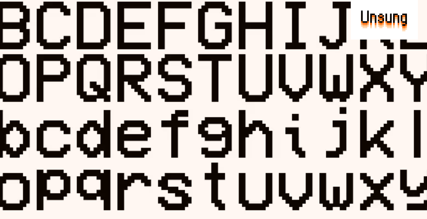
Modern pixel fonts: Analog Mono and Coral Pixels revive retro digital aesthetics
A blog post highlighting interesting modern pixel fonts, focusing on Andrew Gleeson's Analog Mono (which fixes issues with the classic VCR O
 unsung.aresluna.org·6d ago
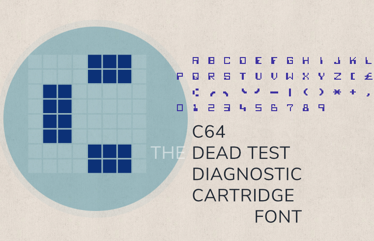
A Technical Deep Dive into the Commodore 64 Dead Test Cartridge Font
A detailed technical exploration of the font used in the Commodore 64's "Dead Test" diagnostic cartridge. The article documents the font's d
 masswerk.at·7d ago
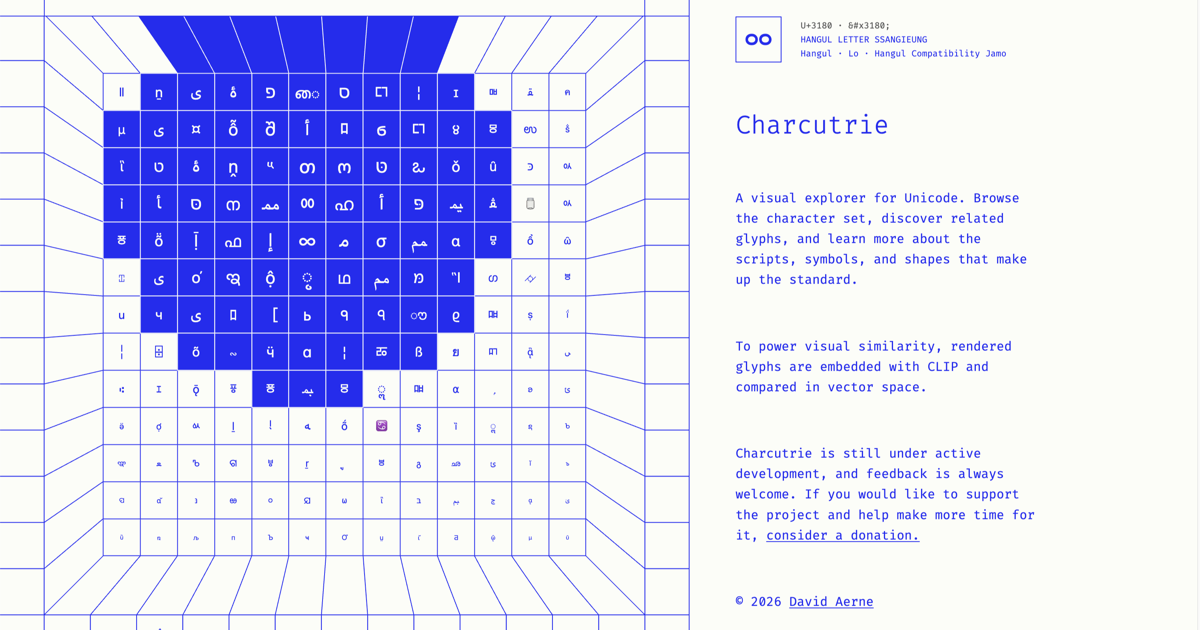
Charcuterie: A Visual Explorer Tool for Unicode Characters and Glyphs
Charcuterie is a visual explorer tool for Unicode that allows users to browse characters, discover related glyphs, and learn about scripts,
 charcuterie.elastiq.ch·1mo ago
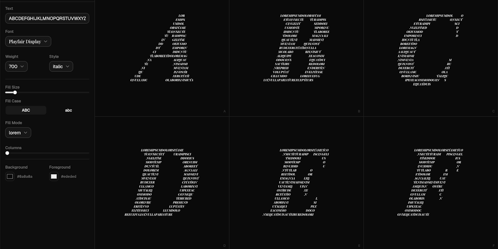
Letterbox: Create Letters Shaped by Text with Custom Fonts and Colors
Letterbox is a creative typography tool that allows users to create letters shaped by text. Users can pick fonts, choose colors, and watch t
 Product Hunt·1mo ago
Technical Analysis of Microsoft's ClearType Font Collection and Screen Typography Design
This article provides a detailed technical review of Microsoft's ClearType font collection, examining the evolution of screen typography fro

Proper Use of Quotation Marks in Digital Typography: Avoiding ASCII Grave Accent as Left Quote
This article explains the proper use of quotation marks in digital typography, specifically warning against using ASCII grave accent (0x60)