Technical Analysis of Microsoft's ClearType Font Collection and Screen Typography Design
Further, designers don't have to carefully hint the metrics to get good spacing.Both refinements are welcome improvements, but at heart the technology is still much the same as shipped with XP.The…
Read the full articleYou might also wanna read
Developer's 90ms Font Swap Obsession Reveals the Limits of Performance Budgets
A developer noticed a brief visual flicker during a website redesign when the browser swapped a system font for a web font, measuring the de

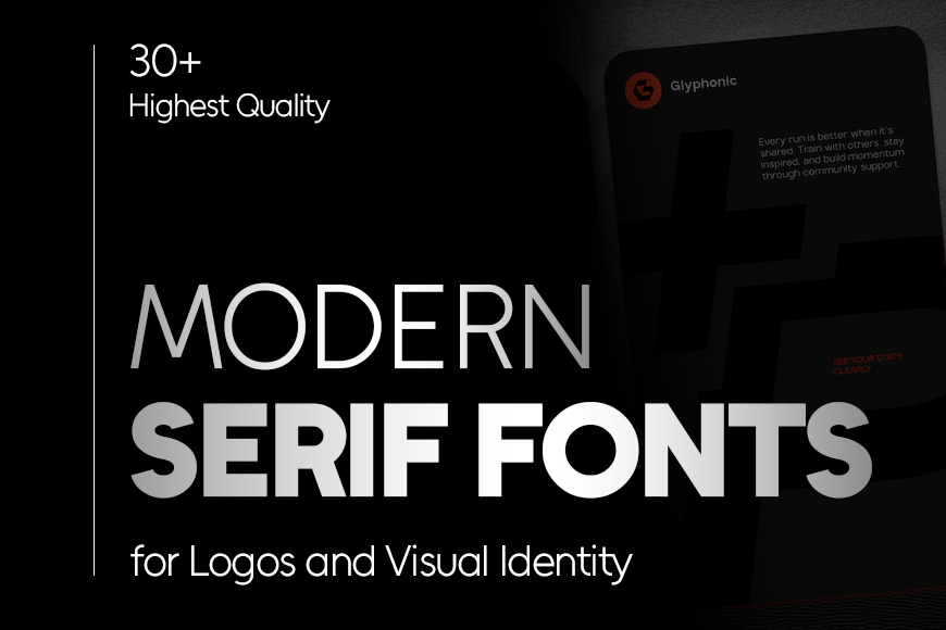
30+ Modern Serif Fonts for Logo Design and Brand Identity
Download modern serif fonts for logos and branding. These logo-ready fonts help you build a strong brand identity while saving time on logo
 Graphic Design Junction·10d ago
20+ Free Geometric Fonts for Modern Design Projects
A collection of the best free geometric fonts. From minimalistic to bold and impactful, we have a geometric style for every design project.
 Speckyboy·1mo ago
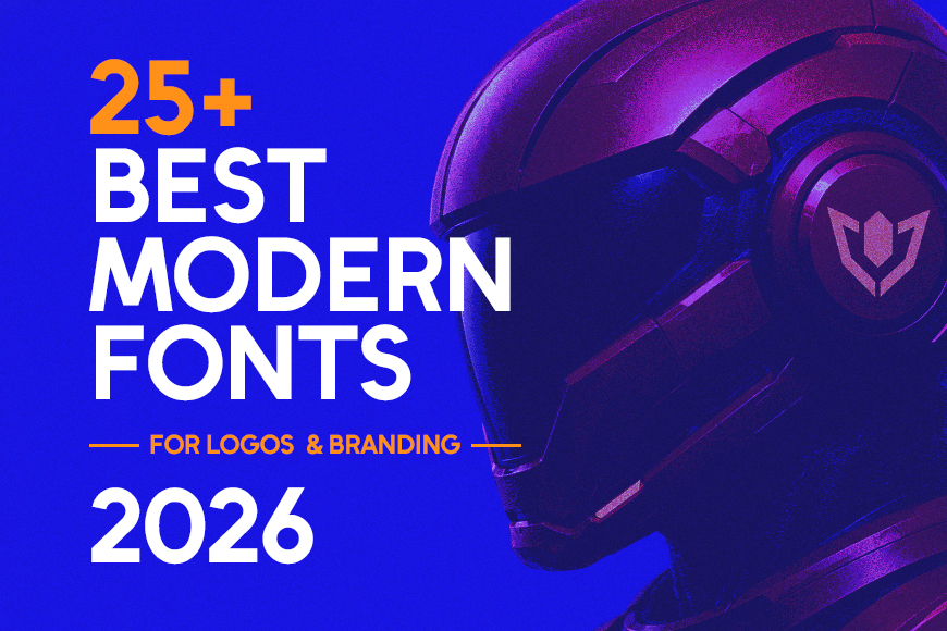
25+ Modern Fonts for Logos and Branding: A Curated Collection for 2026
Modern fonts give logos a clear voice before a single word is spoken. A great logo starts with the right font and typography for a memorable
Graphic Design Junction·13d ago
25+ Plain Fonts for Minimalist and Functional Design
Sometimes, the simplest fonts make the strongest impact. Plain fonts strip away unnecessary styling and focus on clean, functional design. T

20+ Finance Fonts for Professional Branding: Balancing Trust and Modern Elegance
Finance design demands clarity, confidence, and trust. And it’s important to find the right font that can communicate all three. In this col
Comments
Sign in to join the conversation.
No comments yet. Be the first.