Exploring Optical Corrections in Architecture and Typography
By
ArmageddonIt
Crisp on the outside, thoughtful on the inside. A keeper.
Summary
The article discusses optical corrections in architecture and typography, focusing on visual design principles. It includes examples of optical illusions and emphasizes the importance of viewing the content on a large screen for better understanding.
Key quotes
· 2 pulledIf you found my piece about legible typefaces interesting, you’ll likely enjoy this one as well.
Since I included many visual examples that are size-sensitive, make sure you read this on a big screen and not your mobile device.
You might also wanna read


El entoldado de calles: una técnica milenaria eficaz contra el calor urbano
El entoldado de calles es una práctica milenaria que sigue siendo eficaz para mitigar el calor en espacios urbanos. La colocación estratégic
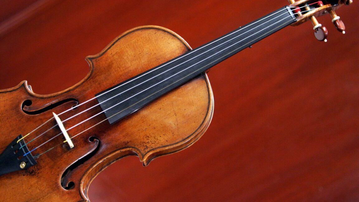
MIT engineers develop virtual violin simulation tool for luthiers
MIT engineers have developed a virtual violin simulation tool that captures the precise physics of the instrument and reproduces realistic s

Designer Creates Artificial Flower to Help Pollinators Navigate Polluted Urban Environments
British designer Justina Alexandroff has created Faux Flora, a fake flower designed to help bees and other pollinators navigate polluted cit
 Dezeen·1mo ago
RMIT Researchers Develop Cement-Free Rammed Earth Building Material Using Cardboard Formwork
RMIT researchers have developed an innovative building material that encases rammed earth in permanent cardboard formwork, eliminating the n
Dezeen·7mo ago
Designing Acceptance: The Challenge of Making Lab-Grown Meat Culturally Palatable
This article explores the challenges and opportunities of lab-grown meat, focusing on the role of design in making it culturally and emotion
Dezeen·8mo ago
MIT Study Shows Pedestrians Walk Faster and Linger Less in Public Spaces
A study by MIT's Senseable City Lab reveals that pedestrians are walking 15% faster and lingering 14% less in public spaces. The research, w
Dezeen·10mo ago