Rethinking Tufte's data-to-ink ratio: When minimalism in data visualization goes too far
Kettled twice. Extra chewy, extra trustworthy.
Summary
This article critically examines Edward Tufte's influential design principles of "chart junk" and the "data-to-ink ratio," questioning how much minimalism is too much in data visualization. The author explores the tension between Tufte's minimalist philosophy and practical visualization needs, proposing an absurdly minimalist visualization as a thought experiment to illustrate the limits of the data-to-ink ratio. The piece argues that novices are often taught to pursue minimalism without understanding when to stop, and that excessive minimalism can strip visualizations of necessary context, narrative, and communicative power.
Key quotes
· 3 pulledTo say that Tufte has been influential in the field of data visualization would be an understatement.
Novices learning to make data visualizations are often taught to avoid 'chart junk' and strive towards visual minimalism. But they aren't told when to stop.
How much minimalism is too much minimalism?
You might also wanna read

Historical Data Visualizations: How William James, W.E.B. Du Bois, and Francis Galton Used Diagrams for Thinking
The article explores the historical data visualizations and diagrams created by notable figures like William James, W.E.B. Du Bois, and Fran
 resobscura.substack.com·1mo ago
Balancing Low-Tech Mathematics with Computational Visualization
The article explores the tension between low-tech mathematical approaches and computational methods, advocating for a balanced perspective t
 mathenchant.wordpress.com·7mo ago
Building a Minimal UI Engine from First Principles with PyGame
The article details the author's experience designing a minimal UI engine from scratch using PyGame, focusing on first principles and event-
 madebymohammed.com·3mo ago
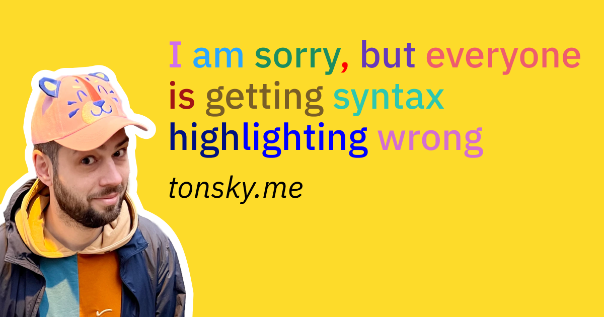
Rethinking Syntax Highlighting: A Minimalist Approach for Better Code Readability
This article critiques modern syntax highlighting practices in programming, arguing that current approaches create visual noise and distract
 tonsky.me·7mo ago
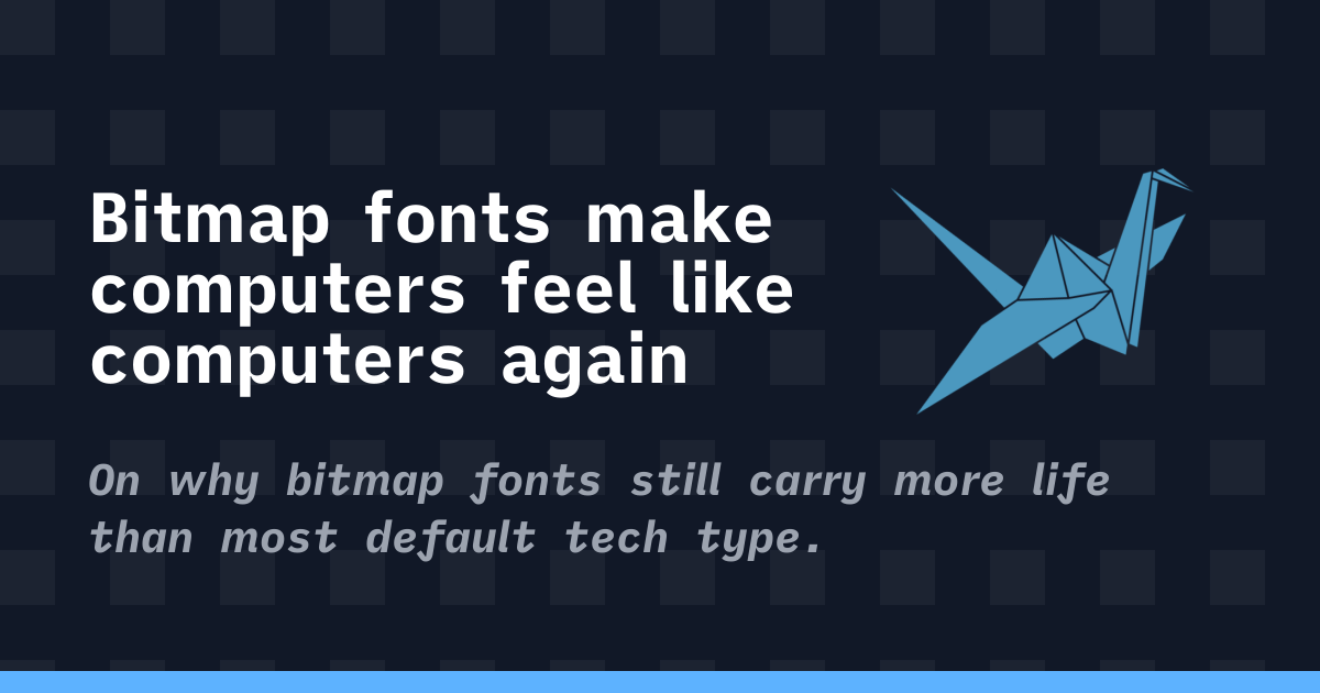
The Enduring Appeal of Bitmap Fonts: How Constraint-Based Design Shapes Digital Aesthetics
The article explores the enduring appeal and significance of bitmap fonts in computing, arguing that they represent a design philosophy born
 korigamik.dev·2mo ago
Why Fewer Ideas Can Lead to Better Creativity and Design
Eric Olive challenges the conventional wisdom around brainstorming and idea quantity, arguing that fewer, more focused ideas lead to better
 Smashing Magazine·1y ago