Walkers unveils biggest rebrand in 80 years, replacing iconic crisp logo with sun motif
By
Abbey Bamford
Warm and crisp on the edges. A bagel with a bit of bite.
Summary
Walkers crisp brand has unveiled its biggest rebrand in nearly 80 years, replacing the iconic yellow crisp logo with a sun-inspired mark to emphasize "real ingredients" and 100% Great British potatoes. The redesign marks a significant departure from decades of subtle visual tweaks, sparking debate among creatives about whether it's a confident evolution of heritage or a risky move away from a beloved brand asset.
Key quotes
· 3 pulledOut goes the familiar yellow crisp at the centre of the logo, replaced by a radiating sun designed to champion 'real ingredients' and 100% Great British potatoes.
For a brand whose visual identity has been subtly tweaked rather than radically overhauled for decades, it's a notable shift.
Walkers has long relied on familiarity as a...
You might also wanna read


Warburtons Celebrates 150th Anniversary with Comprehensive Packaging Redesign by Taxi Studio
Warburtons, the 150-year-old British bakery brand, has undergone a comprehensive packaging redesign by Taxi Studio to celebrate its mileston
 Creative Boom·2mo ago
Mindful Chef Launches Brand Refresh in Partnership with Mother Design
Mindful Chef, a UK premium healthy recipe box service, has unveiled a brand refresh created in partnership with Mother Design. This marks th
Creative Boom·4mo ago
Lay's Updates Logo to Emphasize Agricultural Heritage and Farm-Grown Potatoes
Lay's, the American crisp brand owned by PepsiCo, has undergone a subtle logo redesign that emphasizes its agricultural heritage and connect
 Dezeen·7mo ago
The Protein Ball Co. Rebrands with 'Ballsy by Nature' Identity by Robot Food
Robot Food has rebranded The Protein Ball Co. with a bold new identity called 'Ballsy by Nature,' shifting from a feel-good wellness aesthet
Creative Boom·7mo ago
Design Agency Wins Whisky Label Award Through Analog, Location-Based Creative Process
The article describes how design agency Thirst won a prestigious whisky label design project for East London Liquor Company by taking an ana
Creative Boom·2mo ago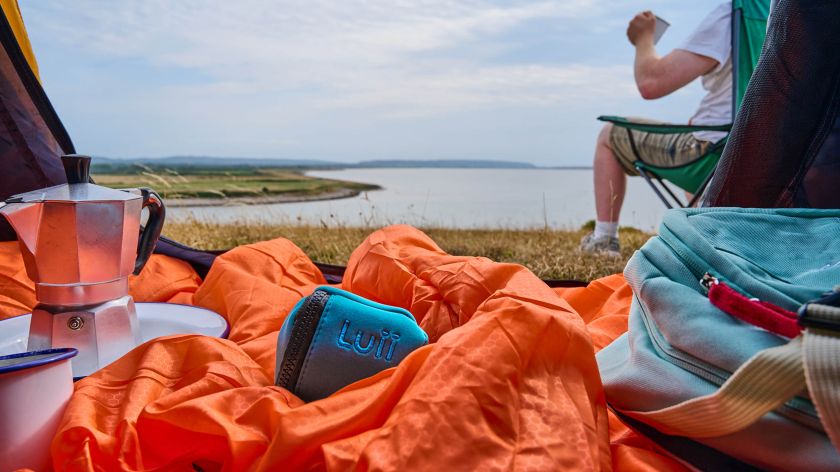
How Lark Design Studio Created a Premium Brand Identity for Portable Toilet Startup Luii
Lark Design Studio took on the challenging branding brief for portable toilet startup Luii, creating a sophisticated brand identity that def
Creative Boom·2mo ago