Design Agency Wins Whisky Label Award Through Analog, Location-Based Creative Process
When Thirst ditched the moodboard and walked East London instead, they created something no algorithm could ever generate. One of the most talked-about booze projects of recent months very much we...
Read the full articleYou might also wanna read
HIGHGINLAND — Premium Gin Label Design
Premium Gin Label Design — HIGHGINLAND HIGHGINLAND — Flow of Distilled Energy BRAND PHILOSOPHY At the heart of this concept are two essentia


Architect-Designed Spirit Bottles: Six Notable Collaborations
Jeanne Gang is the latest architect to design a spirit bottle. We round up six bottles designed by architects and designers including Frank
 Dezeen·9mo ago
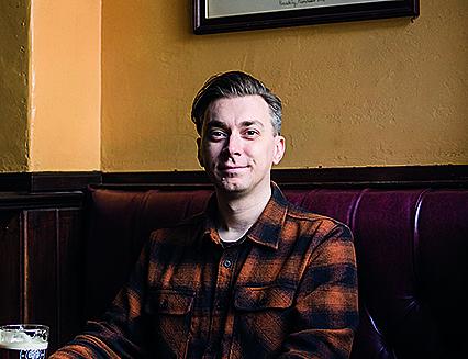
AI-generated beer pump clips spark debate about authenticity in pub culture
Standing at the bar in Sheffield’s Rutland Arms, I scan the beer list before deciding what to order. Settling on a pint of pale ale from Der
 wb.camra.org.uk·1mo ago
How AI-generated visuals are reshaping the agency-client creative relationship
How one experiential agency is dealing with AI concepts.
 Creative Bloq·8d ago
From Taste to System: How Lewis Webber Designs the Machines Behind Creative Studios
From freelancer to multi-studio founder, Lewis Webber's career is built on the idea that taste has to become a system — or it disappears.
 Codrops·27d ago
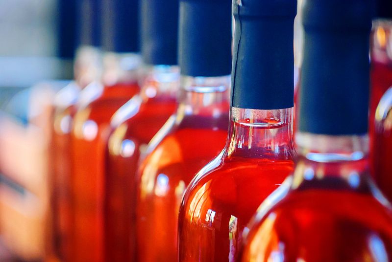
Alcohol Makers Turn to AI for Flavor Development and Younger Consumers
Brewers, wineries and distillers are using data tools to predict flavor, speed development and court younger consumers.
 vinetur.com·1mo ago
Comments
Sign in to join the conversation.
No comments yet. Be the first.