
























Why I Love Clear Icons on iPhone: Muting Visual Distractions & Garish Colors
By
Jamie Cuevas
11d agoen
Source
OS X DailyWhy I Love Clear Icons on iPhone: Muting Visual Distractions & Garish Colorsosxdaily.comEver since Liquid Glass debuted, there has been some debate about using Clear Icons on the Home Screen of iPhone and iPad, with some users really liking the feature and the look, and many other users questioning the usefulness and utility. Some seem to dislike the Clear icons look because of Liquid Glass in general, ... Read More The post Why I Love Clear Icons on iPhone: Muting Visual Distractions & Garish Colors appeared first on OS X Daily .
You might also wanna read

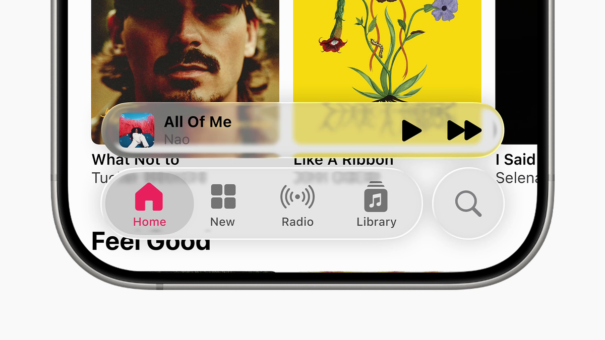
Analysis: Apple's Liquid Glass Design System Prioritizes Aesthetics Over Readability
The article critiques Apple's newly announced Liquid Glass transparent design system, arguing that Apple prioritizes aesthetics over functio
 maxvanijsselmuiden.nl·11mo ago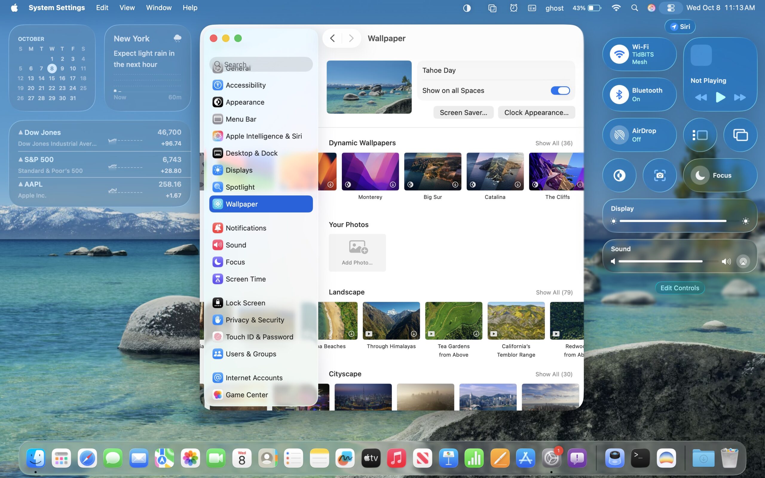
How to Adjust Apple's Liquid Glass Interface for Better Readability
This article provides a comprehensive guide on how to adjust Apple's Liquid Glass interface design across macOS, iOS, watchOS, and tvOS to i
 tidbits.com·8mo ago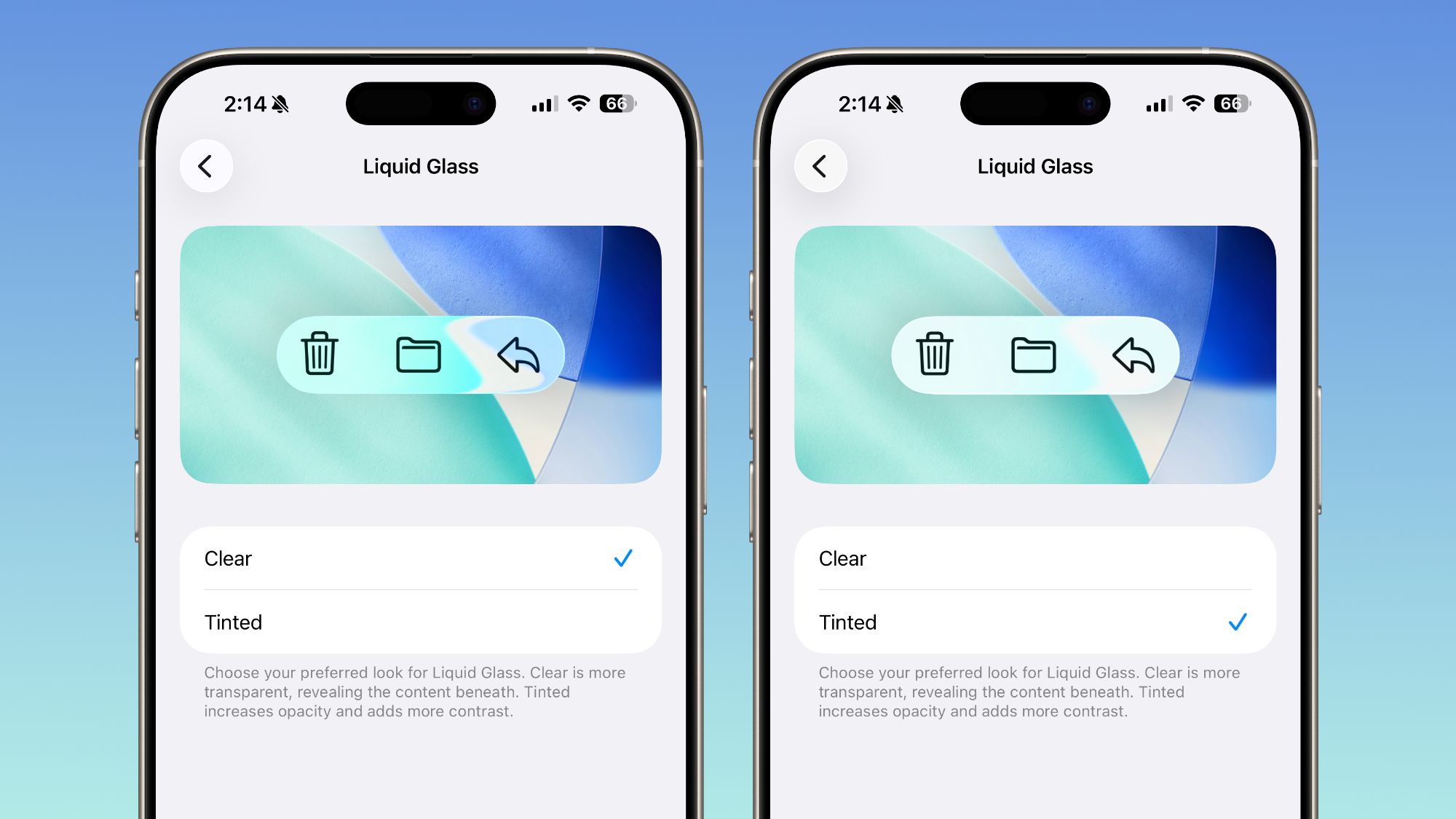
Apple Adds Liquid Glass Transparency Toggle in iOS 26.1 Beta 4
Apple has released the fourth beta versions of iOS 26.1, iPadOS 26.1, and macOS 26.1, introducing a new Liquid Glass transparency toggle tha
 macrumors.com·8mo ago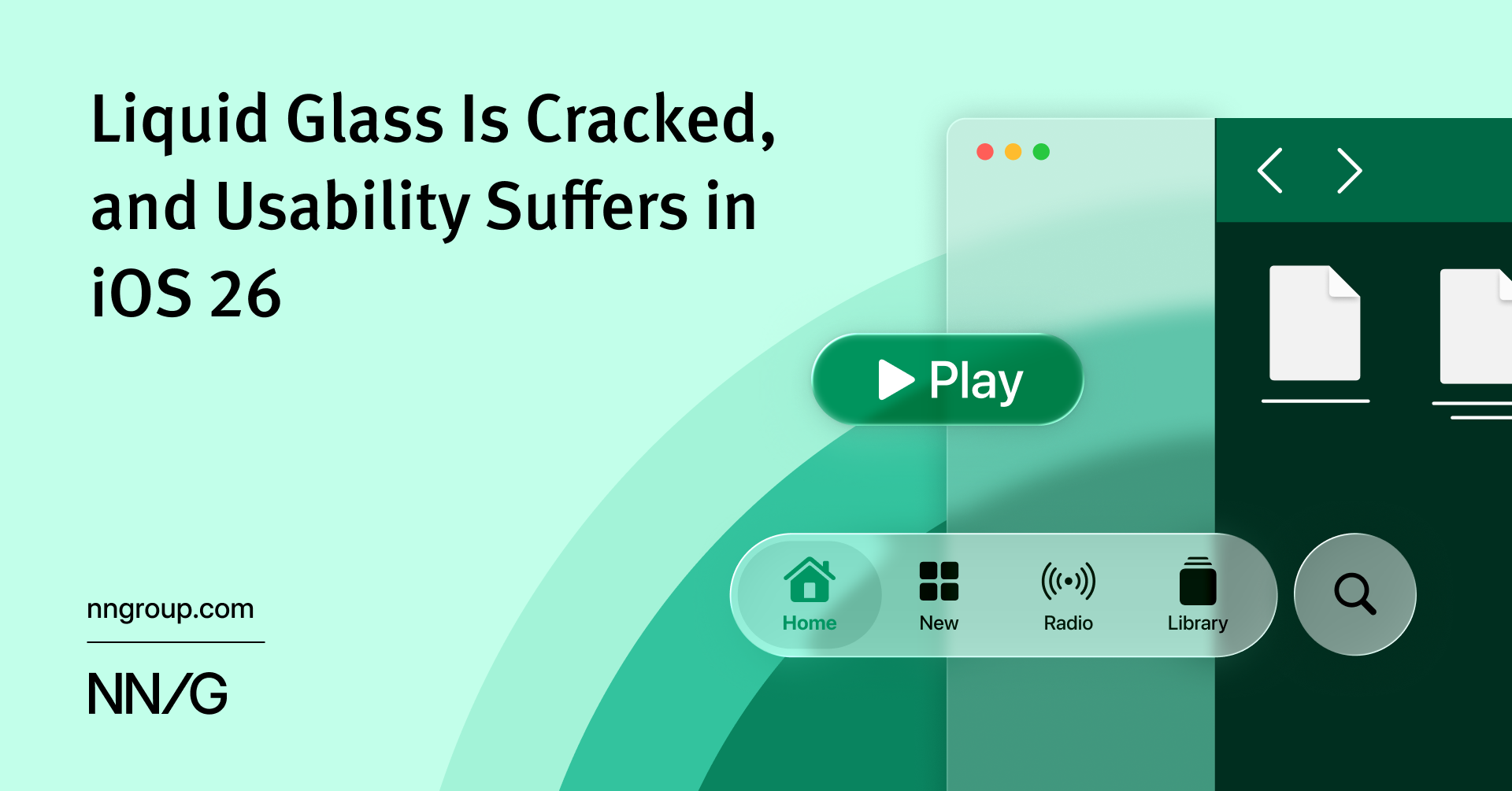
iOS 26's Liquid Glass Design Compromises Usability for Visual Effects
iOS 26's new 'Liquid Glass' visual design language prioritizes decorative UI effects over usability, creating shimmering surfaces and animat
 nngroup.com·9mo ago
What Liquid Glass tint setting are you using?
MacRumors·1d ago

Evolution of macOS System Icons
Apple introduces a new UI design called Liquid Glass in macOS 26, featuring softer and shinier icons. The article documents the evolution of
basicappleguy.com·1y ago
Comments
Sign in to join the conversation.
No comments yet. Be the first.