iOS 26's Liquid Glass Design Compromises Usability for Visual Effects
iOS 26’s visual language obscures content instead of letting it take the spotlight. New (but not always better) design patterns replace established conventions.
Read the full articleYou might also wanna read


Apple Reveals iOS 26 Update with Translucent Liquid Glass Design
Apple has revealed iOS 26, its "broadest software design update ever", which features translucent buttons, expanded AI capabilities and a ga
 Dezeen·1y ago
Still Struggling With Liquid Glass on iOS? Tone It Down With These 5 Settings
Apple's polarizing UI design isn't going anywhere, but the iOS 27 public beta gives you more control. Here's how to make Liquid Glass less t

Still Struggling With Liquid Glass on iOS? Tone It Down With These 5 Settings
Apple's polarizing UI design isn't going anywhere, but the iOS 27 public beta gives you more control. Here's how to make Liquid Glass less t
WhatsApp’s Next iOS Update Could Bring Liquid Glass Design Across the App
WhatsApp is preparing a major visual refresh for iOS, testing a “Liquid Glass” design across beta versions. Selected users on iOS now see tr
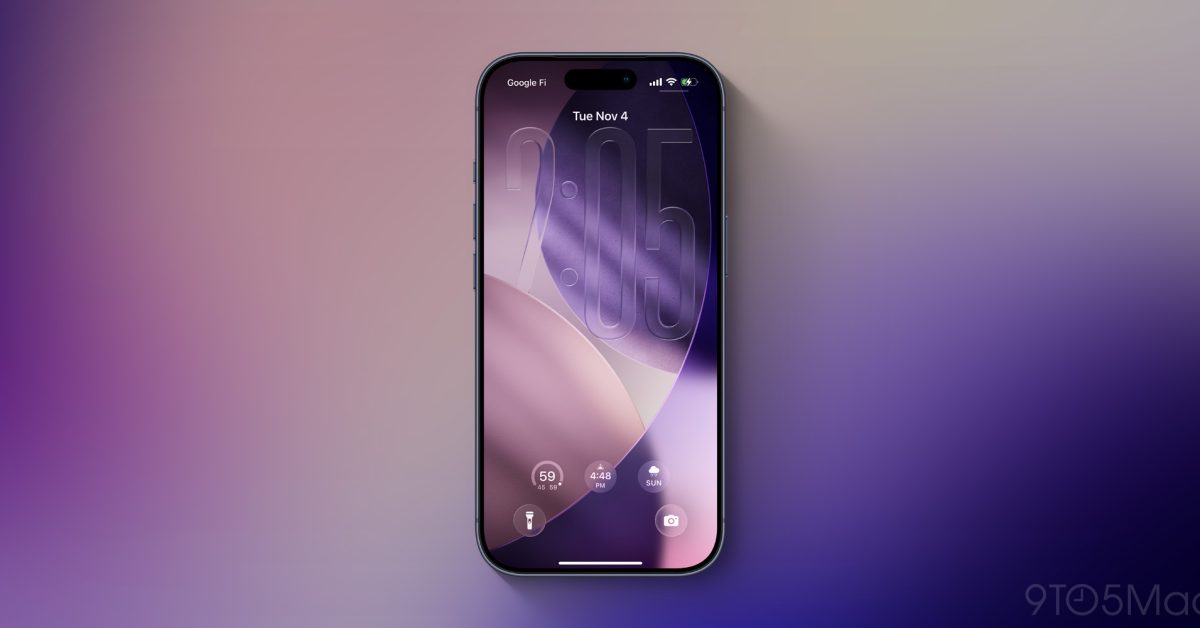
iOS 27 rumored to introduce new Liquid Glass design customization options
The next major iPhone software update, iOS 27, is rumored to bring change in two new areas related to Apple’s Liquid Glass design.
 9to5mac.com·1mo ago
Why Apple’s ‘Liquid Glass’ Design Is a Step Backward for UX
It’s always a bit thrilling to watch a new Apple keynote. The polish, the drama, the language — “a bold new expression,” they said this year
Prototypr·1y ago
Comments
Sign in to join the conversation.
No comments yet. Be the first.