
























Subscription Cost Visualizer: A lightweight tool for visualizing spending
By
Designed by Tina Roth Eisenberg (swiss-miss.com) and built by John Ford (johnford.is)
Summary
A blog post on swissmiss (a design blog) briefly introducing the "Subscription Cost Visualizer" — a lightweight, interactive tool that displays subscriptions as a proportional visual grid, making spending patterns instantly legible through block sizes that correspond to cost.
Source

 swiss-missSubscription Cost Visualizer: A lightweight tool for visualizing spendingswiss-miss.com
Key quotes
· 2 pulledSubscription Cost Visualizer is a lightweight, interactive tool that turns your subscriptions into a visual grid.
Instead of a list of numbers, you get a clear, proportional view of where your money is going—larger blocks represent higher costs, making your spending instantly legible.
You might also wanna read


Japan launches data visualization tool for local government finances
Japan has released a new tool that allows users to visualize local government finances, including revenues, expenditures, and fiscal indicat

Cloudflare Fundamentals, Workers - Introducing Billable Usage dashboard and Budget alerts
Cloudflare Fundamentals, Workers, D1, R2, KV, Queues, Vectorize, Durable Objects, Containers - Billable usage and budget alerts now in product sidebars
Exploring the 'Physics Visualizer': A Tool for Simplifying Physics Concepts
The article discusses a tool or concept called 'Physics Visualizer,' likely aimed at illustrating or simplifying physics concepts through vi
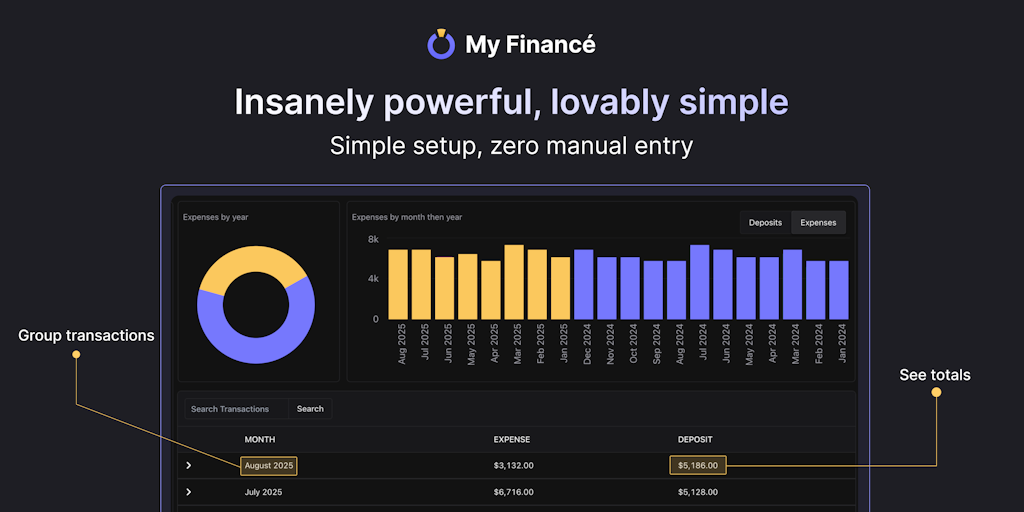
My Financé review: A tool for automating personal finance tracking and net worth monitoring
A personal finance article that shares a simple, practical approach to managing finances using the My Financé tool. The author explains thei
 Product Hunt·1y ago
Interactive US Job Market Visualizer Tool Using BLS Occupational Data
This article describes a research tool called "US Job Market Visualizer" that provides interactive visualizations of 342 occupations from th
Comments
Sign in to join the conversation.
No comments yet. Be the first.