Interactive visualization: The Economist's prediction accuracy (2000-2026)
Summary
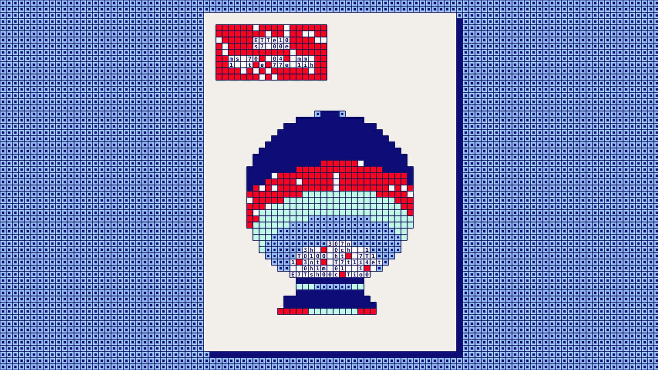
This is an interactive data visualization companion piece to an article about The Economist's prediction accuracy. It presents a scatter plot of predictions made in The Economist's leaders from 2000-2026, scored by an LLM (GPT-5.5) on two axes: accuracy and out-of-consensus rating. Users can hover over data points to see individual predictions, click to pin details, and navigate through predictions from mainstream to boldest. The piece is primarily a visual tool rather than a standalone article.
Source
Twitter / XInteractive visualization: The Economist's prediction accuracy (2000-2026)crystal-balls-chart.onrender.comKey quotes
· 3 pulledPredictions in The Economist leaders, 2000–26
Accuracy and out-of-consensus rating scored by an LLM
Click a point to pin its details and get a link to the leader; press Esc to release.
You might also wanna read

The Economist tests its own forecasting accuracy using artificial intelligence
The Economist uses AI to test the accuracy of its own forecasts, particularly those made in its leader pages. The article examines the track
 econ.st·1d ago
The Economist experiments with agent-readable content for AI-driven discovery
The Economist is experimenting with a "two-track internet" strategy, creating content specifically structured for AI agents and answer engin
 digiday.com·1mo ago
Vanguard economist predicts AI will benefit users more than providers, similar to electricity
Vanguard's Joseph Davis argues that AI technology will follow the pattern of electricity, where the users of the technology benefit more tha
 interest.co.nz·6d ago
The 2026 Economic Paradox: AI Investment Surges While Software Jobs Grow
The article discusses the paradoxical state of the 2026 economy where despite narratives of AI-driven job displacement, software engineering
 Citadel Securities·2mo ago
Stanford and ADP launch AI Economic Indicators dashboard to track AI's impact on jobs and productivity
Stanford Digital Economy Lab, in partnership with ADP, has launched an AI Economic Indicators dashboard to track AI adoption, productivity,
 marketplace.org·8d ago
Comments
Sign in to join the conversation.
No comments yet. Be the first.