
























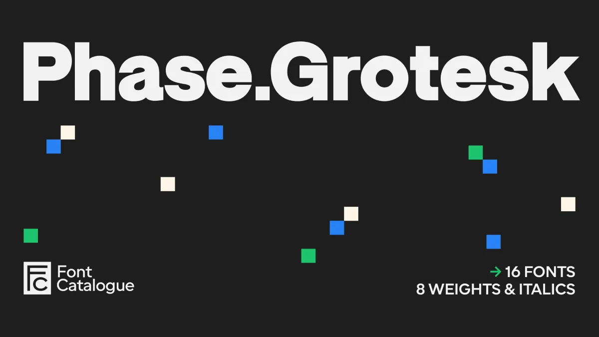
Phase Grotesk Font Family Review: Deliberate Imperfections in a Grotesque Sans-Serif
By
Dirk Petzold
Summary
A hands-on review of the Phase Grotesk font family by Font Catalogue. The author spent three weeks testing the typeface across UI screens, editorial layouts, and oversized posters. Unlike most low-contrast sans-serif fonts that aim for flawlessness, Phase Grotesk deliberately retains small stroke irregularities, which changes how the typeface behaves at every size. The article documents the author's findings from extensive real-world testing during a brand refresh project.
Source
 bskyPhase Grotesk Font Family Review: Deliberate Imperfections in a Grotesque Sans-Serifweandthecolor.com
Key quotes
· 4 pulledPhase Grotesk showed up on my desktop during a brand refresh project, and it refused to behave like a normal grotesque.
Most low-contrast sans-serif fonts try to look flawless. This font family does the opposite.
It keeps small stroke irregularities on purpose, and that single decision changes how the whole typeface behaves at every size.
I spent three weeks testing the Phase Grotesk font family across UI screens, editorial layouts, and oversized posters, and this article documents exactly what I found.
You might also wanna read

25+ Plain Fonts for Minimalist and Functional Design
A curated collection of plain, minimalist fonts designed for clean and functional typography. The article highlights how simple, unadorned f

A Curated Roundup of 20+ Hybrid Fonts for Versatile Modern Branding
A curated roundup of over 20 hybrid typefaces designed for modern branding, each blending design traits (such as serif and sans-serif charac

Technical Analysis of Microsoft's ClearType Font Collection and Screen Typography Design
This article provides a detailed technical review of Microsoft's ClearType font collection, examining the evolution of screen typography fro
 typographica.org·3mo ago
November 2025's best new typefaces: Grotesques, experimental systems, and typographic heritage
A roundup of the best new typeface releases for November 2025, highlighting a dialogue between tradition and innovation. The article covers
 Creative Boom·7mo ago
Shantell Sans: A variable typeface blending readability with experimental animation styles
Shantell Sans is a new variable typeface created by artist Shantell Martin that offers multiple adjustable axes including Weight, Italic, In
 shantellsans.com·1mo ago
The Enduring Appeal of Bitmap Fonts: How Constraint-Based Design Shapes Digital Aesthetics
The article explores the enduring appeal and significance of bitmap fonts in computing, arguing that they represent a design philosophy born
 korigamik.dev·3mo ago
Comments
Sign in to join the conversation.
No comments yet. Be the first.