
























Savene Jewelry Brand Identity Built on Swiss Grid Typographic System
By
abduzeedo
Summary
Savene jewelry brand's visual identity is built on a disciplined Swiss grid typographic system. The design uses tight margin alignment, generous negative space, and minimal borders to create compositional tension and structural breathing room. Large graphics are balanced with clean, quiet zones to guide the reader's eye across editorial layouts.
Source
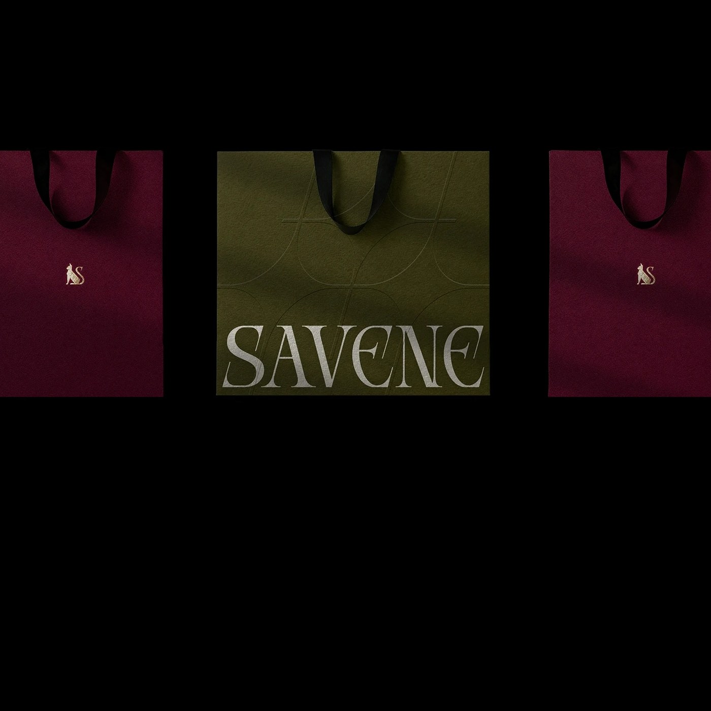
 AbduzeedoSavene Jewelry Brand Identity Built on Swiss Grid Typographic Systemabduzeedo.com
Key quotes
· 4 pulledEvery graphic element pins tightly to the page margins.
This placement creates a compelling sense of compositional tension.
Generous negative space serves as an active visual weight.
This deliberate restraint gives each layout structural breathing room.
You might also wanna read

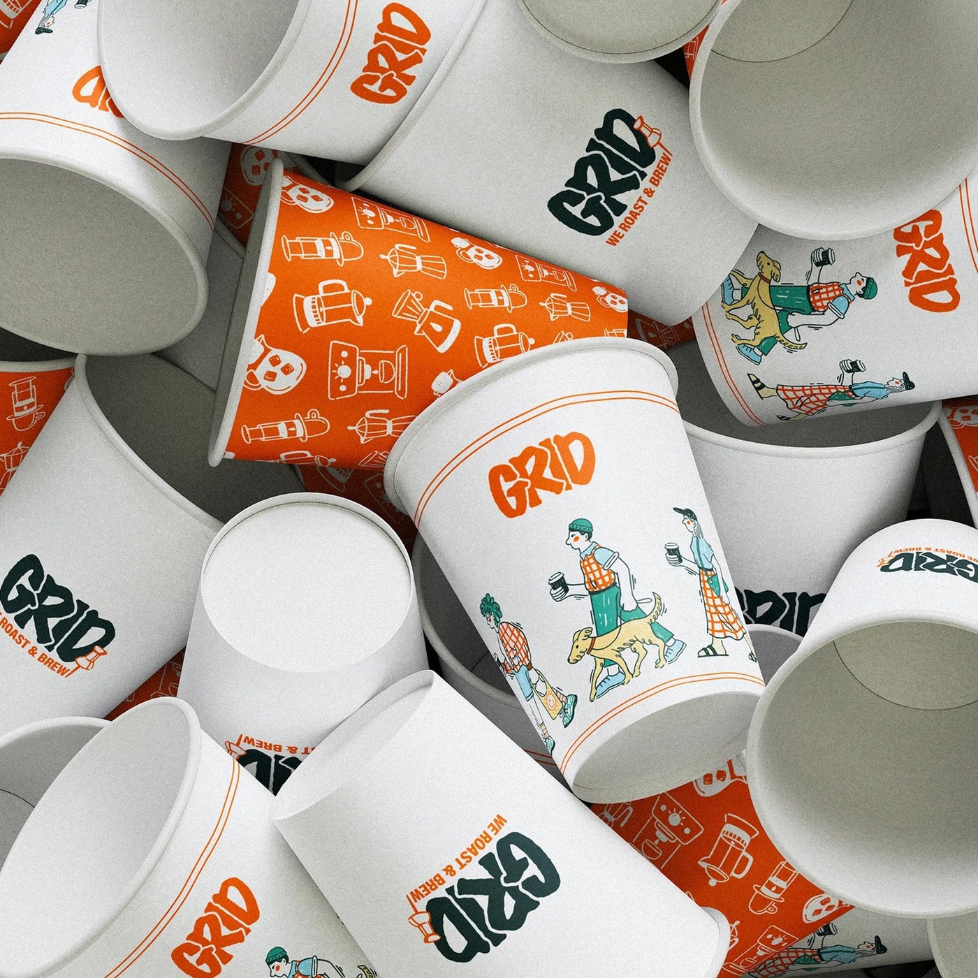
Grid-Based Modular Design System for Coffee Shop Branding and Packaging
This article presents a coffee shop branding visual identity system that uses a grid-based modular design approach. The design rejects tradi
abduzeedo.com·6d ago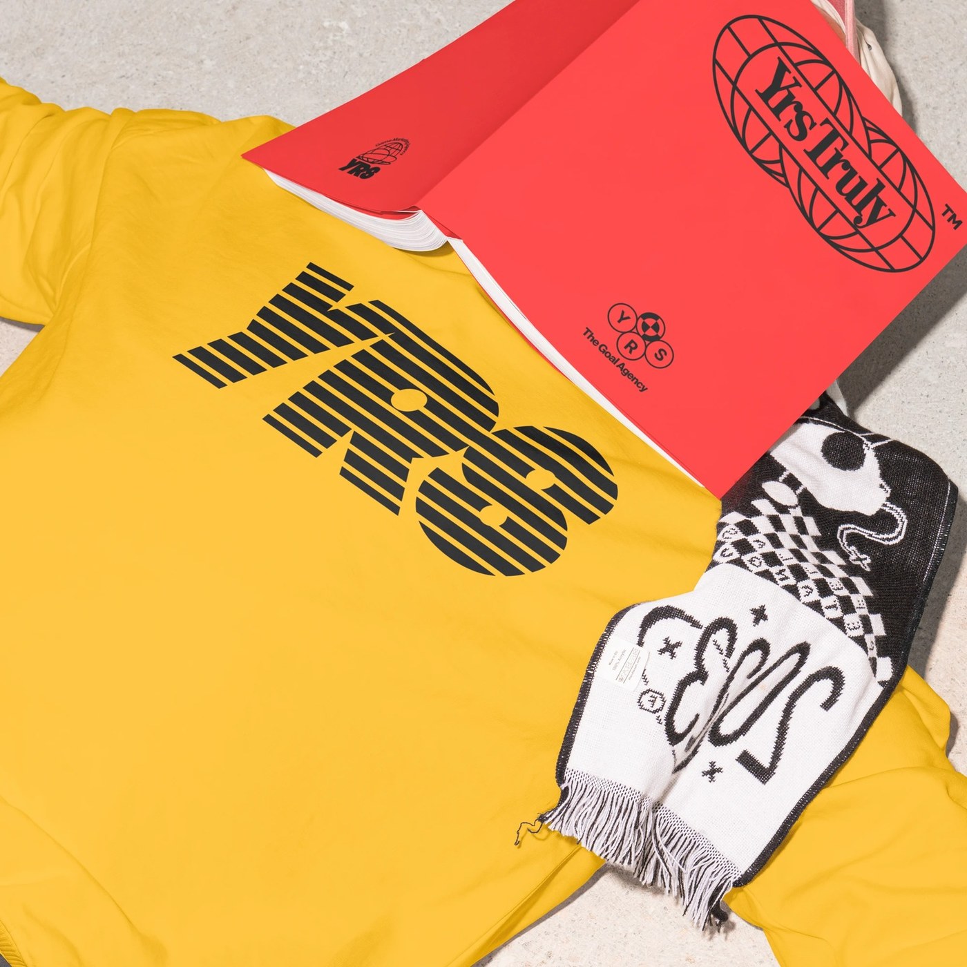
Monga Design creates disciplined visual identity system for Yrs Truly
Monga Design has created a disciplined visual identity system for Yrs Truly, characterized by structured layouts, high-contrast corporate-vi
abduzeedo.com·12d ago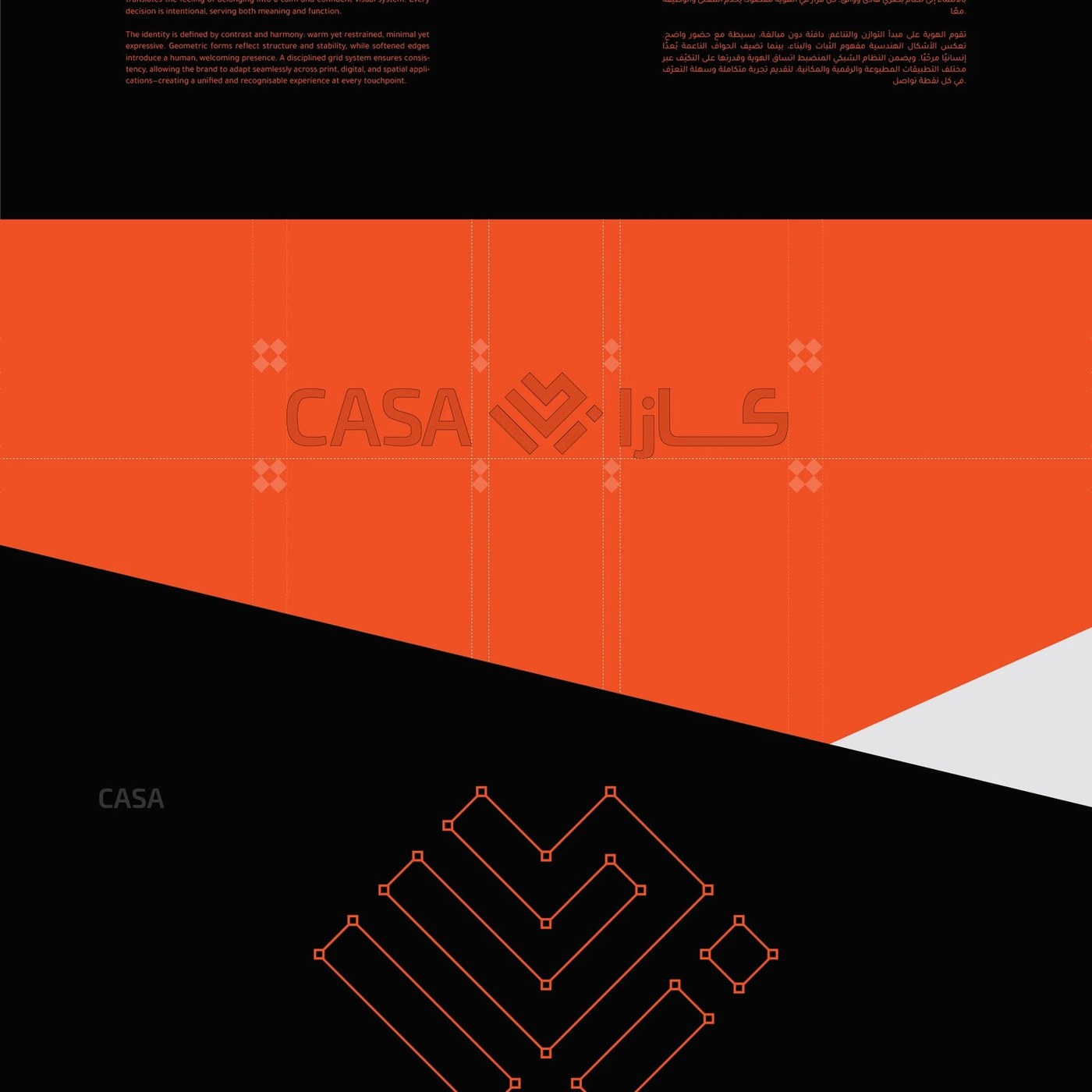
AOB Design Creates Conceptual Brand Identity for CASA Inspired by the Feeling of Home
AOB Design presents a conceptual brand identity system for CASA that translates the feeling of home into geometric form. The logo uses diago
abduzeedo.com·17d ago
Ruda Olive Oil Packaging: Yai Salinas' Geometric Typography and Grid-Based Design System
This article discusses the brand identity typography and design system for Ruda olive oil packaging, created by designer Yai Salinas. It foc
abduzeedo.com·6d ago
Chantelle Pulp and Monotype create a variable font logo that embodies brand identity through shape-shifting typography
Variable fonts have been used primarily for technical efficiency (responsive type, file size benefits), but Chantelle Pulp's collaboration w
 Creative Boom·5mo ago
How typography built Penguin Books' iconic brand identity over 90 years
Penguin Books celebrates its 90th anniversary, highlighting how typography and design — particularly Jan Tschichold's influential compositio
Creative Boom·7mo ago
Comments
Sign in to join the conversation.
No comments yet. Be the first.