How typography built Penguin Books' iconic brand identity over 90 years
This year, Penguin celebrates its 90th birthday, marking a near-century of one of the most instantly recognisable and influential identities in publishing history. From the beginning, typography wa...
Read the full articleYou might also wanna read

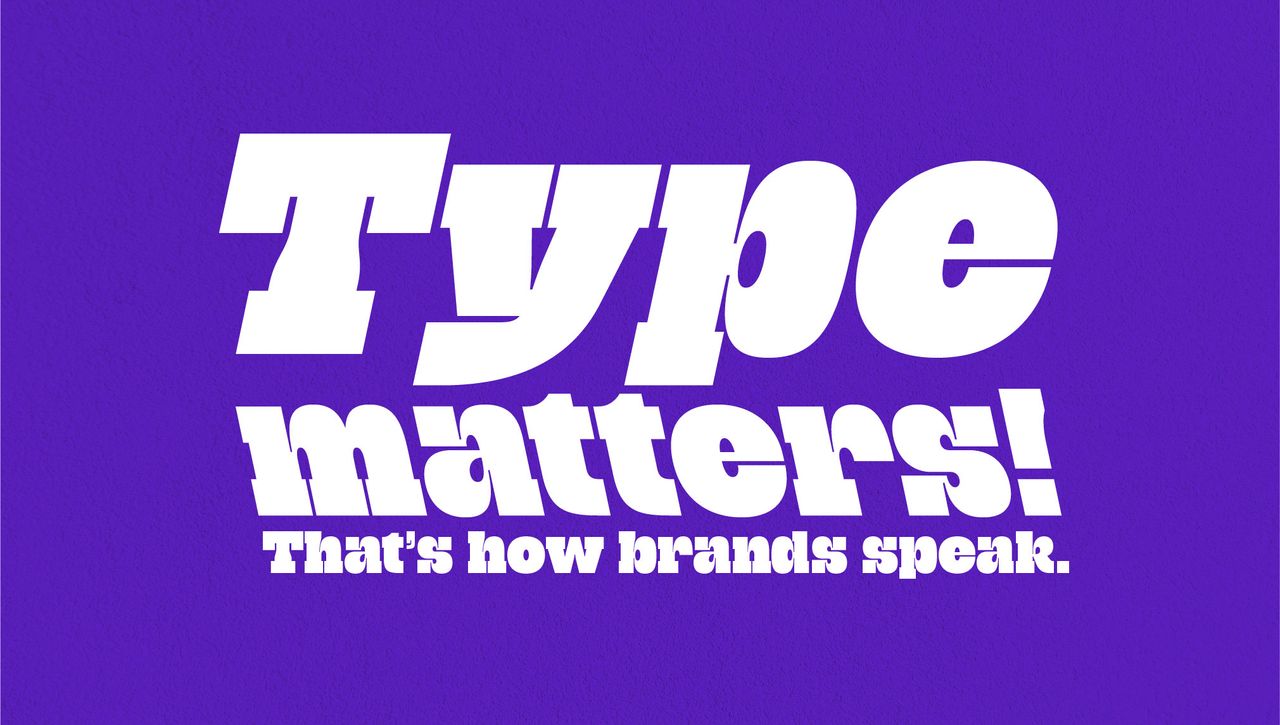
Why typography is a vital but overlooked branding tool
Typography shapes perception, communicates values, and gives every brand its own voice.
 Creative Bloq·10d ago
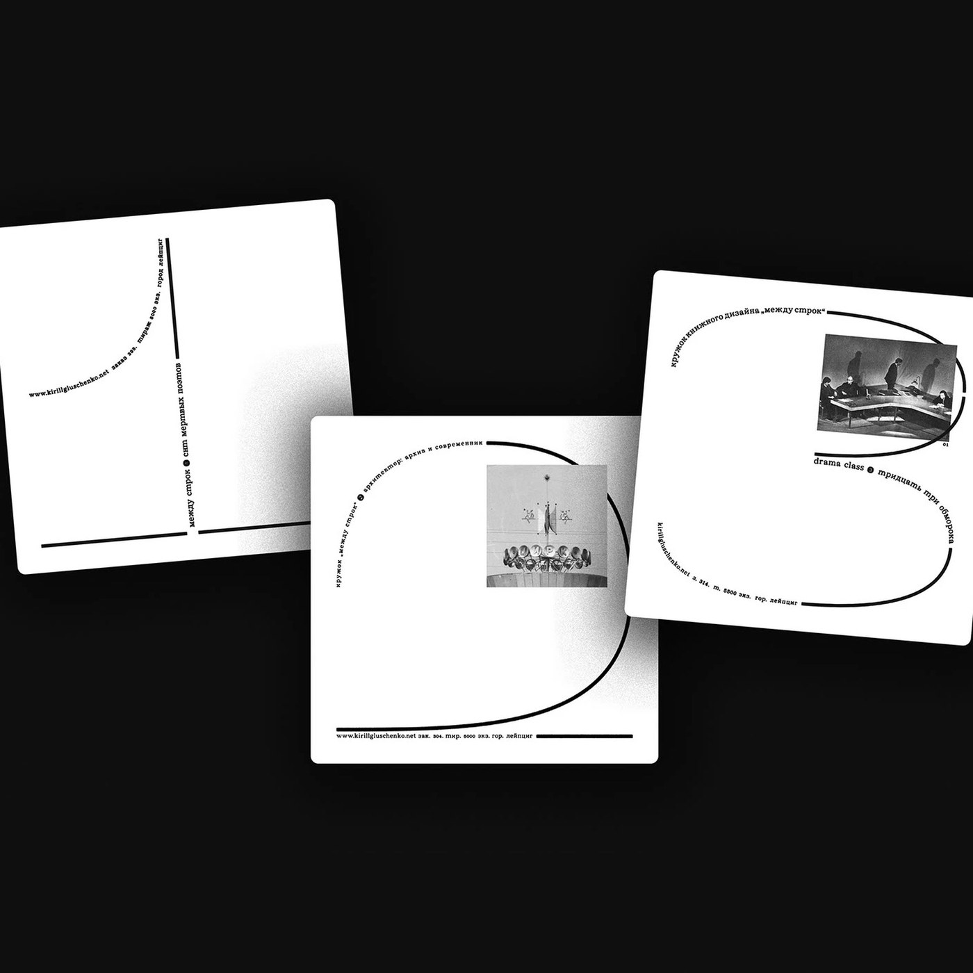
Kirill Gluschenko's Disciplined Approach to Book Design: Layout, Grids, and Typographic Rhythm
Kirill Gluschenko explores a disciplined approach to book design, treating physical formats, layout structure, and text ...
 abduzeedo.com·26d ago
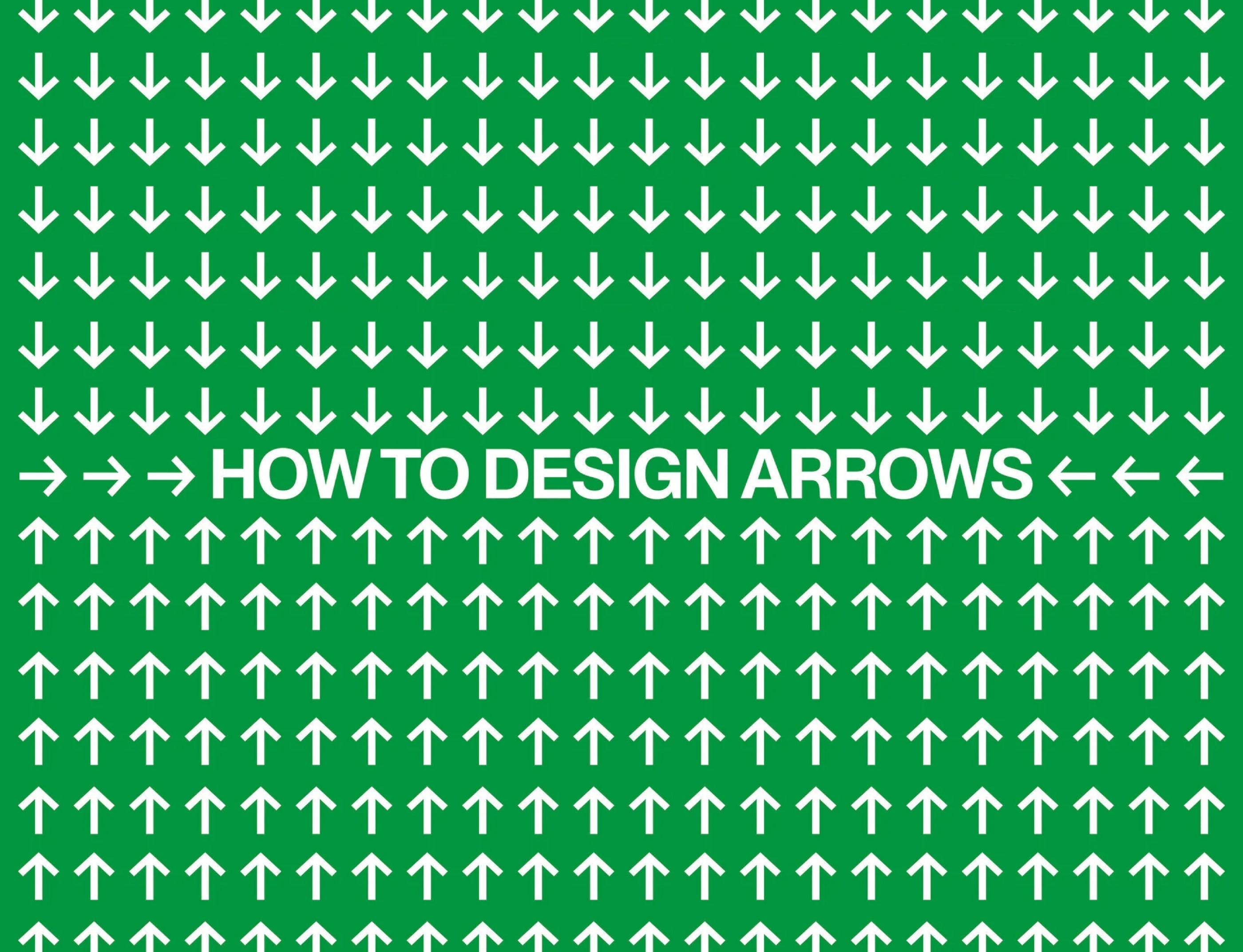
The craft of designing typographic arrows: insights from Pangram Pangram's type designers
An in-depth conversation with PP best and brightest type designers on how to nail the design of typography’s more identifiable (but easily i
 pangrampangram.com·15d ago
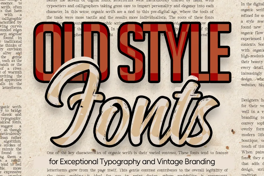
30+ Old Style Fonts for Classic Typography and Timeless Design
Download best old style fonts for classic logos, vintage posters, branding, and typography. Find timeless serif fonts and font pairing ideas
 Graphic Design Junction·8d ago
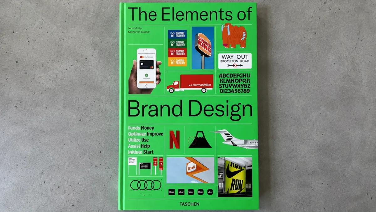
The Elements of Brand Design Review: A Comprehensive Guide to Branding's Full Terrain
A hands-on review of TASCHEN's The Elements of Brand Design by Sussek and Müller, with frameworks, a verdict, and buying guidance.
 weandthecolor.com·1d ago
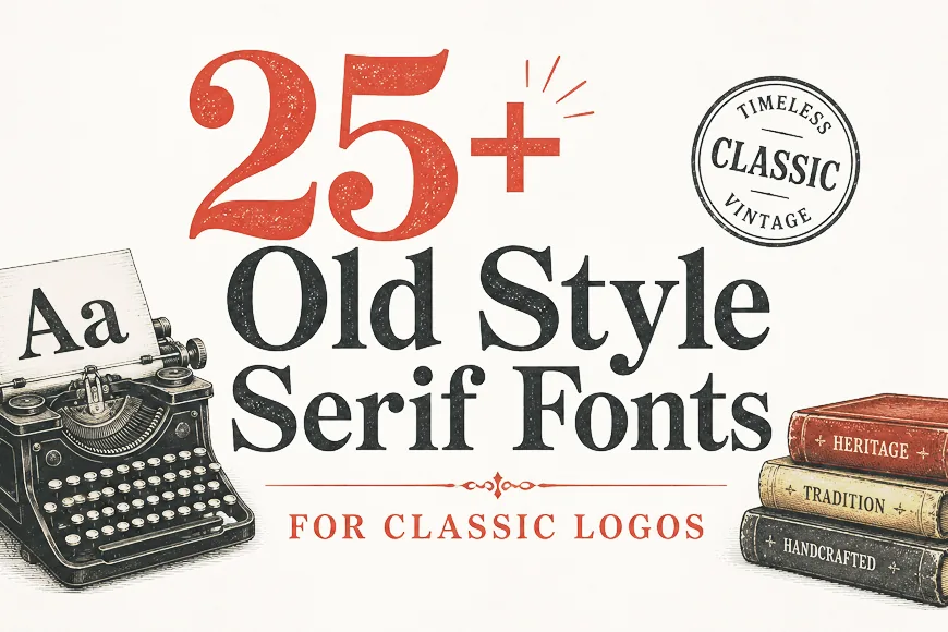
Old Style Serif Fonts for Classic Logos and Vintage Branding
Download the old style serif fonts perfect for classic logos, luxury branding, vintage packaging, and timeless typography projects.
Graphic Design Junction·4d ago
Comments
Sign in to join the conversation.
No comments yet. Be the first.