Deadpony Studio Brand Identity: A Raw, Primary-Color Design System by Anna Matevosian
By
abduzeedo
Summary
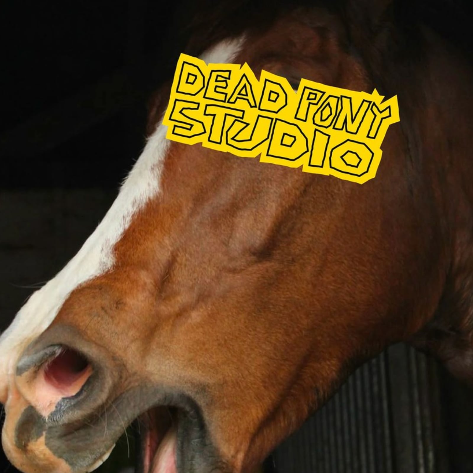
Anna Matevosian designed a brand identity for Deadpony Studio featuring a heavy grotesque wordmark in Helvetica Black, a blue-filled circle accent around the copyright symbol, six raw primary colors (white, black, yellow, blue, red, green), and a crude horse mascot. The design system deliberately avoids pastels and neutrals beyond pure black and white, embracing a raw, street-oriented aesthetic.
Source
 Twitter / XDeadpony Studio Brand Identity: A Raw, Primary-Color Design System by Anna Matevosianabduzeedo.com
Key quotes
· 2 pulledThe wordmark 'deadpony©' sits in black Helvetica Black weight at display scale — then a single blue-filled circle breaks the lockup around the copyright symbol, the only chromatic accent in an otherwise all-black logotype.
The brand identity design system runs on six pure primaries: white, black, yellow (#F5C800), blue (#2979FF), red (#E8000D), and green (#00A651) — no pastels, no neutrals beyond pure black and white.
You might also wanna read


Divine Chocolate unveils vibrant rebrand by Wildish & Co., shifting to flavour-focused identity
Divine Chocolate, the farmer co-owned Fairtrade brand, has undergone its most significant rebrand since 1998, created by London agency Wildi
 Creative Boom·4mo ago
Hello Pet Dreams: Transform Pet Photos into Magical Character Styles
Hello Pet Dreams is a product that allows users to transform their pet's photo into 30+ magical styles including royalty, astronaut, and Pix
 Product Hunt·1y ago
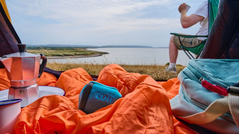
How Lark Design Studio Created a Premium Brand Identity for Portable Toilet Startup Luii
Lark Design Studio took on the challenging branding brief for portable toilet startup Luii, creating a sophisticated brand identity that def
Creative Boom·3mo ago
Pneuhaus Collaborates on Inflatable Panelling for Murderbot Series Set Design
Rhode Island design studio Pneuhaus collaborated with production designer Sue Chan to create hundreds of inflatable cushions from flexible p
 Dezeen·1y ago
Deuce Studio Launches New Brand Identity for White Rabbit Pizza Co.
London-based design agency Deuce Studio has created a new brand identity and packaging system for White Rabbit Pizza Co., a fast-growing glu
Creative Boom·9mo ago
Dezeen Showroom Summer 2025 Newsletter Features Poodle-Inspired Stainless Steel Chair
The article announces the summer 2025 edition of Dezeen Showroom's New Releases newsletter, featuring a stainless steel chair designed by Po
Dezeen·10mo ago
Comments
Sign in to join the conversation.
No comments yet. Be the first.