
























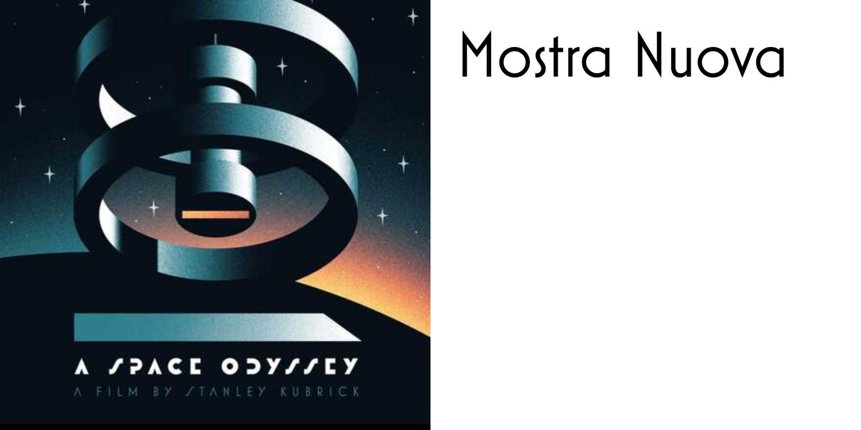
Review: Thomas Gilbert's stylized fan poster for 2001: A Space Odyssey
By
Mark Simonson
Summary
A brief review and appreciation of Thomas Gilbert's fan poster for the film 2001: A Space Odyssey, focusing on its stylized design, the use of the Mostra Nuova typeface (based on 1930s Italian Art Deco lettering), and the clever visual pun of using the movie's space station to represent the double-zero in "2001."
Source
 Fonts In UseReview: Thomas Gilbert's stylized fan poster for 2001: A Space Odysseyfontsinuse.com
Key quotes
· 3 pulledThomas Gilbert's fan poster for 2001: A Space Odyssey is a highly stylized, refreshing take on one of the most revered science fiction movies of all time.
The choice of Mostra Nuova, based on Italian Art Deco lettering of the 1930s, is an unexpectedly natural fit.
The use of the movie's space station as a visual pun to represent the double-zero is genius.
You might also wanna read

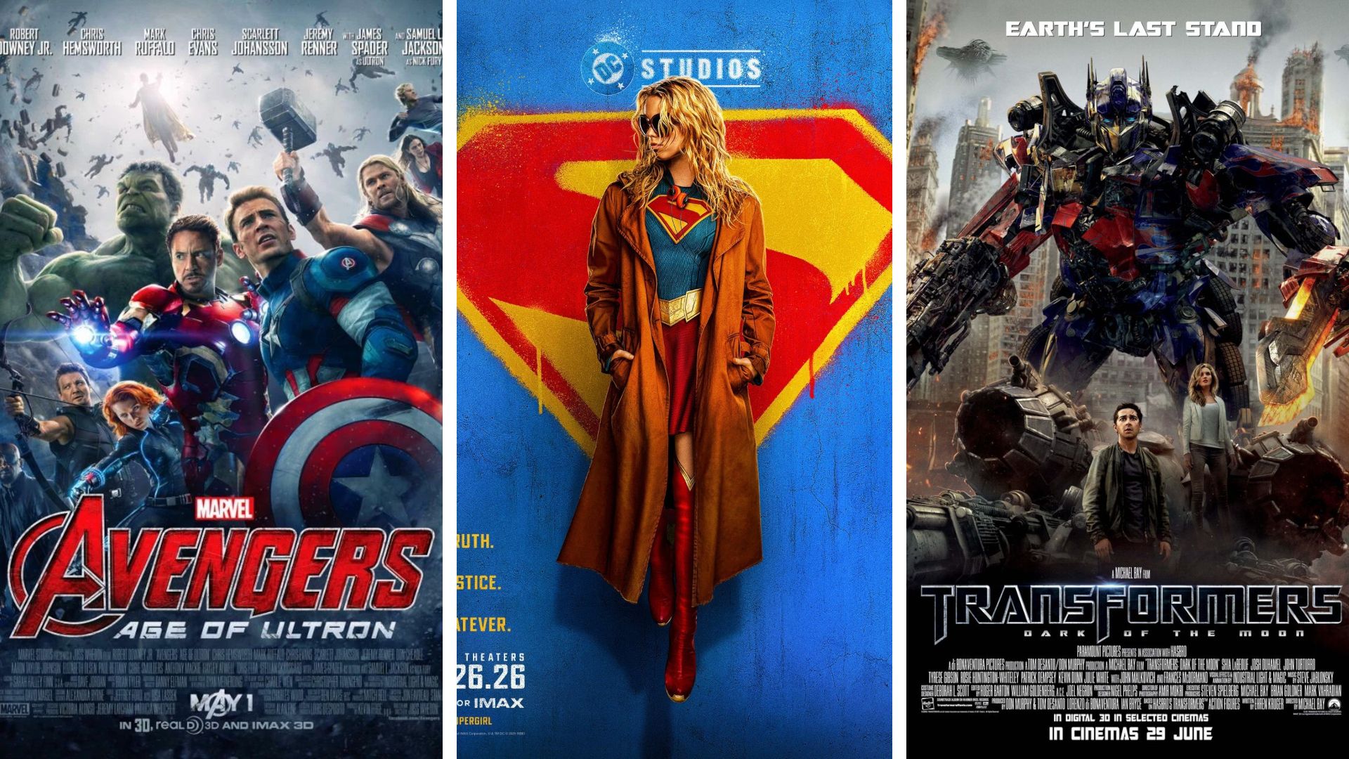
Why modern sci-fi movie posters have become generic — and how Supergirl bucks the trend
This article critiques the decline of modern sci-fi movie poster design, arguing that contemporary posters rely on boring, generic montages
 space.com·11d ago
Why modern sci-fi movie posters have become generic — and how Supergirl bucks the trend
This article critiques the decline of modern sci-fi movie poster design, arguing that contemporary posters rely on boring, generic montages
space.com·11d ago
The Enduring Appeal of Bitmap Fonts: How Constraint-Based Design Shapes Digital Aesthetics
The article explores the enduring appeal and significance of bitmap fonts in computing, arguing that they represent a design philosophy born
 korigamik.dev·2mo ago
The Letter S, by Donald Knuth [pdf]
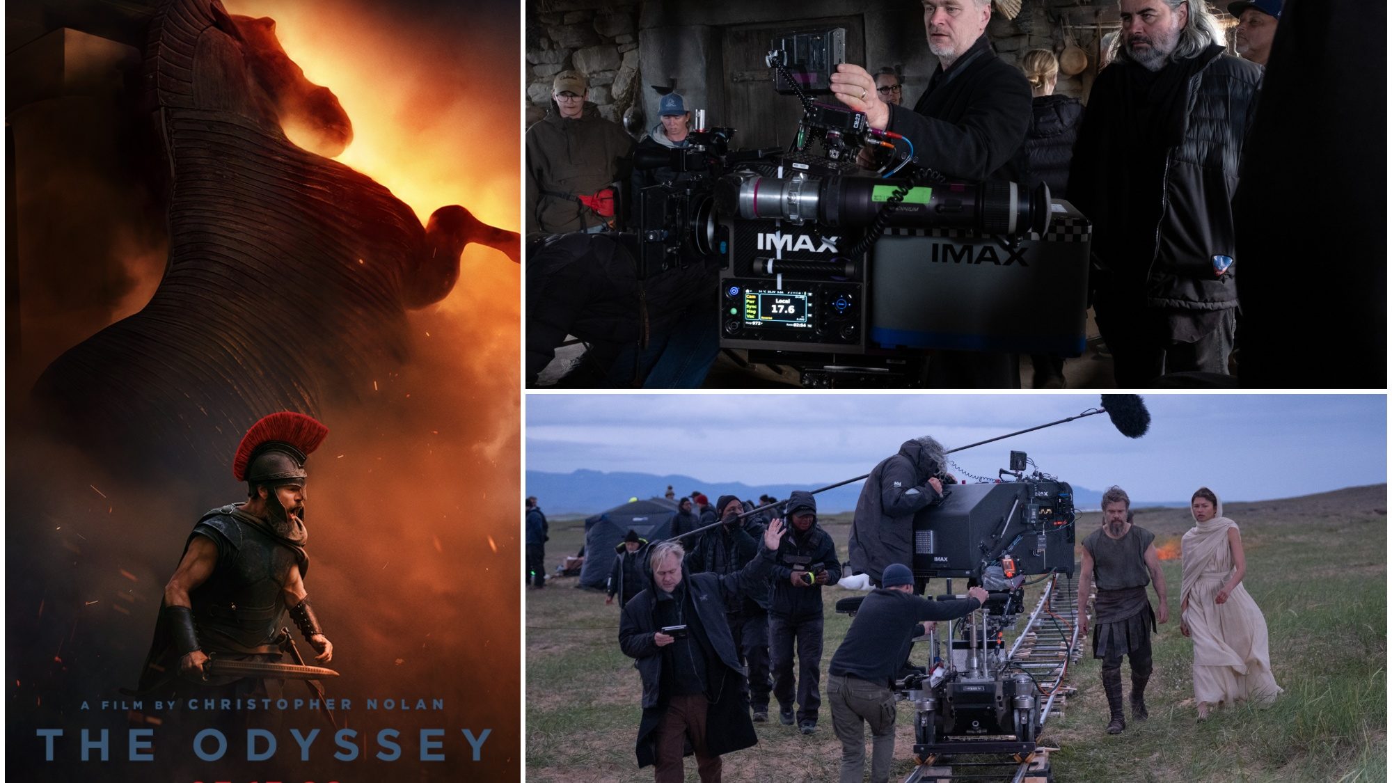
The Odyssey Large Format Tickets Go On Sale Tomorrow; New Poster Released
Tickets for large screen format screenings (70MM and IMAX) of Christopher Nolan's adaptation of The Odyssey go on sale tomorrow. A new poste

Vintage Space Garden Surrealism Sci‑Fi Poster
 wearsco.com·21d ago
Comments
Sign in to join the conversation.
No comments yet. Be the first.