Infographics – FlowingData
Strength in Numbers
FlowingData
Feed
Rdf
Tutorials – FlowingData
Comments on: About
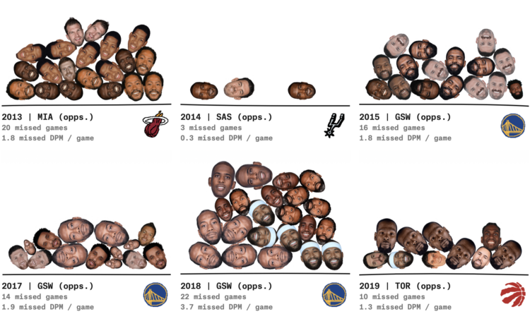
A brief article discussing a statistical analysis by Russell Samora for The Pudding, which calculated which NBA championship teams over the past 25 seasons benefited most from opponent injuries. The piece uses a "pile-o-heads" visualization method to show missed games due to inju
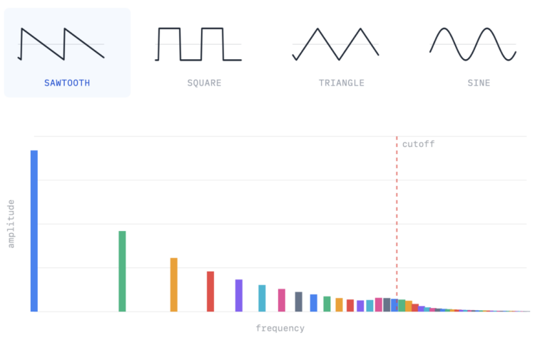
A brief article from PerThirtySix by Shri Khalpada that uses interactive graphics and math (Fourier transforms) to visually explain how synthesizers work by breaking down musical sounds. The author notes this would have been useful during their college Fourier transform course.
This article from The Pudding, by Alvin Chang, examines how the pandemic affected romantic relationships, using the Stanford University "How Couples Meet and Stay Together" dataset. It reports that divorce and separation were more common than usual during the pandemic, and allows
 Infographics1d ago
 Infographics4d ago
 Infographics12d ago
 Infographics14d ago
 Infographics15d ago
 Infographics20d ago