All Topics
All Topics
Technology
Technology
AI
AI
Business
Business
Entertainment
Entertainment
News
News
Programming
Programming
Science
Science
Design
Design
Environment
Environment
Finance
Finance
Crypto
Crypto
Politics
Politics
Sports
Sports
Education
Education
Gaming
Gaming
Art
Art
Music
Music
Health
Health
Security
Security
Books
Books
Food
Food
Travel
Travel
Personal
Personal
Bluesky
Twitter

designWednesday, September 9, 2026

Fewer details, clearer design

Today's design conversation is about subtraction. A thoughtful essay argues for limiting the number of details in a project, while a case study on Cursor's 600-plus icons shows how even a large set can feel cohesive through craft. The thread is about making hard choices: what to keep, what to cut, and how to make the remaining elements count.

Sources
+4

The case for less

One piece argues for scarcity as a design principle; another shows the craft that goes into a very large set of icons.

#01design.lightspark.comSep 9
0
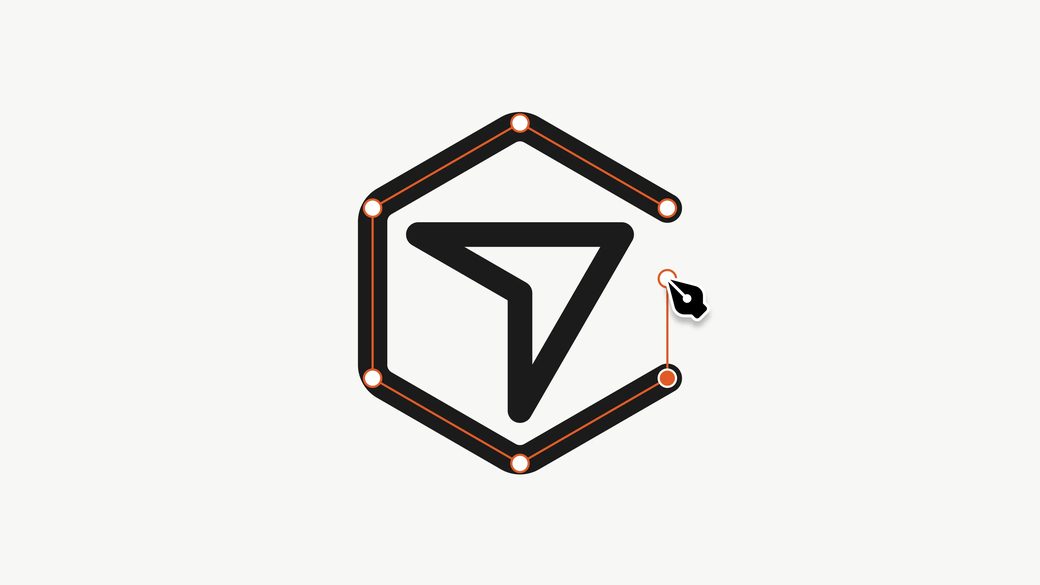
Limit the number of details

A sharp reminder that attention is finite. The piece argues that limiting features, controls, and visual elements lets teams spend more care on what remains. It's a useful counterweight to feature creep, especially in product design.

11 min readRead original
Identity and narrative

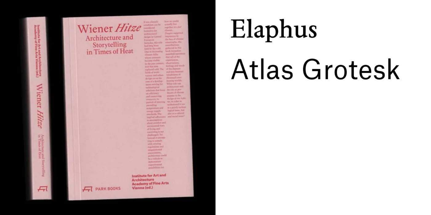
Two projects use typography and visual identity to tell stories about heritage and climate change.

#03fontsinuse.comSep 9
0
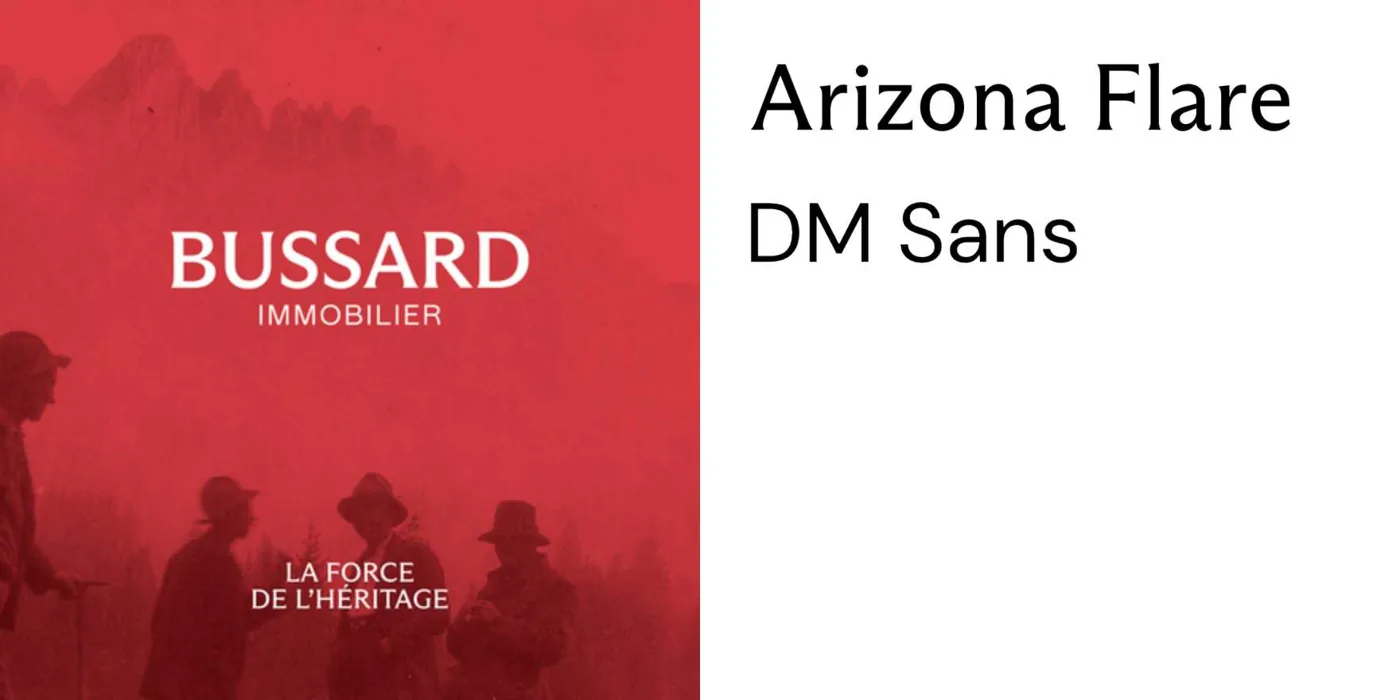
Bussard Immobilier

Paradoxe Studio's rebrand of a Swiss real estate agency leans into heritage with a tagline about legacy and typography from Dinamo. A clean, understated identity for a family-run business.

Also today16

More roundups that day