White Bear Agency Redesigns Bold Bean Brand Identity and Packaging
The London agency has reworked the cult bean brand's packaging and identity with a
Read the full articleYou might also wanna read

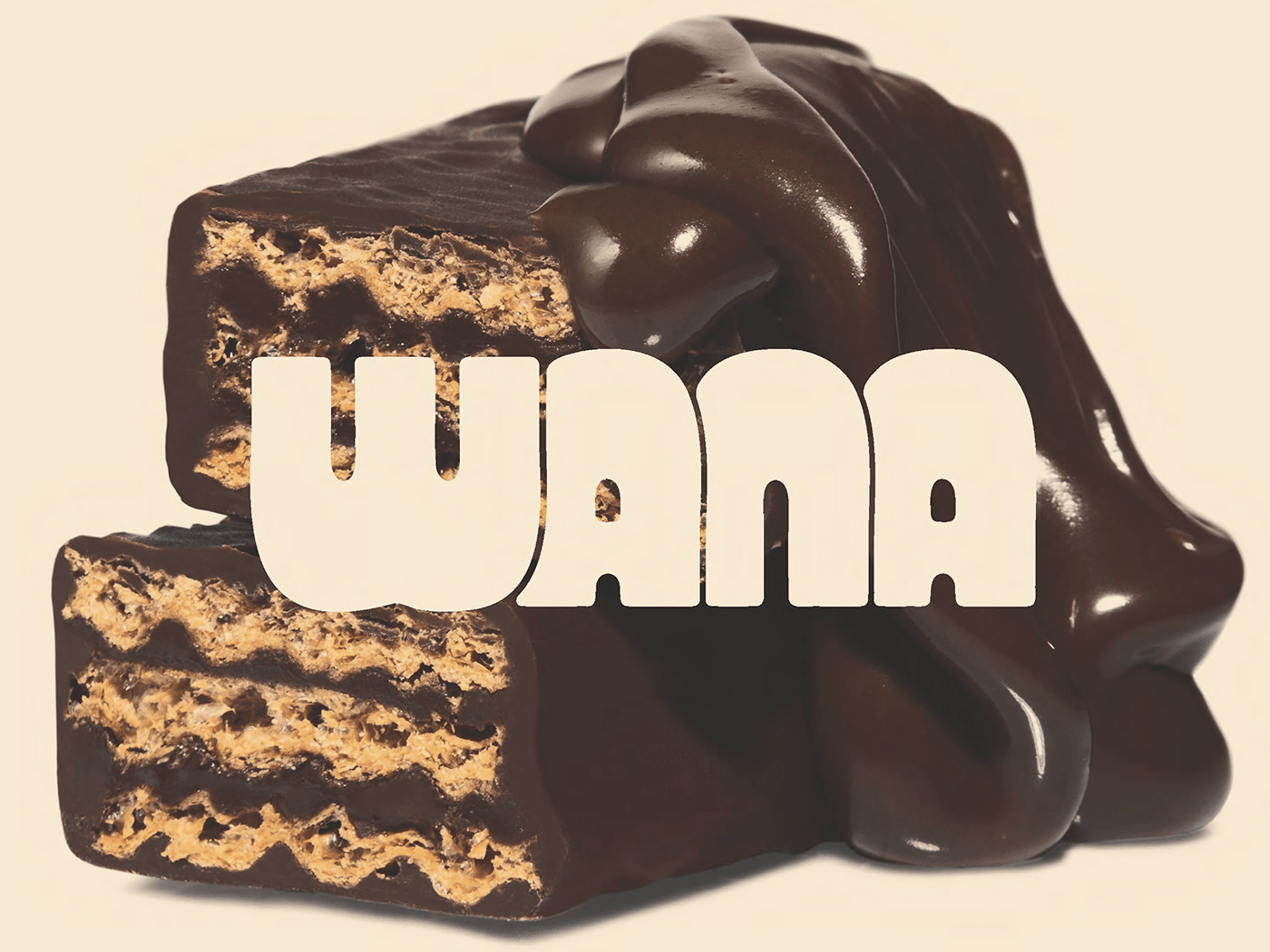
Ulysses Design Co creates bold cartoon-style branding for Wana confectionary packaging
Ulysses Design Co develops a playful branding system for Wana sweet packaging, using bold drawings, high-contrast boxes,...
 Abduzeedo·21d ago
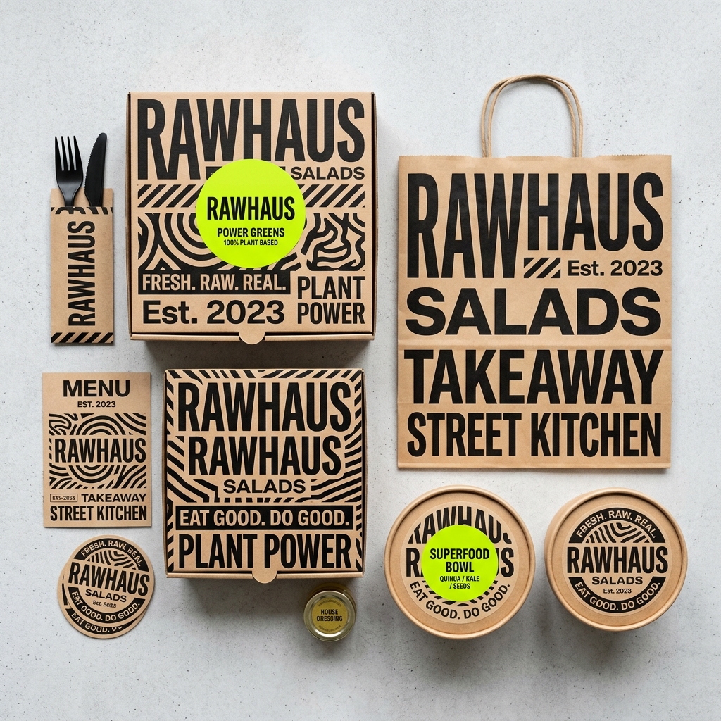
Rawhaus Salad Branding: Street Art and Bold Typography Redefine Healthy Food Packaging
Food branding system for Rawhaus redefines healthy salad packaging with energetic street art and bold condensed typograp...
Abduzeedo·13d agoJoia Brand Identity: Design by Base Design (2025)
Joia brand identity. Including logos, fonts, art direction and more.
 brandarchive.xyz·17d ago
Calbee switches to black-and-white packaging for 14 products due to Iran war supply disruptions
Japanese snack food brand Calbee has announced that it is changing the design of its packaging for some products because of "supply instabil
 Dezeen·2mo ago
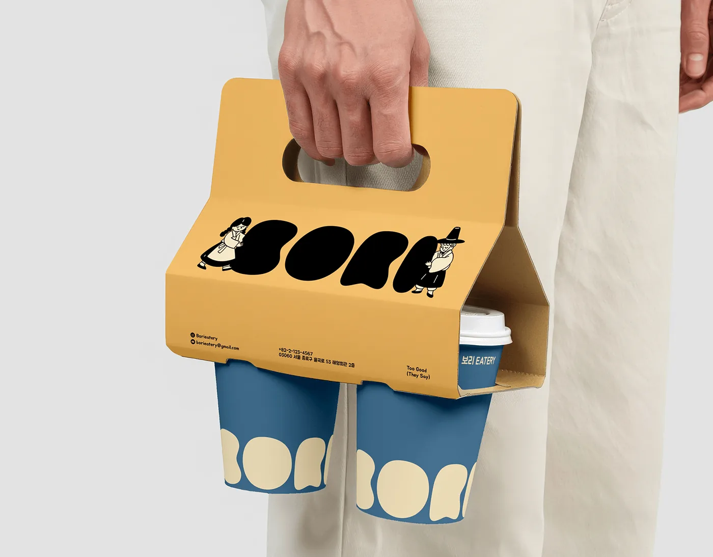
Studio Moara Creates Earthy, Organic Brand Identity for Bori Cafe
Bori Cafe introduces a warm identity with strategic branding, combining earth tones and clean typography designed by Stu...
Abduzeedo·9d agoAn ICONIC Starbucks Cup Is Coming Back SOON With a Twist
The Starbucks Bearista cups are back, and this time, they’re pink! The post An ICONIC Starbucks Cup Is Coming Back SOON With a Twist appeare
Comments
Sign in to join the conversation.
No comments yet. Be the first.