WeWantMore Studio's Design Strategy Revitalizes Aperol Spritz Brand Identity
By
Tom May
A good honest bake. Not flashy, but you'll finish the whole bagel.
Summary
The article discusses how design studio WeWantMore helped Aperol Spritz address the challenge of brand ubiquity and invisibility after becoming America's most popular drink. Rather than using traditional marketing tactics, the studio created a subtle, sophisticated design approach using translucent orange panels and Mediterranean wave motifs to make the brand feel fresh and relevant again. The solution focused on creating an emotional connection through design that evokes the drink's Italian heritage and summer experience.
Key quotes
· 4 pulledAfter Forbes crowned the Aperol Spritz America's most popular drink in 2024, the Italian aperitif faced an ironic crisis: ubiquity had made it invisible.
Rather than screaming louder or plastering logos everywhere, they did something more interesting
When your bright orange bottle appears everywhere from Coachella to corner shops, how do you stop people from scrolling past?
Antwerp and London-based studio WeWantMore had an answer, though not the obvious one.
You might also wanna read


Studio Blackburn's Brand Refresh for So Energy: Visualizing the Invisible
Studio Blackburn's brand refresh for So Energy tackles the unique challenge of branding an invisible product - energy. The design agency use
 Creative Boom·4mo ago
Designer Critiques Safe Branding Trends and Advocates for Distinctive Identity Design in 2026
The article critiques the current state of branding and identity design, arguing that 2025 saw a trend toward safe, forgettable, and overly
Creative Boom·4mo ago
Why 2025's most significant brand rebrands went unnoticed by social media
The article argues that the most significant brand rebrands of 2025 were not the ones that went viral on social media (like Cracker Barrel's
Creative Boom·5mo ago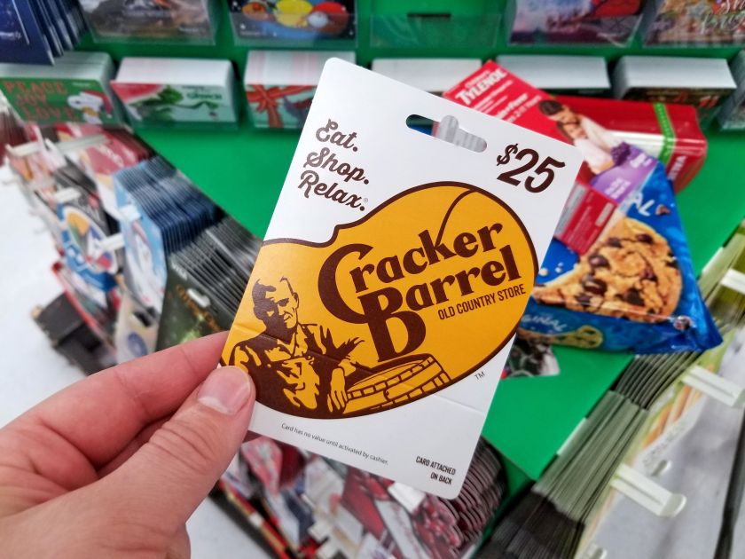
Cracker Barrel's rebrand cost $100M-$200M in stock value — a lesson in brand equity
Cracker Barrel's rebranding effort caused a $100M-$200M drop in its stock value immediately after the new brand was revealed. While widely s
Creative Boom·6mo ago
The Myth of Anti-Branding: How 'Authentic' Marketing Is Still Marketing
This article critiques the concept of 'anti-branding' as a marketing trend, arguing that what appears to be raw and authentic is actually ca
Creative Boom·7mo ago
Brand Awareness vs. Brand Identity: Understanding the Key Differences in Branding
This article explores the distinction between brand awareness and brand identity in marketing. Brand awareness refers to how familiar consum
 selfmoneycare.com·20h ago