Studio Blackburn's Brand Refresh for So Energy: Visualizing the Invisible
By
Tom May
Solid neighbourhood-bakery energy. Trustworthy and warm.
Summary
Studio Blackburn's brand refresh for So Energy tackles the unique challenge of branding an invisible product - energy. The design agency uses color, motion, and emotional messaging to create a visual identity that positions the renewable energy supplier as a confident challenger in a market dominated by established players. The refresh builds on their original 2021 brand identity, focusing on making the abstract concept of energy tangible through design elements that convey reliability, innovation, and customer-centric values.
Key quotes
· 4 pulledEnergy is fundamentally abstract, invisible, and taken for granted until something goes wrong, which makes branding an energy company one of the trickier challenges in commercial design.
The goal was straightforward: position So Energy as a confident challenger in a market long dominated by established players.
The London design agency uses colour, motion and emotional messaging to reposition a renewable energy supplier as a confident challenger.
Try to visualise energy. Not solar panels or wind turbines: actual energy. The thing that powers your kettle, charges your phone, and keeps your lights on. You can't, really.
You might also wanna read


WeWantMore Studio's Design Strategy Revitalizes Aperol Spritz Brand Identity
The article discusses how design studio WeWantMore helped Aperol Spritz address the challenge of brand ubiquity and invisibility after becom
 Creative Boom·4mo ago
Designer Critiques Safe Branding Trends and Advocates for Distinctive Identity Design in 2026
The article critiques the current state of branding and identity design, arguing that 2025 saw a trend toward safe, forgettable, and overly
Creative Boom·4mo ago
Why 2025's most significant brand rebrands went unnoticed by social media
The article argues that the most significant brand rebrands of 2025 were not the ones that went viral on social media (like Cracker Barrel's
Creative Boom·5mo ago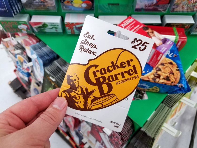
Cracker Barrel's rebrand cost $100M-$200M in stock value — a lesson in brand equity
Cracker Barrel's rebranding effort caused a $100M-$200M drop in its stock value immediately after the new brand was revealed. While widely s
Creative Boom·6mo ago
The Myth of Anti-Branding: How 'Authentic' Marketing Is Still Marketing
This article critiques the concept of 'anti-branding' as a marketing trend, arguing that what appears to be raw and authentic is actually ca
Creative Boom·7mo ago
Brand Awareness vs. Brand Identity: Understanding the Key Differences in Branding
This article explores the distinction between brand awareness and brand identity in marketing. Brand awareness refers to how familiar consum
 selfmoneycare.com·15h ago