
























Westhighland White vs Alabaster: The Comparison That Actually Helps You Decide
Beril Yilmaz2d ago
From the article
On paper, Westhighland White looks like the brighter, more neutral option. Its LRV sits four points above Alabaster's. On the wall, that number tells you almost nothing useful, because Westhighland White's undertone is stronger and more visible than Alabaster's, and a higher LRV does not mean a quieter colour. I have specified both across UK residential projects, and clients are consistently surprised that the 'brighter' swatch is the one that reads warmer in the room. Here is exactly how I...
Continue reading on bydesignandviz.comYou might also wanna read

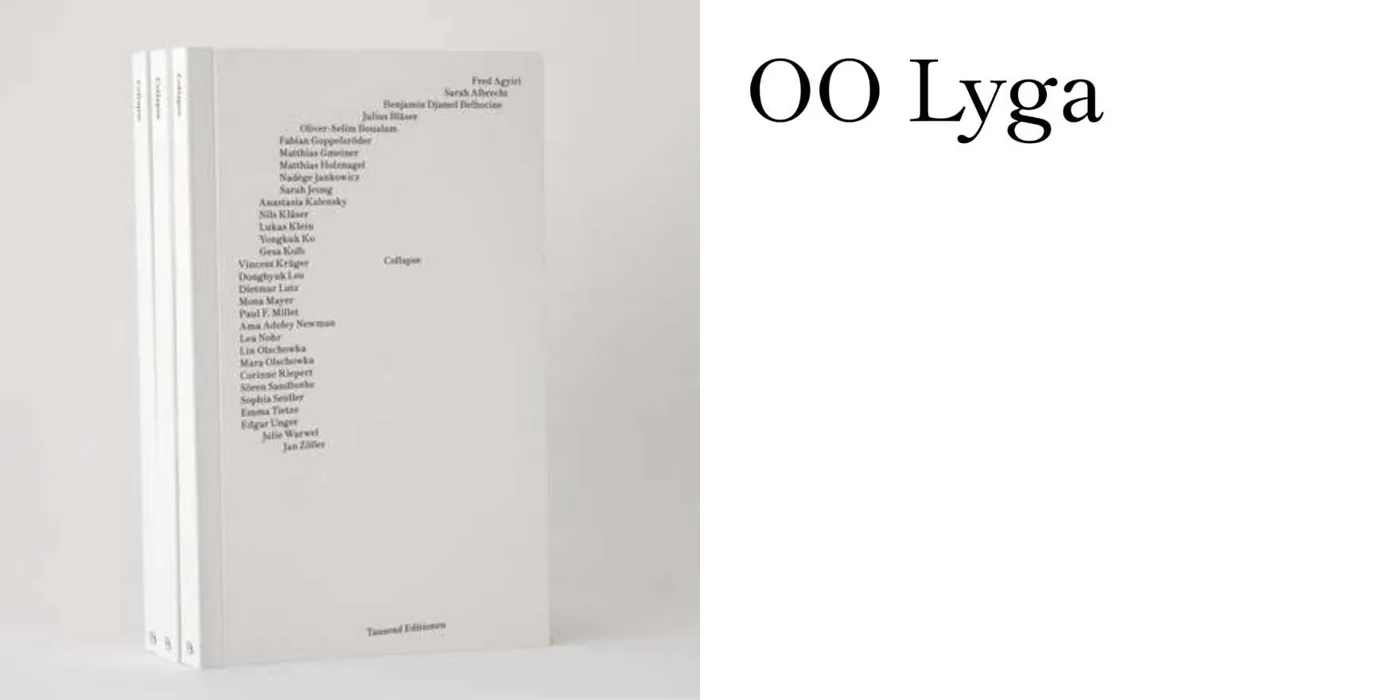
Collapse: A Multidisciplinary Book on Falling, Failing, and Disruption
A book designed by Sören Sandbothe for artist Mara Olschowka, featuring 31 contributions from artists, designers, and cultural practitioners
 Fonts In Use·32m ago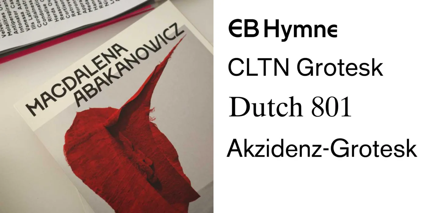
Book design for the Magdalena Abakanowicz exhibition catalog at musée Bourdelle
A brief description of the book design for the exhibition catalog "Magdalena Abakanowicz. La Trame de l'existence / The Fabric of Existence"
Fonts In Use·33m ago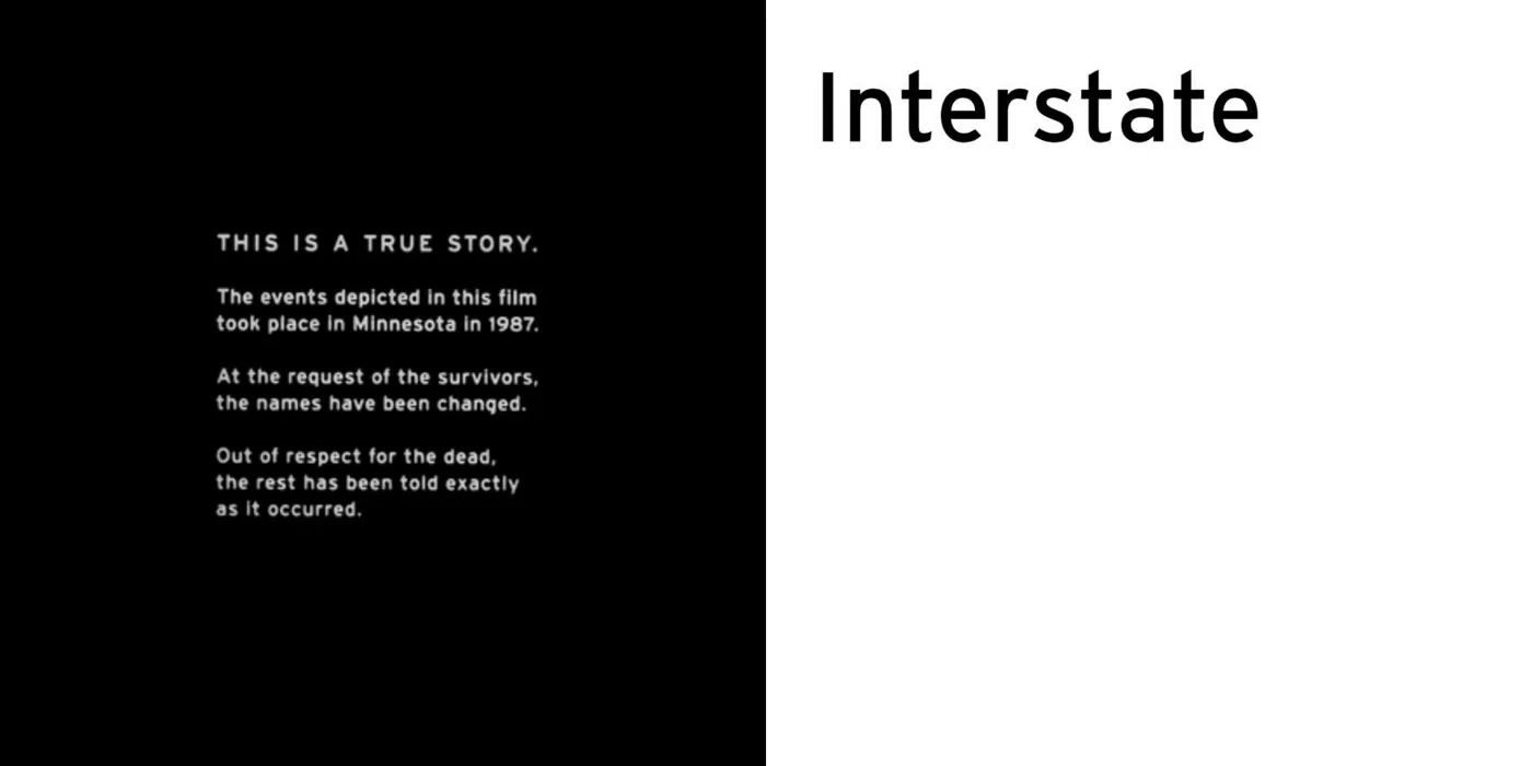
The design and legacy of Fargo's opening credits
A brief description of the opening credits design for the 1996 film Fargo, noting the use of Interstate typeface by Frere-Jones Type and des
Fonts In Use·33m ago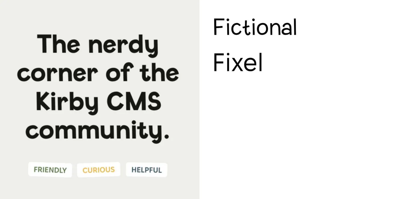
Moinframe: A Kirby CMS Community Project by Justus Kraft
Moinframe is a community, blog, and YouTube channel dedicated to Kirby CMS, created by designer Justus Kraft of Gute Kombi. The project uses
Fonts In Use·33m ago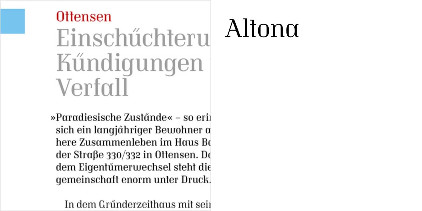
Mietraum² December 2025 issue features Altona typeface inspired by interwar social housing modernism
A brief article about the typography choice for the December 2025 issue of Mietraum², a magazine for tenants' rights organization members in
Fonts In Use·34m ago
a modular cabin stands between river, forest, and mountains in argentine patagonia
designboom·1h ago
Comments
Sign in to join the conversation.
No comments yet. Be the first.