All Topics
All Topics
Technology
Technology
Design
Design
Programming
Programming
Science
Science
News
News
Gaming
Gaming
Entertainment
Entertainment
Business
Business
Finance
Finance
Sports
Sports
Health
Health
Food
Food
Travel
Travel
Art
Art
Music
Music
Books
Books
Education
Education
Politics
Politics
Personal
Personal
No algorithm. No AI slop. No ads. Just RSS. Pro-human. Indie writers. Real journalism. Open web. Chronological. Hand toasted.

Volvo Develops Custom Volvo Centum Typeface for Enhanced Safety and Legibility in Car Interfaces

By

ohjeez

5mo ago· 7 min readenNews

FeedBagel synthesis

· 2 sources

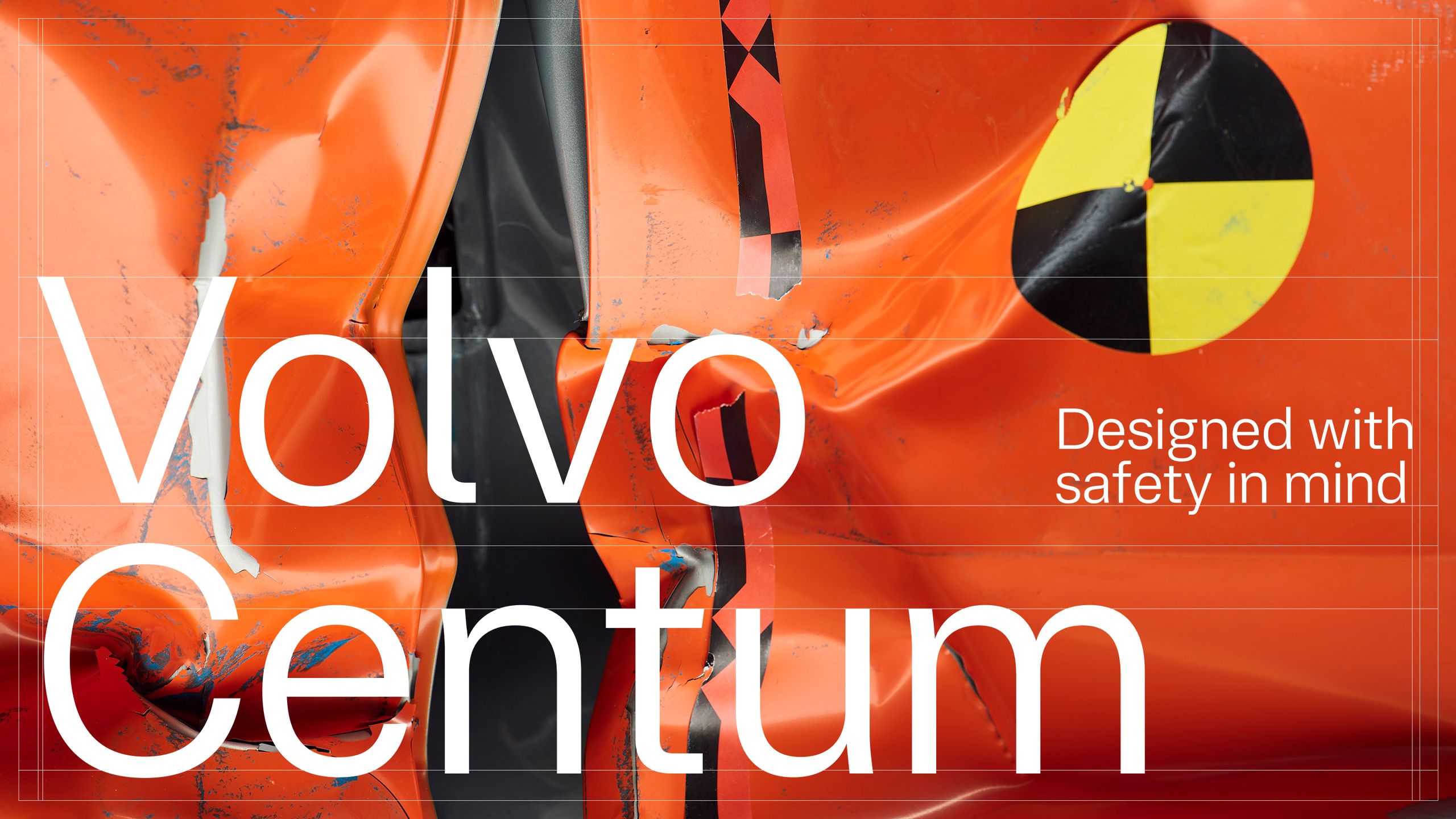
Volvo has developed a custom typeface called Volvo Centum in collaboration with London-based type foundry Dalton Maag, designed specifically for use in its cars' digital screens to enhance driver safety. Hacker News reported the typeface features increased character spacing, optimized stroke widths, and clear differentiation between similar characters to reduce driver distraction. Dezeen noted the design focuses on reducing cognitive load through distinct character shapes and high contrast, allowing drivers to quickly read information while maintaining focus on the road. The typeface was created in anticipation of Volvo's 100th anniversary in 2027, according to Hacker News.

Summary

Volvo has developed a new custom typeface called Volvo Centum in collaboration with London-based type foundry Dalton Maag. The typeface is designed to enhance safety through improved legibility in car interfaces, combining Volvo's modernist design heritage with its safety-first philosophy. Created in anticipation of Volvo's 100th anniversary in 2027, the typeface features specific design elements like increased character spacing, optimized stroke widths, and clear differentiation between similar characters to reduce driver distraction and improve readability in various lighting conditions.

Key quotes

· 5 pulled
The arrival of a new brand typeface, Volvo Centum, manages to combine the company's obvious love of modernist design with its obsessive pursuit of safety.
Volvo Centum is designed to be highly legible in the challenging environment of a car interior, where lighting conditions can change rapidly and drivers need to process information quickly.
The typeface features increased character spacing, optimized stroke widths, and clear differentiation between similar characters like 'I', 'l', and '1' to reduce driver distraction.
This isn't just about branding—it's about creating a typeface that can literally save lives by making information easier to read at a glance.
The development of Volvo Centum represents how design thinking can be applied to enhance safety in ways that might not be immediately obvious to consumers.
Snippet from the RSS feed
Dalton Maag designs a new sans serif typeface for the Swedish carmaker, Volvo Centum, building on the brand’s strong safety ethos

You might also wanna read