
























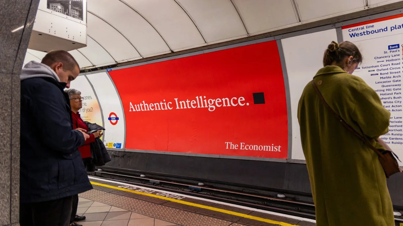
Cocogun creates new OOH campaign continuing The Economist's classic 'white out of red' tradition
By
Eliza Williams
Summary
The article reports on Sydney-based agency Cocogun creating a new out-of-home advertising campaign for The Economist. The campaign continues the brand's iconic 'white out of red' poster series that originated in the late 1980s with Abbott Mead Vickers. The new posters aim to highlight The Economist's "commitment to truth and reason in an era of complexity and exponential change," adapting the classic witty style to reflect contemporary times.
Source
 Creative ReviewCocogun creates new OOH campaign continuing The Economist's classic 'white out of red' traditioncreativereview.co.uk
Key quotes
· 4 pulledThe new posters continue the Economist's classic 'white out of red' campaign
The campaign aims to highlight the brand's 'commitment to truth and reason in an era of complexity and exponential change'
Great minds like a think
Would you like to sit next to you at dinner?
You might also wanna read

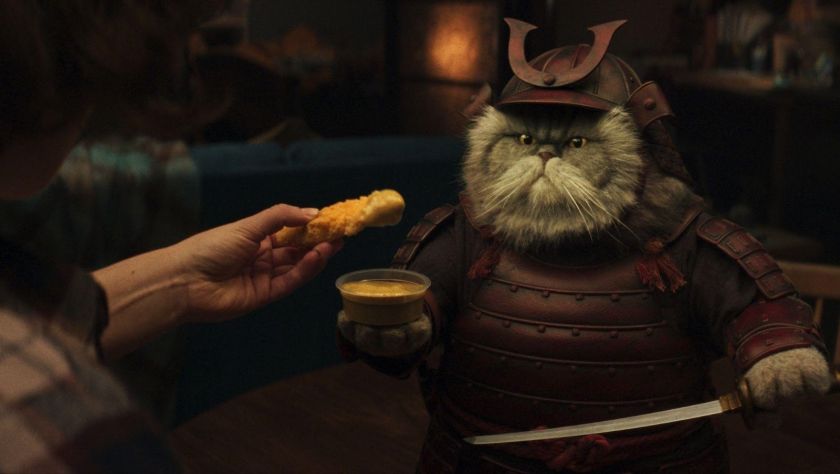
The rise of absurdist humour in advertising: creative strategy or strategic crutch?
The article examines the growing trend of absurdist humour in mainstream advertising, using Domino's new campaign as a case study. It traces
 Creative Boom·4mo ago
White Bear Agency Redesigns Bold Bean Brand Identity and Packaging
London design agency White Bear has refreshed the brand identity and packaging for Bold Bean, a premium bean brand that launched in 2021. Th
Creative Boom·9mo ago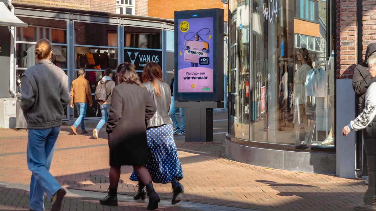
Broadsign and Draft Digital execute first fully autonomous AI-powered OOH advertising campaign
Broadsign and Draft Digital have successfully executed what they claim is the first fully agentic AI-powered out-of-home (OOH) advertising c
 ppc.land·1mo ago
Study: Creative Quality Drives Out-of-Home Ad Campaign Performance
A new analysis from Clear Channel Outdoor and Super Optimal, drawing on 27 RADARProof studies conducted with Kantar, finds that creative qua
 ethicalmarketingnews.com·1mo ago
The Resurgence of Illustration in Modern Brand Advertising
This article explores the resurgence of illustration in advertising and branding, examining why brands are returning to hand-drawn artwork a
Creative Boom·9mo ago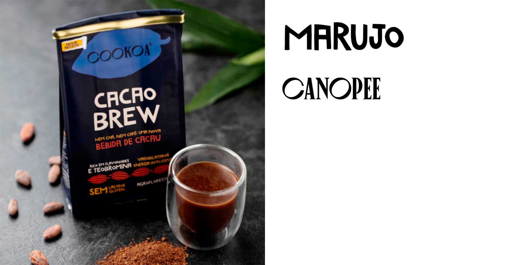
Cookoa packaging design by MOVE features hand-drawn Marujo typeface
A short article about the packaging design for Cookoa, a Brazilian chocolate brand, created by design agency MOVE. The identity features the
 Fonts In Use·1d ago
Comments
Sign in to join the conversation.
No comments yet. Be the first.