#ShowYourStripes
By
Manish Karkera & Guy Griffiths (Institute for Environmental Analytics)
3d agoNews
Source
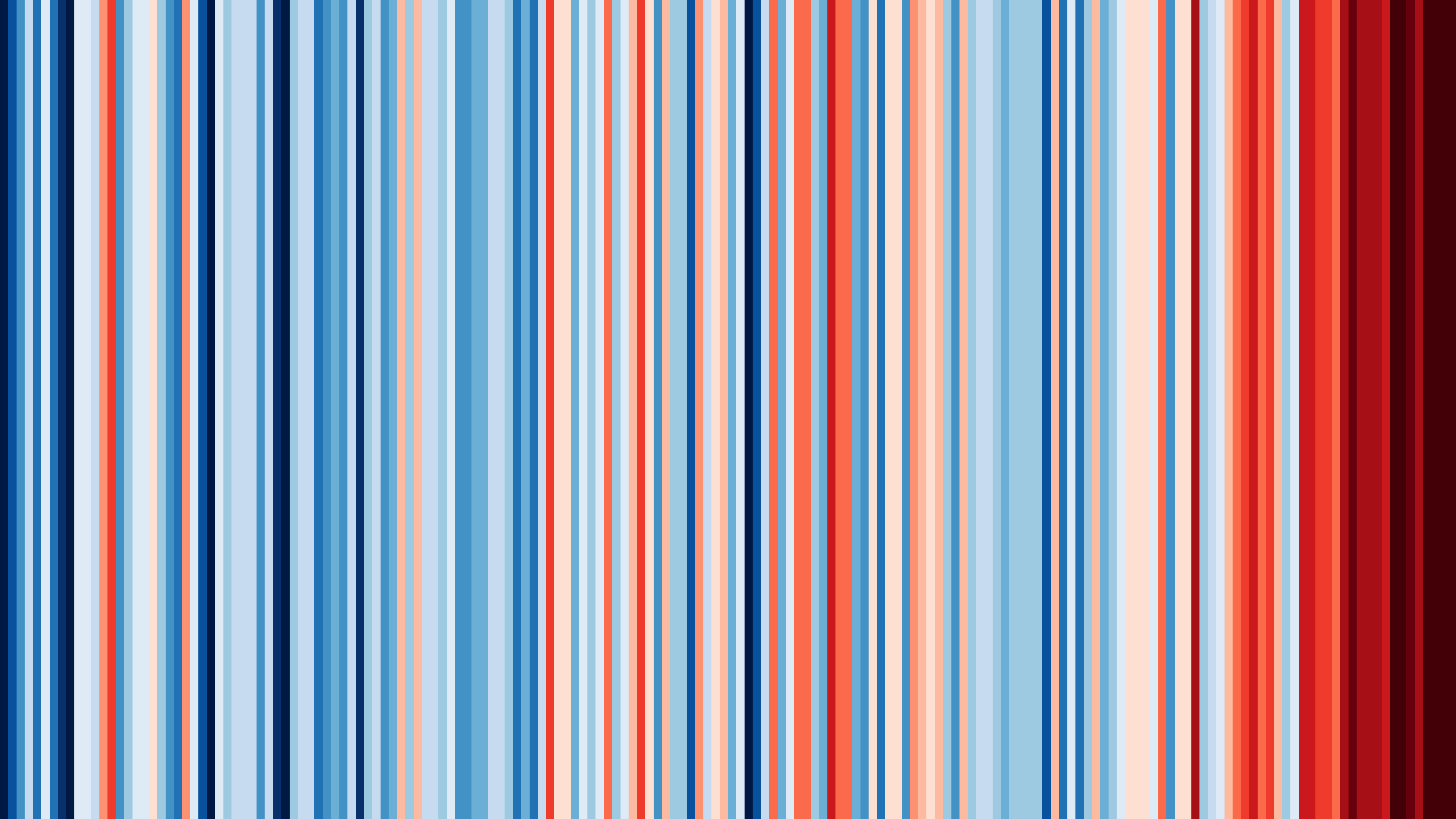
 bsky#ShowYourStripesshowyourstripes.info
Visualising how the climate has changed for every country across the globe
You might also wanna read

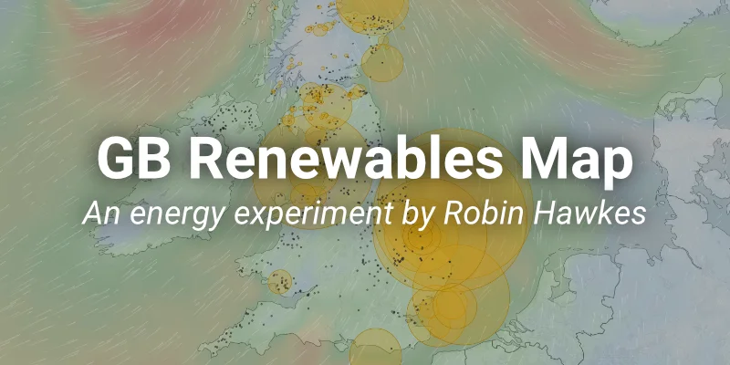
Interactive Map Shows Real-Time Renewable Energy Generation in Great Britain
The article describes an interactive live map created by Robin Hawkes that visualizes real-time renewable energy generation across Great Bri
 renewables-map.robinhawkes.com·4mo ago
metiq - Global Intelligence
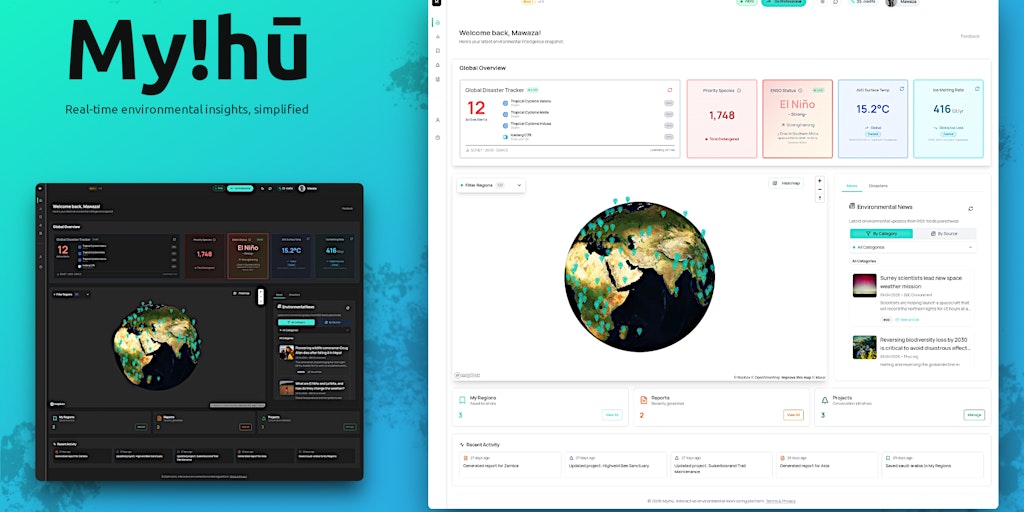
My!hū: Real-Time Global Platform for Climate and Disaster Data Visualization
My!hū is a real-time global platform that consolidates fragmented climate and disaster data into a unified, map-based interface. It transfor
 Product Hunt·2mo ago
OnTheMap: Visual Global Platform for Tracking Founders and Startup Ecosystems
OnTheMap is a visual platform that maps founders, builders, and visionaries globally on an interactive globe. It uses Stripe-powered recurri
Product Hunt·2mo ago
How media disruption undermines climate science communication and justice
The article examines how digital disruption has transformed the media landscape over the past two decades, leading to declining trust in new
 iwmi.org·6d ago
I changed my job application strategy and was instantly rewarded for it.
Prototypr·11mo ago
Comments
Sign in to join the conversation.
No comments yet. Be the first.