ShowYourStripes: Climate Change Visualized for Every Country
By
Manish Karkera & Guy Griffiths (Institute for Environmental Analytics)
Summary
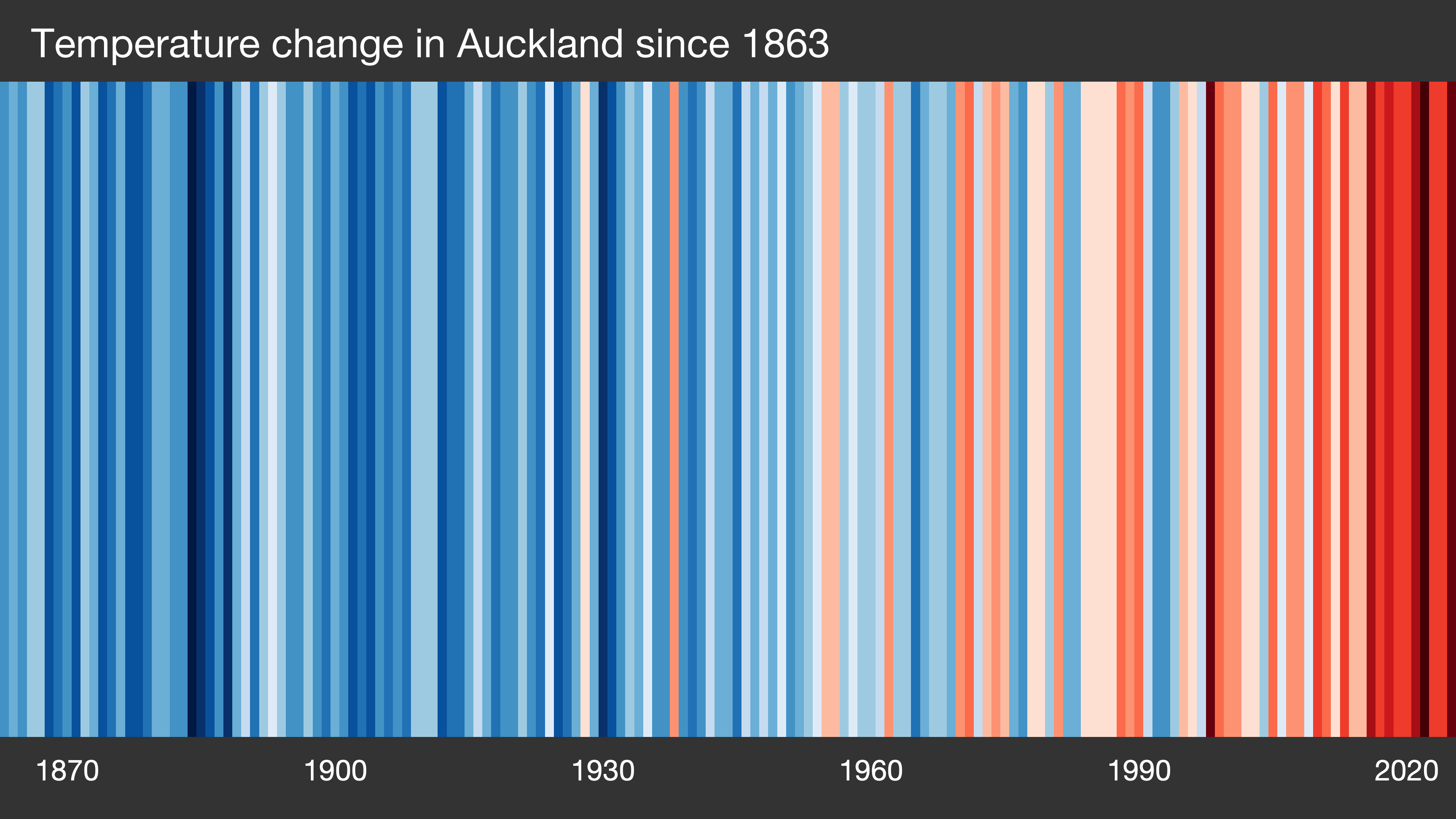
The article "#ShowYourStripes" is about a climate visualization initiative that uses striped graphics to show how the climate has changed for every country across the globe. Each country is represented by a series of colored stripes (typically blue to red) that illustrate temperature changes over time, making the abstract concept of global warming visually accessible and immediate.
Source
 bskyShowYourStripes: Climate Change Visualized for Every Countryshowyourstripes.info
Key quotes
· 3 pulledVisualising how the climate has changed for every country across the globe
Each country is represented by a series of colored stripes that illustrate temperature changes over time
The stripes make the abstract concept of global warming visually accessible and immediate
You might also wanna read

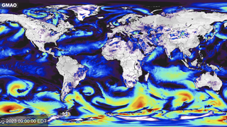
NASA Earth Now Dashboard: Real-Time Satellite Observations of Our Changing Planet
NASA's Earth Now Dashboard provides near real-time satellite observations of Earth's land, ecosystems, water, air temperature, and climate.
 svs.gsfc.nasa.gov·13h ago
41-Year Timelapse of Daily Ocean Temperature Anomalies (1985-Present)
A 41-year timelapse visualization of daily ocean temperature anomalies from January 1985 to present, highlighting specific oceanographic phe
Untitled
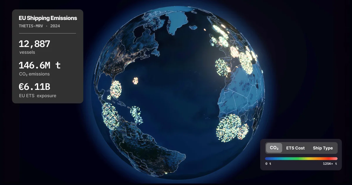
Interactive 3D Globe Visualizes EU Shipping Emissions Data (2018-2024)
An interactive 3D data visualization tool showing seven years of EU shipping emissions data (2018-2024) from the THETIS-MRV system. The visu
 seafloor.pages.dev·3mo ago
1,200 years of Kyoto cherry blossom peak bloom dates reveal climate change impact
This article presents a data visualization and analysis of the peak bloom dates of Kyoto's cherry blossoms, recorded continuously for over 1
 jivx.com·1mo ago
From Climate Catastrophism to Pragmatism: An Evolving Perspective on Climate Risk
The author reflects on his evolution from being a climate catastrophist to adopting a more pragmatic approach to climate change. He acknowle
 breakthroughjournal.org·7mo ago
Comments
Sign in to join the conversation.
No comments yet. Be the first.