
























How to Design Form Error Messages That Help Instead of Punish Users
By
Peter Makeshoff
Summary
This article examines how form error messages in user interfaces often feel punitive rather than helpful. It argues that common practices — like placing errors at the top of the page away from the relevant field, using vague language, and clearing user input — create frustration and shame. The piece advocates for inline, specific, and constructive error messages that guide users toward resolution, treating mistakes as opportunities for better design rather than failures.
Source

 Designer DailyHow to Design Form Error Messages That Help Instead of Punish Usersdesigner-daily.com
Key quotes
· 3 pulledThey present errors as red text at the top of the page, disconnected from the field that caused the problem.
They use vague language that does not explain how to fix the issue.
They clear the user's input, forcing them to start over. These are not error messages. They are punishments.
You might also wanna read

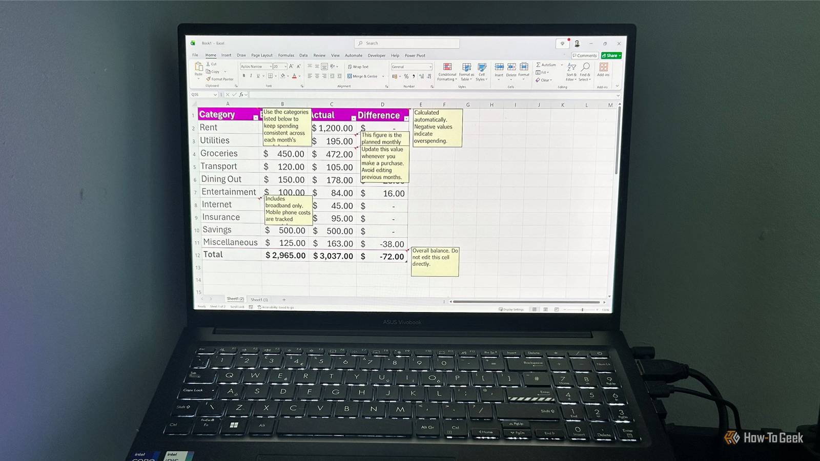
Excel's input messages: a cleaner alternative to cluttered notes and comments
This article discusses how Excel's "input messages" feature (part of Data Validation) offers a cleaner, less cluttered alternative to tradit
 ift.tt·8d ago
From Error Forwarding to Intentional Error Design in Software Development
The article critiques traditional error handling in software development as mere 'error forwarding' where errors lose context as they bubble
 fast.github.io·6mo ago
Why bad UX is often a business decision, not a design failure
This article explores how poor user experience (UX) in digital products is often the result of deliberate business decisions rather than des
 uxdesign.cc·10d ago
CSS Design Critiques: Analysis of Perceived Mistakes in CSS Properties and Specifications
The article presents a critique of CSS design decisions, listing specific perceived mistakes and suggesting alternative approaches. It cover

IT Expert Critiques Microsoft's User-Hostile Design Through Customer Support Experience
A programmer and IT expert recounts helping a non-tech-savvy neighbor with a laptop issue, using the experience to critique Microsoft and ot
 lzon.ca·2mo ago
Critique of Scroll Fade Animations in Web Design
The article criticizes the overuse of scroll fade animations in web design, arguing that they often create poor user experiences by being ex
 dbushell.com·3mo ago
Comments
Sign in to join the conversation.
No comments yet. Be the first.