






















CSS Scroll Snap
3y ago
Source
 12daysofweb.devCSS Scroll Snap12daysofweb.dev
With scrolling on the web, there's a feature called Scroll Snap which allows authors to articulate mandatory or optional resting places for scroll. A common initial use case is for carousel-like scrolling. See the CodePen . Each of those rows of items uses scroll snapping but tells each row of items to snap to a different spot in the scrollable area. The top one snaps items to the beginning with scroll-snap-align: start . The middle example snaps items to the center of the scroll area with scroll-snap-align: center . The last example snaps items to the end of the scroll area with scroll-snap-align: end . Several of Adam's demos are built using cascade layers (reviewed on Day 5 !), be sure you're using a supporting browser . The @layer syntax is a CSS organization choice and not required for scroll-snapping. The basics # The achieve a scroll-snapping scroll experience, there are 2 essential parts to establish: A scrollable container with overflow that adds ` scroll-snap-type ` which says the scrollable viewport can be snapped to, which axis to do the snapping, and whether or not it's a requirement to snap ( mandatory ) or optional ( proximity ). One or many children of a scroll-snap container that specifies where to snap with ` scroll-snap-align ` which says, on an item-by-item basis, where it should snap within that container You're not limited to a single axis either. A horizontal scrolling snap experience may be the first place your design mind goes to with the feature, but consider this example where snapping can occur on both the x and y-axis. See the CodePen . The scroll container specifies it can be scrolled horizontally and vertically, that it's a snap area, and each child should snap to the center. This demo is also a good time to introduce the scroll-snap devtools in Chromium browsers. Open the codepen in a new tab and inspect the grid. Look for the scroll-snap badge in the elements panel and click it to enable the debugging overlay: The scroll-snap overlay puts a purple border around the scroll area and a dot on each item that has scroll-snap-align on it. These items all want to snap to the center, so they all have a dot in the center. It also will show overflowing items which is really handy. Here I've constrained the height and width of the scroll area so we can see the overflow and snap alignment. For a practical application of scroll snapping, I made a media scrolling experience on GUI Challenges that emulates the browsing experience for many media networks. It also features great keyboard navigation and use of ` scroll-padding ` to create an edge-to-edge scroll experience that rests in perfect alignment with its section header. Check out the media scroller demo . Advanced # So far we've put snap alignment on every direct child of the scroll container like .scroll-container > * , but things get interesting when there's only one or a couple of snap targets. See the CodePen . In the above demo, the edge most elements are not snap targets, and when that is combined with mandatory snapping specified on the scroll container, it gives a nice bouncy effect to the edges of scrolling (often called an overscroll effect). You can also have scroll areas inside of scroll areas, each with its own snapping: See the CodePen . In the following demo, only 1 element is a snap target (the most recent/last message) which keeps the scroll container at the bottom, even as new messages are added: See the CodePen . Conclusion # There's a lot more you can do with scroll snap on the web. I've created a collection on Codepen to make them easy to discover and take code from. That's the grab-n-go aspect of this article! Hopefully, this gave you an overview of the design opportunities with scroll snap. There's a lot of potential to enhance a scroll experience with healthy scrolling resting places. Adam Argyle Adam is a bright, passionate, punk engineer with an adoration for the web who prefers using his skills for best in class UI/UX and empowering those around him. He’s worked at small and large companies, and built an app for pretty much every screen (or voice). He is capable of over-engineering, but spends lots of brain power not. Loves CSS, loves JS, loves great UX. He's also a member of the CSS Working Group, VisBug and Open Props creator, and overall web fan. Adam selected Black Girls Code for an honorary donation of $50 which has been matched by We build pathways for young women of color to embrace the current tech marketplace as builders and creators by introducing them to skills in computer programming and technology.
You might also wanna read


Chrome 146 Ships Scroll-Triggered Animations: How They Differ from Scroll-Driven Animations
Chrome 146 has shipped scroll-triggered animations, becoming the first browser to support this CSS feature. Unlike scroll-driven animations
 CSS-Tricks·19d ago
CSS Technique for True Shrinkwrapping Using Anchor Positioning and Scroll-Driven Animations
The article presents an innovative CSS technique for achieving true shrinkwrapping of elements with auto-wrapped content, which was previous
kizu.dev·5mo ago
Keyboard shortcuts you can use in Windows 10 and 11
almart.com·2y ago

Solving Dropdown Clipping Issues in Scrollable Containers: Technical Solutions for Web Developers
This technical article addresses a common web development problem where dropdown menus get clipped or disappear when placed inside scrollabl
 Smashing Magazine·3mo ago
Understanding the Differences Between Scroll-Driven Animations, Scroll-Triggered Animations, Container Query Scroll States, and View Transitions
A technical comparison of four related but distinct CSS concepts: scroll-driven animations (animation progress tied directly to scroll posit
CSS-Tricks·1mo ago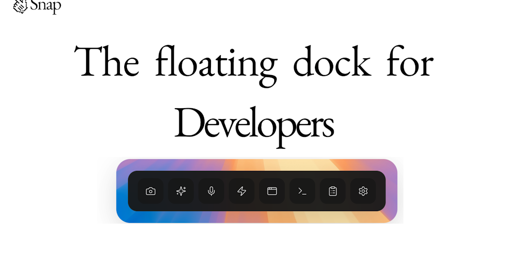
Snap: A Floating Dock Tool for Cursor and Claude Code Development
Snap is a floating dock tool designed for Cursor and Claude Code development environments. It provides various productivity features includi
 Product Hunt·4mo ago
Comments
Sign in to join the conversation.
No comments yet. Be the first.