
























Baked Baam Bakery Packaging: Retro Camp Illustrations Meet Structured Typography
By
abduzeedo
Summary
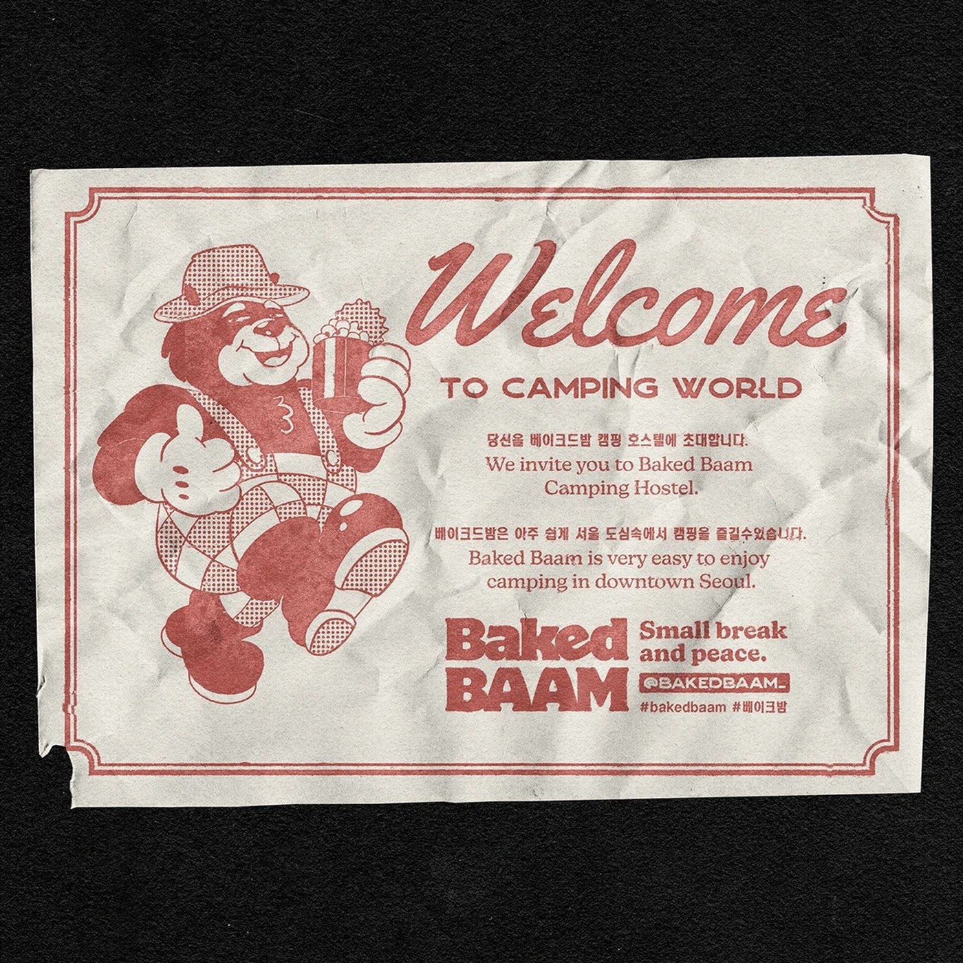
Monga Design created a visual identity system for Baked Baam, an express camping hostel in Seoul, South Korea. The bakery packaging design pairs retro camp illustrations with strict typographic layouts, drawing inspiration from the quick preparation of canned beans. The design balances playfulness with structural visual tension, using custom visual assets to establish a clear typographic hierarchy.
Source
 AbduzeedoBaked Baam Bakery Packaging: Retro Camp Illustrations Meet Structured Typographyabduzeedo.com
Key quotes
· 3 pulledMonga Design constructed this visual system for Baked Baam, an express camping hostel based in Seoul, South Korea.
The concept stems from the quick prep of canned beans, translating camp utility into bakery packaging design that balances playfulness with structural visual tension.
The studio relies on custom visual assets to establish a clear typographic hierarchy.
You might also wanna read

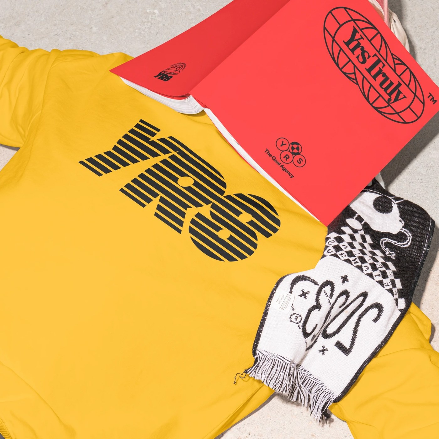
Monga Design creates disciplined visual identity system for Yrs Truly
Monga Design has created a disciplined visual identity system for Yrs Truly, characterized by structured layouts, high-contrast corporate-vi
abduzeedo.com·13d ago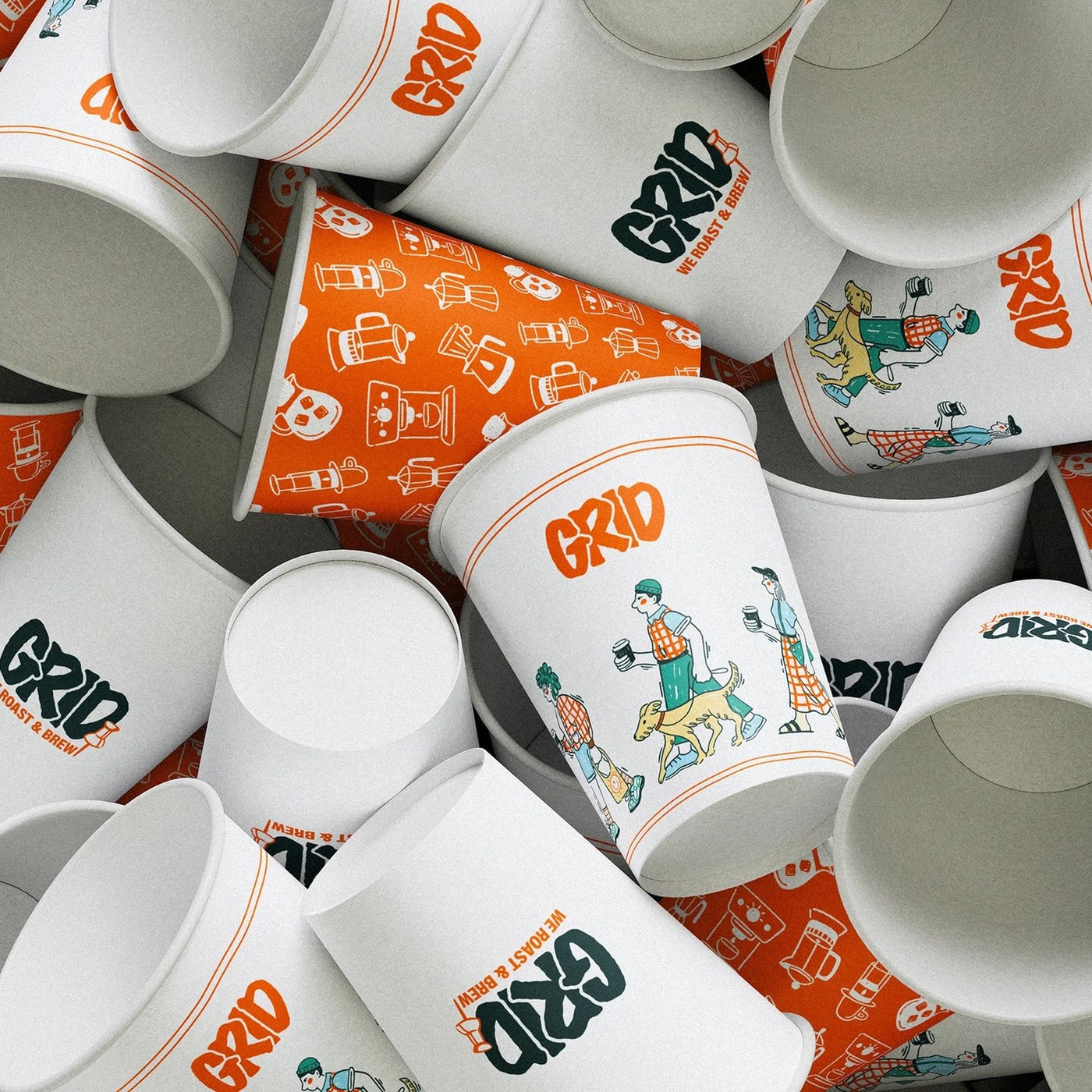
Grid-Based Modular Design System for Coffee Shop Branding and Packaging
This article presents a coffee shop branding visual identity system that uses a grid-based modular design approach. The design rejects tradi
abduzeedo.com·6d ago
Studio Morfar modernizes Danish butter cookie branding by blending heritage with contemporary design
Studio Morfar, a Copenhagen design studio, was tasked with rebranding Juno the Bakery's butter cookie line. The article explores how they su
 Creative Boom·7mo ago
The Enduring Appeal of Bitmap Fonts: How Constraint-Based Design Shapes Digital Aesthetics
The article explores the enduring appeal and significance of bitmap fonts in computing, arguing that they represent a design philosophy born
 korigamik.dev·2mo ago
Plastic Box Supermarket in Mallorca Features Brutalist Architecture with Concrete and Plastic Crate Ceiling
Architecture practice Minimal Studio has designed Plastic Box, a supermarket in Mallorca's Port of Pollensa featuring a minimalist, brutalis
 Dezeen·7mo ago
How M&S transformed its own-brand packaging with a more expressive design system
M&S has reinvented its own-brand packaging, moving away from uniform templates to more expressive, contemporary designs. The shift includes
 Creative Review·1d ago
Comments
Sign in to join the conversation.
No comments yet. Be the first.