
























Yakitoriya, by Art Lebedev
This illustrative logo for a chain of Japanese restaurants caught my eye. It was designed by Egor Zhgun of Art. Lebedev Studio in 2014. The studio’s case study dates back a while but you can catch…
Read the full articleYou might also wanna read


New design platform S—3 debuts at Milan design week with chopstick exhibition
Sticks, pasta and braille all feature in an exhibition of chopsticks, presented at Milan design week by design platform S—3.
 Dezeen·2mo ago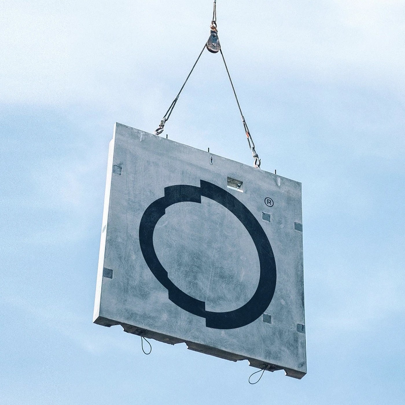
HITO Brand Identity: La Libertad Studio's Iterative Visual System for Habitational Experimentation
Explore the complete HITO brand identity design on Behance. Discover the inspiration, logo concept, typography, and visu...
 Abduzeedo·16d ago
3 Fils
Sharp Japanese-inspired plates and marina views
Studio Blackburn's comprehensive visual identity for the Olympic Museum
Logo, custom typeface, posters and merchandise for Olympic Museum designed by Studio Blackburn. Reviewed by Emily Gosling for BP&O.
 bpando.org·1d ago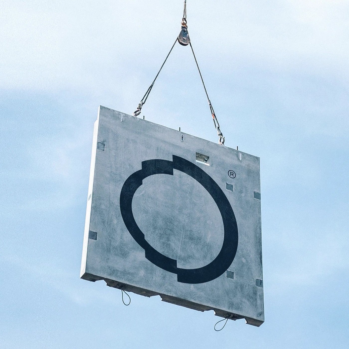
HITO Brand Identity: La Libertad Studio's Iterative Visual System for Habitational Experimentation
Explore the complete HITO brand identity design on Behance. Discover the inspiration, logo concept, typography, and visu...
abduzeedo.com·16d ago
Why AI company logos share a striking and unintentional visual pattern
A humorous exploration of the uncanny resemblance between AI company logos and human anatomy. Discover why circular, gradient-based designs
 velvetshark.com·19d ago
Comments
Sign in to join the conversation.
No comments yet. Be the first.