
























Cape Wine's packaging design embraces asymmetrical grids and visual restraint
Kad Hemolloriah Makoundou crafts a bold concept for Cape Wine. The project highlights wine packaging design through stru...
Read the full articleYou might also wanna read

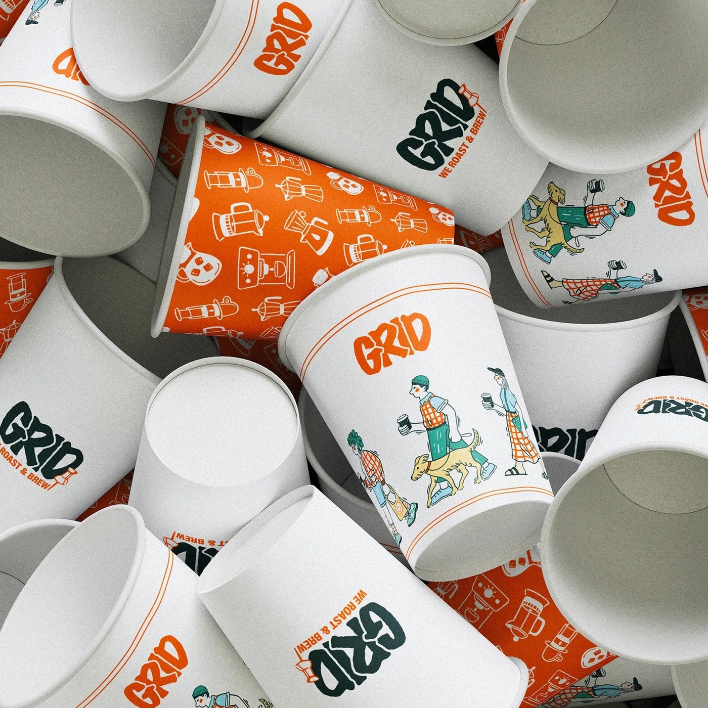
Grid-Based Modular Design System for Coffee Shop Branding and Packaging
This coffee shop branding visual identity system uses clean grids. The physical design features raw cardboard packaging ...
 abduzeedo.com·10d ago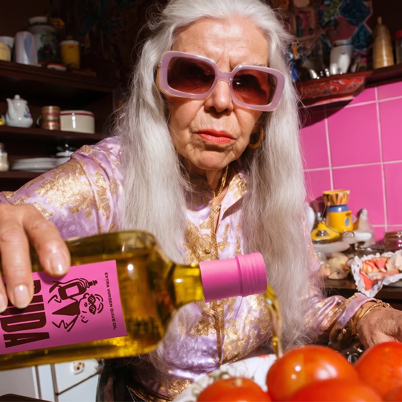
Ruda Olive Oil Packaging: Yai Salinas' Geometric Typography and Grid-Based Design System
Brand identity typography defines the Ruda olive oil design system by Yai Salinas, using custom geometric monograms and ...
abduzeedo.com·10d ago
How packaging design evolved from functional afterthought to cultural touchstone
There was a time when packaging was dismissed as functional or forgettable, but now it's evolved into one of the most emotionally charged an
 Creative Boom·5mo ago
Outsiders creates glow-in-the-dark brand identity for Supernatural natural wine label
Margate-based studio Outsiders has conjured up a new identity for Supernatural – a natural wine brand "not of this earth" – with monster-lik
Creative Boom·8mo ago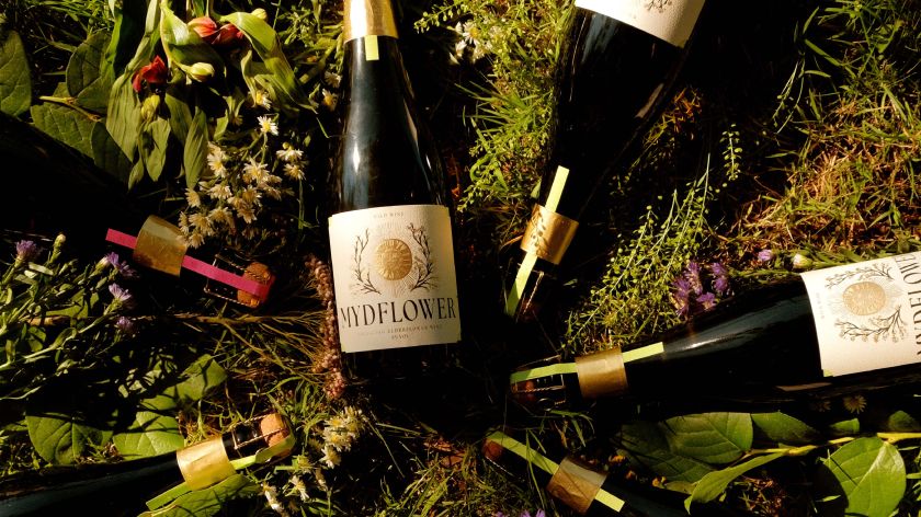
Handmade Illustration Proves Its Commercial Value in Mydflower Wine Rebranding
While AI churns out generic images, Kingdom & Sparrow's premium designs for Mydflower prove that hand-crafted illustration retains serious c
Creative Boom·6mo ago
How M&S transformed its own-brand packaging with a more expressive design system
We speak to John-Paul Hunter, head of packaging design at M&S, about how the team has built a more expressive own-label design system
 Creative Review·4d ago
Comments
Sign in to join the conversation.
No comments yet. Be the first.