
























Why the 1986 World Cup logo is celebrated by designers while the 2026 version disappoints
By
Mariana Alfaro
Summary
The article contrasts the beloved 1986 World Cup logo — an iconic symbol of Mexican design voted FIFA's "greatest emblem" — with the 2026 edition's logo, which has disappointed designers who see it as a missed opportunity. The 1986 logo is celebrated for its distinctive Mexican design aesthetic, while the 2026 version fails to capture that same spirit.
Source

 bskyWhy the 1986 World Cup logo is celebrated by designers while the 2026 version disappointswashingtonpost.com
Key quotes
· 3 pulledThe 1986 World Cup...became an enduring symbol of Mexican design and was later voted the 'greatest emblem' of any World Cup in a survey held by FIFA
The '86 logo became a staple of Mexico City design
The 2026 edition has left designers mourning a missed opportunity
You might also wanna read

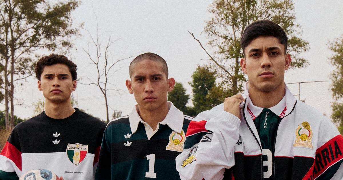
A Fashion Guide to the 2026 World Cup's Style Highlights
A fashion-focused guide to the 2026 World Cup, offering an alternative entry point for those less interested in sports by highlighting the t
 wmagazine.com·7d ago
Mexican design studios create custom furniture collection for Azteca Stadium's World Cup renovation
A group of Mexican design studios — CUAIK | CDS, Luis Huerta, Estudio Ignacio Urquiza Ana Paula de Alba, CAAM Arquitectos, and Clásicos Mexi
 Dezeen·13d ago
Adidas Unveils Official FIFA World Cup 2026 Match Ball with Host Country Symbolism
Adidas has unveiled the official match ball for the FIFA World Cup 2026, named Trionda, which features a distinctive design representing the
Dezeen·9mo ago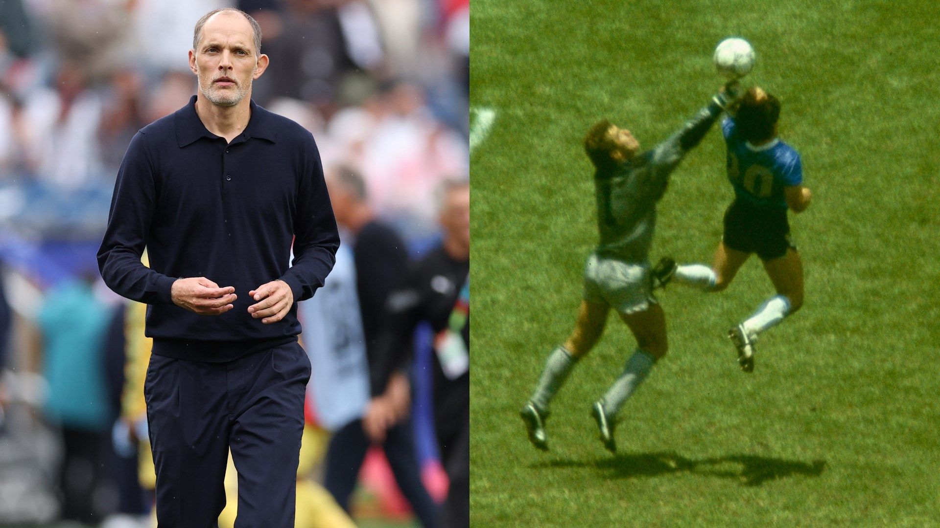
Tuchel says England owed 'karma' for Maradona's Hand of God goal ahead of Mexico clash at Azteca
England manager Thomas Tuchel believes his team will receive karmic justice at the Azteca Stadium when they face Mexico in the 2026 World Cu
 goal.com·5d ago
Comments
Sign in to join the conversation.
No comments yet. Be the first.