
























WALDKRAFT packaging design uses embossed aluminum and forest tones to reflect mushroom brand origins
By
sofia
Summary
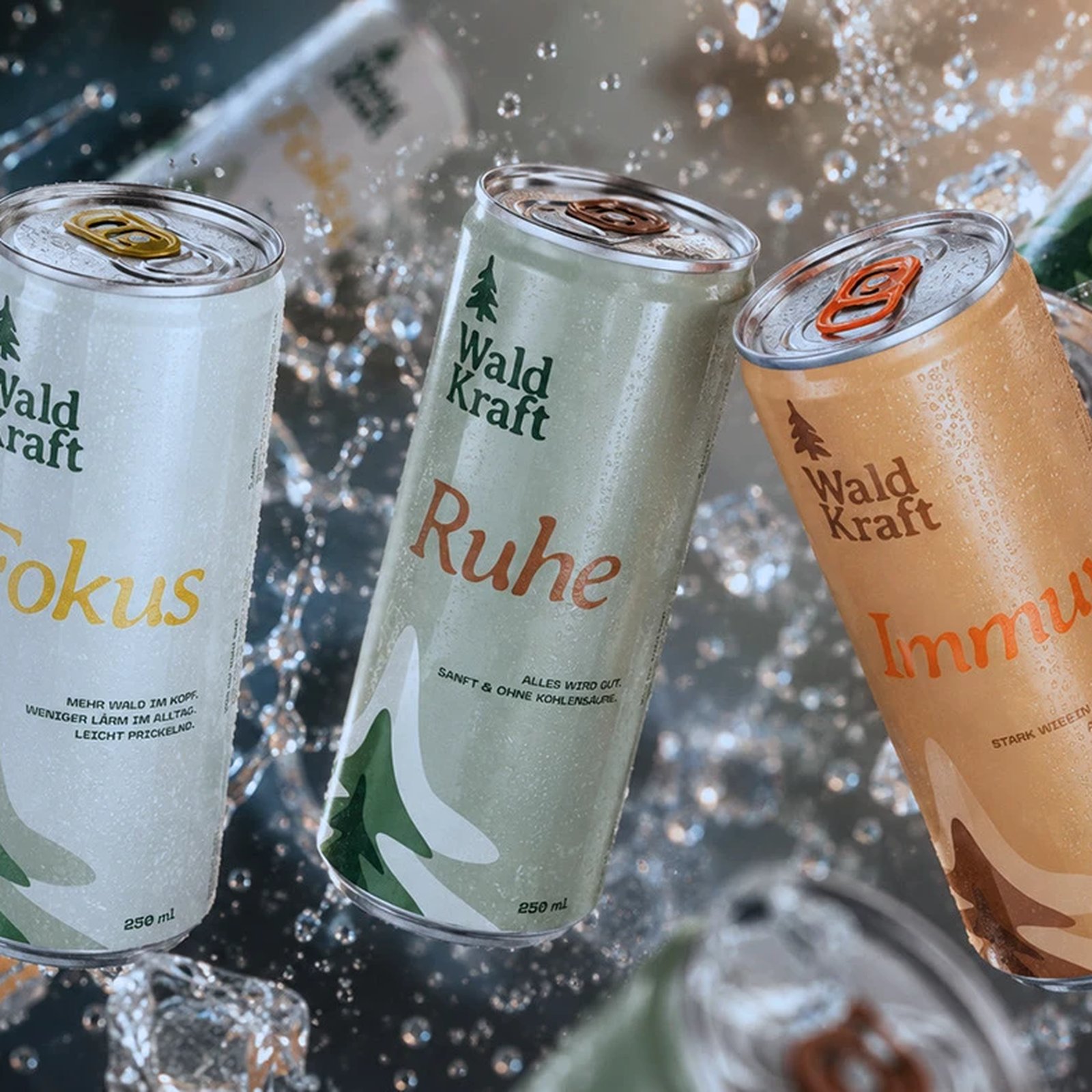
WALDKRAFT, a Berlin-based design studio, created packaging for a functional mushroom brand that emphasizes materiality and restraint. The design features embossed vertical ridges on aluminum cans (evoking bark or growth rings), kraft-brown labels, and deep forest green tones. The packaging draws inspiration from the brand's origin story — mushrooms harvested from forests in Brandenburg and Mecklenburg — and prioritizes texture and natural aesthetics over heavy branding or decoration.
Source
 AbduzeedoWALDKRAFT packaging design uses embossed aluminum and forest tones to reflect mushroom brand originsabduzeedo.com
Key quotes
· 3 pulledThe can itself carries the argument.
Hüterin Kreative embossed vertical ridges into the aluminum surface, a texture that reads like bark or growth rings before it reads like branding.
the packaging never lets that origin story become an afterthought.
You might also wanna read


Mushroom Packaging: Sustainable Alternative to Plastic Using Mycelium Technology
The article introduces Mushroom® Packaging, a sustainable alternative to traditional plastic packaging made from expanded polystyrene (EPS).
 magicalmushroom.com·4mo ago
Portuguese mushroom company taps into growing wellness market
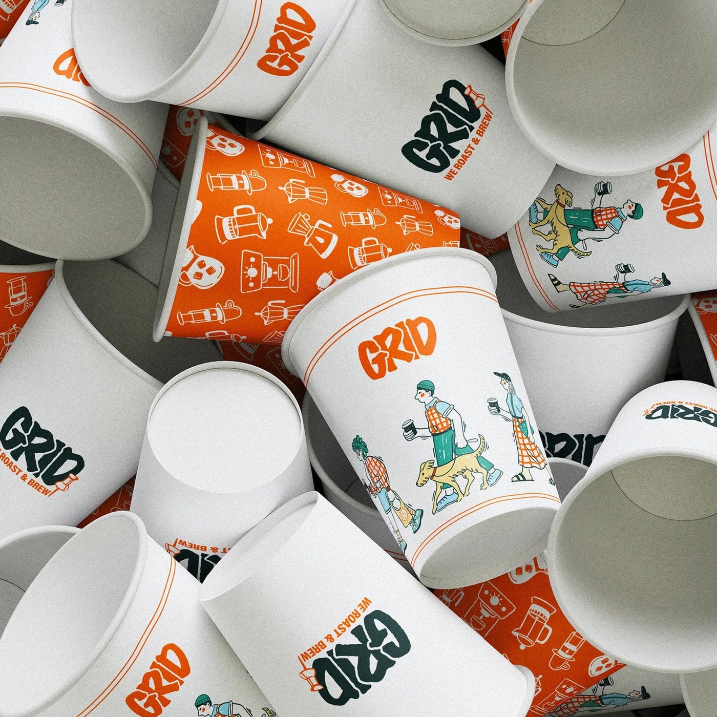
Grid-Based Modular Design System for Coffee Shop Branding and Packaging
This article presents a coffee shop branding visual identity system that uses a grid-based modular design approach. The design rejects tradi
abduzeedo.com·6d ago
Mycelium curtains used as room dividers in Ukrainian mushroom-themed restaurant Grybova Hata
Ukrainian design studio YOD Group has designed Grybova Hata restaurant near Bukovel, Ukraine, featuring mycelium curtains made from mushroom
 Dezeen·11mo ago
Sheep Inc Opens First London Store with Cork and Wool Interior Design
Interior designer Mark Brown created natural, tactile interiors for clothing brand Sheep Inc's first physical store in London's Carnaby Stre
Dezeen·6mo ago
West Elm and Designtex Collaborate on Durable Upholstery Fabrics for High-Traffic Interiors
US textile company Designtex collaborated with homeware brand West Elm to create three durable upholstery fabrics called Template, Acre, and
Dezeen·9mo ago
Comments
Sign in to join the conversation.
No comments yet. Be the first.