Visualize This: The FlowingData Guide to Design, Visualization, and Statistics – Book Overview
By
Follow the author
Summary
A review/description of Nathan Yau's updated data visualization book "Visualize This" (FlowingData Guide), which teaches readers how to create thoughtful charts, maps, and analysis to communicate data visually in an appealing and understandable way. The book covers design, visualization techniques, and statistics.
Source
 Twitter / XVisualize This: The FlowingData Guide to Design, Visualization, and Statistics – Book Overviewamzn.to
Key quotes
· 4 pulledVisualize This demonstrates how to explain data visually, so that you can present and communicate information in a way that is appealing and easy to understand.
Thoughtful charts, maps, and analysis can help us make sense of this data.
But the data does not speak for itself.
Graphics provide little value unless they are built upon a firm understanding.
You might also wanna read


Rethinking Tufte's data-to-ink ratio: When minimalism in data visualization goes too far
This article critically examines Edward Tufte's influential design principles of "chart junk" and the "data-to-ink ratio," questioning how m
 frank.computer·13d ago
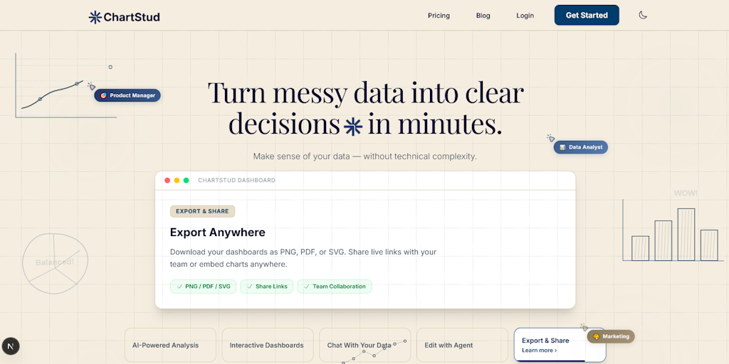
ChartStud: Data Visualization Tool for Creating Charts, Dashboards, and AI Insights
ChartStud is a data visualization tool that helps users transform raw data into charts, dashboards, and AI-powered insights. The platform of
 Product Hunt·4mo ago
Historical Data Visualizations: How William James, W.E.B. Du Bois, and Francis Galton Used Diagrams for Thinking
The article explores the historical data visualizations and diagrams created by notable figures like William James, W.E.B. Du Bois, and Fran
 resobscura.substack.com·1mo ago
StoryMotion: Tool for Creating Animated Diagrams and Flowcharts with Hand-Drawn Style
StoryMotion is a tool that enables users to easily create animated diagrams and flowcharts with a hand-drawn aesthetic. The platform allows
Product Hunt·7mo ago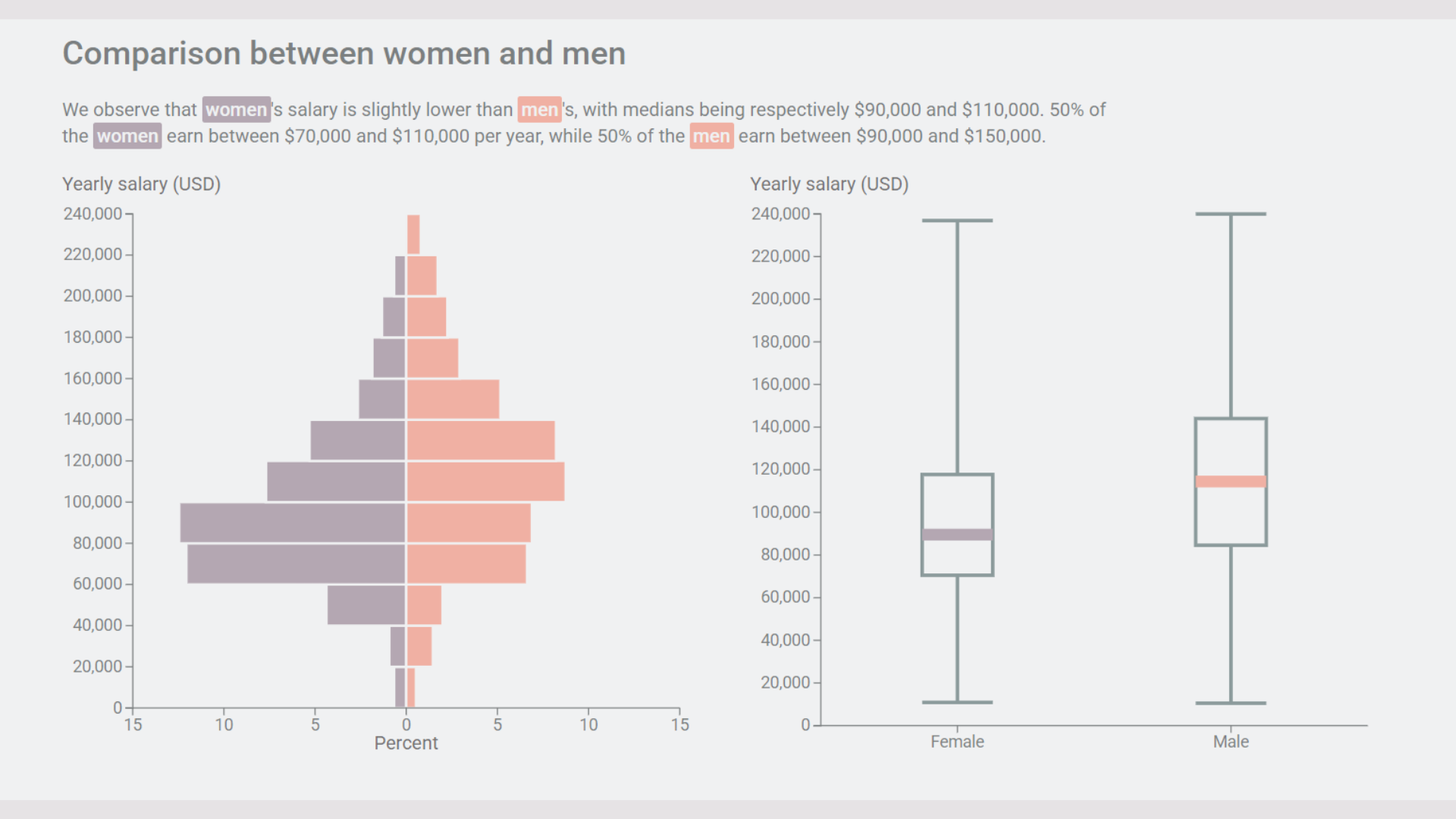
Understanding D3.js Verbosity: Why the Data Visualization Library Requires Detailed Code
The article explores why D3.js, a JavaScript library for data visualization, appears verbose and complex to beginners. The author, currently
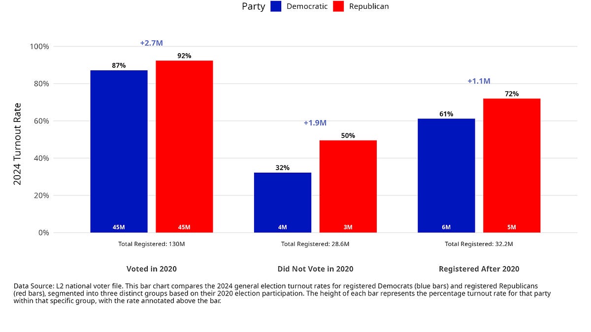
Data and Democracy Mid-Year Roundup: 29 Visualizations Charting the Assault on American Democracy
This article presents a mid-year roundup of the "On Data and Democracy" series, using 29 data visualizations to analyze the state of America
 data4democracy.substack.com·11mo ago