
























Using focal points, aspect ratio & object-fit to crop images correctly
From the article
Before I even get into the impetus for this blog post, if you came from a search engine and you just want the code, here’s a demo . Pleasure doing business with you. Introduction In a client’s project recently, I found that their Wordpress setup required content editors to upload four separate versions of a blog post’s featured image at varying dimensions to ensure a correct appearance in the many contexts that the post will be displayed in (i.e. homepage feature, blog list item, blog post page, social media sharing). Most of these images were getting created with the crop tool in GIMP or Photoshop, and not every content editor felt empowered to create all these images, so publishing timelines were getting pushed back waiting for the images to be generated. This is the sort of thing we can solve with modern CSS, so let’s do it! Don’t touch that dial! Choosing a focal point There are many solutions for implementing a focal point selector on images in Wordpress (other content management systems are available), but for the purposes of this tutorial, we’ll create an imitation focal point picker that uses client-side JavaScript to imitate what a back-end tool might do. Because this part isn’t useful beyond this tutorial, I’ll breeze through so we can get to the actual CSS Tricks (other web development blogs are available). TL;DR , we’ll display our image in HTML, listen for click events on that image, and use the position of each click to set a --focus-x and --focus-y CSS variable on the :root of the page. In a product implementation of this, it’d be better to be more specific and set those CSS variables somewhere that “focus-x” makes more sense, but since we’re using the same image many times on this page, document.documentElement is okay. < img class = " source-image " src = " " /> const sourceImage = document . querySelector ( ".source-image" ) ; sourceImage . addEventListener ( "click" , ( event ) => { const rect = event . target . getBoundingClientRect ( ) ; const xCoord = event . clientX - rect . left ; const yCoord = event . clientY - rect . top ; const xAsPercentage = ( xCoord / rect . width ) _ 100 ; const yAsPercentage = ( yCoord / rect . height ) _ 100 ; document . documentElement . style . setProperty ( "--focus-x" , ` ${ xAsPercentage } % ` ) ; document . documentElement . style . setProperty ( "--focus-y" , ` ${ yAsPercentage } % ` ) ; } ) ; Now, clicking the source image should give us some output like: < html style = " --focus-x : 64.2862% ; --focus-y : 35.5263% ; " > Using Aspect-Ratio To Size Images Now let’s create a few example images that can represent those use cases we described at the start. We’ll imagine we have three potential use cases for this image: A wide landscape homepage hero, 16:9 dimensions in the design file we’ve been given A square thumbnail for a blog list item A 3:4 portrait view for each individual blog post page We’ll write some HTML for these examples: < article class = " homepage-hero " > < img src = " the same URL as the one before lol " /> < article class = " blog-list-item " > < img src = " ... " /> < article class = " blog-post " > < img src = " ... " /> Now, some accompanying CSS. We’ll first use a property called aspect-ratio , which takes an aspect-ratio expressed fraction or decimal. article > img { aspect-ratio : var ( --aspect-ratio ) ; } .homepage-hero { --aspect-ratio : 16 / 9 ; } .blog-list-item { --aspect-ratio : 1 / 1 ; } .blog-post { --aspect-ratio : 3 / 4 ; } This is doing something , but our images are a little squished. That’s where object-fit comes in. We can use object-fit similarly to background-position , setting it to contain or cover to keep it from stretching. The default value is fill , which will always stretch an image in any direction it needs to in order to fit the rendered aspect ratio of the image. We’ll use object-fit: cover; because we always want images to completely cover their rendered aspect ratio, we just don’t want the deformation. article > img { aspect-ratio : var ( --aspect-ratio ) ; object-fit : cover ; } The images are looking a lot better now, but hark: in some of the images, the subject of the image is cropped out strangely. Let’s sort that. Using the focal point in image positioning Now we can use object-position (similar to background-position ) to move the image until the thing we’ve decided is most important is in frame. article > img { aspect-ratio : var ( --aspect-ratio ) ; object-fit : cover ; object-position : var ( --focus-x ) var ( --focus-y ) ; } That’s more like it. There’s a problem that used to take a couple minutes per post in an image editor, more-or-less solved with fifteen lines of CSS. Golly gosh is it a good day to be working on the web. Possible improvements You’ll find in some cases that setting a focal point in the corner or edge of an image doesn’t work perfectly — the selected point will always be in the image but it won’t always be centered in the image. I briefly tried to work out how this could be solved with exactly our markup and existing CSS, but I think there’s more to it. By my estimate, roughly what would need to happen is: Wrap the image in a 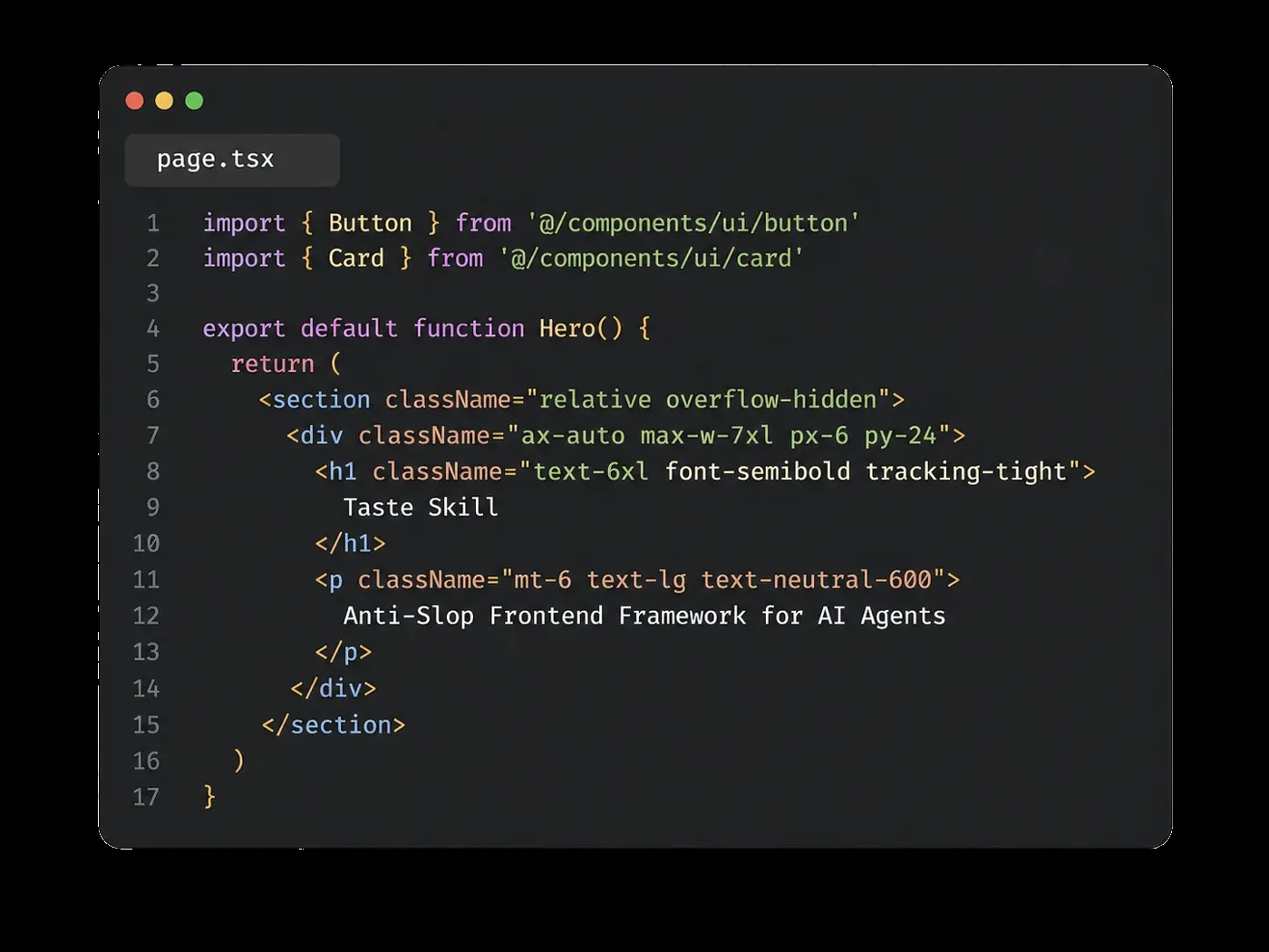
 Abduzeedo·1d ago

 github.com·5d ago
 Hongkiat·8d ago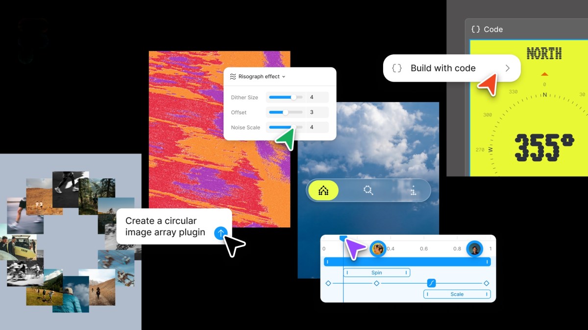
 techcrunch.com·13d ago
using-focal-points-aspect-ratio-object-fit-to-crop-images-correctly with the same aspect-ratio value as the image, and make sure its overflow is hidden. Figure out how far the focal point is from the center of the rendered image container. Translate the ![]() by that distance so that the focal point is in the center. Additionally, scale the
by that distance so that the focal point is in the center. Additionally, scale the ![]() by whatever factor is necessary fo ensure it still covers its parent. (I think the math would be something like: if you translate the image left 10%, you’ll need to scale the image to 120% in order to account for that movement.) Conclusion Anyway thanks for reading. As always, feel free to shoot me an email if you have further questions, need to make a correction, or think my cool hat is stupid. I’m also on Mastodon . CSS is sick, skate fast, have a blast. Further Reading aspect-ratio on MDN object-fit on MDN object-position on MDN And here’s that CodePen demo one more time.
by whatever factor is necessary fo ensure it still covers its parent. (I think the math would be something like: if you translate the image left 10%, you’ll need to scale the image to 120% in order to account for that movement.) Conclusion Anyway thanks for reading. As always, feel free to shoot me an email if you have further questions, need to make a correction, or think my cool hat is stupid. I’m also on Mastodon . CSS is sick, skate fast, have a blast. Further Reading aspect-ratio on MDN object-fit on MDN object-position on MDN And here’s that CodePen demo one more time.
Continue reading on henry.codesYou might also wanna read

Taste Skill: An Open-Source Framework for Disciplined AI-Generated Web Design
Taste Skill is an open-source frontend framework created by designer Leon Lin that helps AI coding agents (like Cursor and Claude Code) gene
Abduzeedo·1d agon8n workflow template: AI-powered UI design assistant using Telegram, Gemini, and Google Stitch
This article presents an n8n workflow template that creates an AI-powered design and prototyping assistant. The workflow integrates Telegram
n8n.io·2d ago
If You're a Button, You Have One Job: The Case for Responsive UI
developersdigest.tech·3d ago
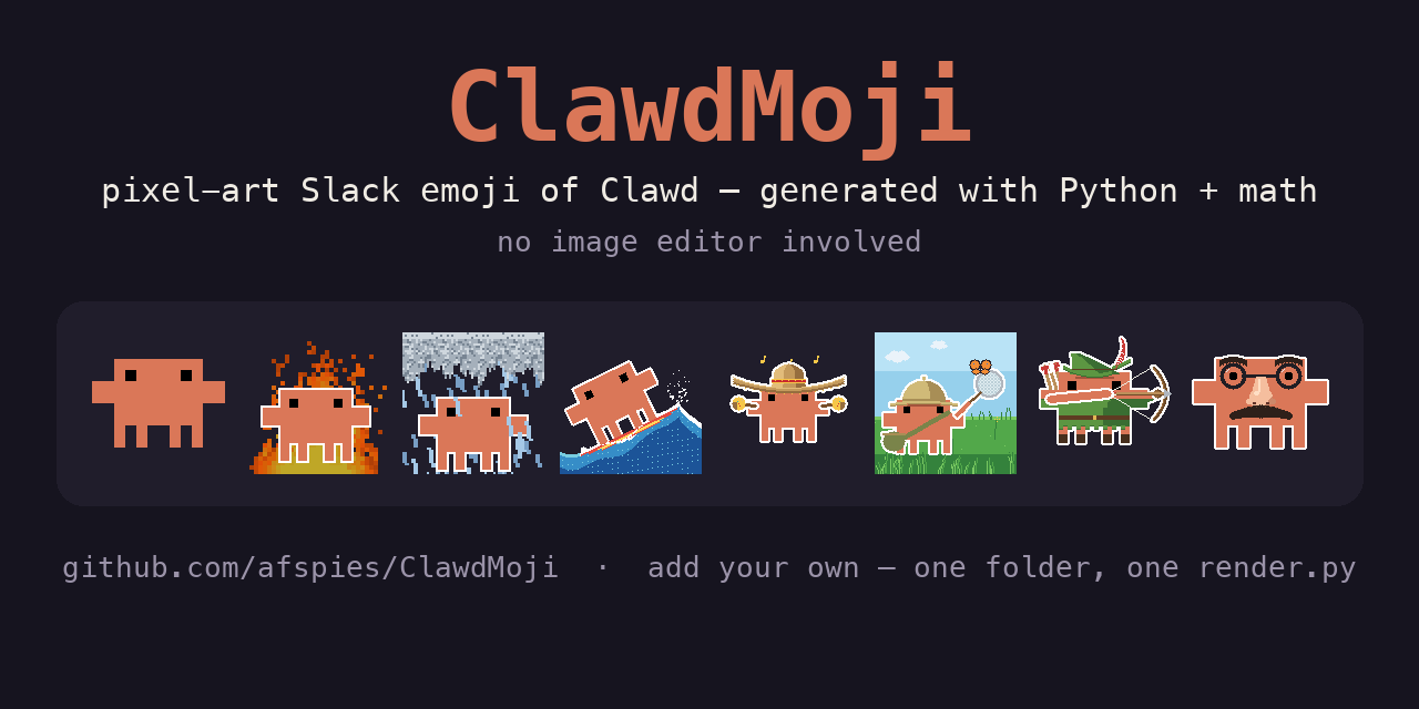
ClawdMoji: Programmatically generated pixel-art Slack emoji of the Clawd mascot using Python and math
A GitHub repository (ClawdMoji) that programmatically generates pixel-art Slack emoji of the Clawd mascot using Python and math, without any
github.com·5d agoJune 2026 Roundup: New Tools and Resources for Web Developers and Designers
A curated roundup of new tools and resources for web developers and designers for June 2026, covering GPU-accelerated terminal emulators, AI
Hongkiat·8d agoFigma adds native code layers, animation support, and AI plug-in creation
Figma announced a major update adding code layers directly to its collaborative canvas, support for motion and shaders, and AI-powered custo
techcrunch.com·13d ago
Comments
Sign in to join the conversation.
No comments yet. Be the first.