The Evolution of Google Sans: How Google Developed a Text-Optimized Version for Better UX
By
meetpateltech
Slow-proofed and worth the wait. Worth its weight in flour.
Summary
The article details the evolution of Google Sans, Google's brand typeface, from its initial 2018 launch to the development of Google Sans Text (GST) in 2020. It explains how designers initially faced challenges with the geometric Google Sans at smaller text sizes, leading to a dual-font system with Roboto. Through collaboration with Search designers and Colophon Foundry, Google developed GST specifically optimized for readability at smaller sizes, solving UX design problems and creating a more cohesive typographic system across Google products.
Key quotes
· 5 pulledWhen Google Sans rolled out in 2018, designers were initially ecstatic. 'It meant we could finally use typography for a stronger brand statement,' recalls UX Designer Miche Alvarez.
'But it also created a dual-font system using Google Sans for larger display text and Roboto for smaller text. It ended up being a compromise.'
Designers fought for a Google Sans version that would work at smaller sizes.
So the team collaborated with designers in Search and at Colophon Foundry to refine the font, ultimately launching Google Sans Text (GST) in 2020.
Unlike the geometric Google Sans, the characters in Google Sans Text were specifically designed for better readability at smaller sizes.
You might also wanna read

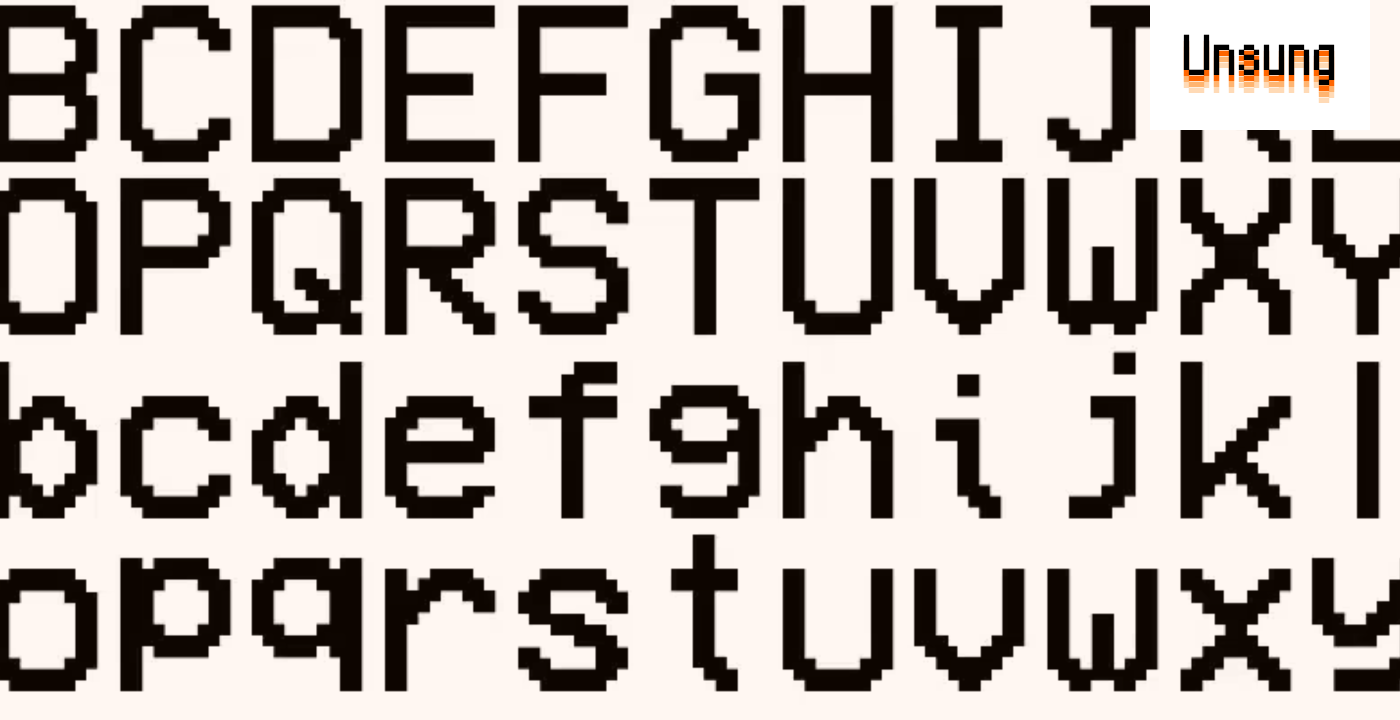
Modern pixel fonts: Analog Mono and Coral Pixels revive retro digital aesthetics
A blog post highlighting interesting modern pixel fonts, focusing on Andrew Gleeson's Analog Mono (which fixes issues with the classic VCR O
 unsung.aresluna.org·6d ago
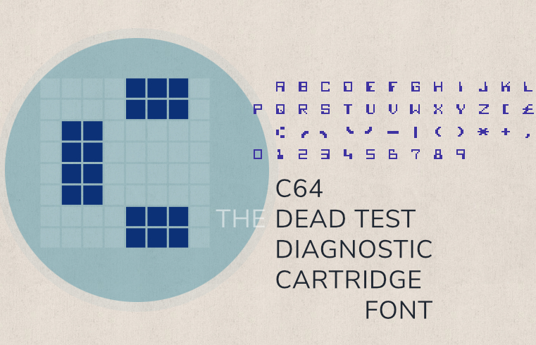
A Technical Deep Dive into the Commodore 64 Dead Test Cartridge Font
A detailed technical exploration of the font used in the Commodore 64's "Dead Test" diagnostic cartridge. The article documents the font's d
 masswerk.at·7d ago
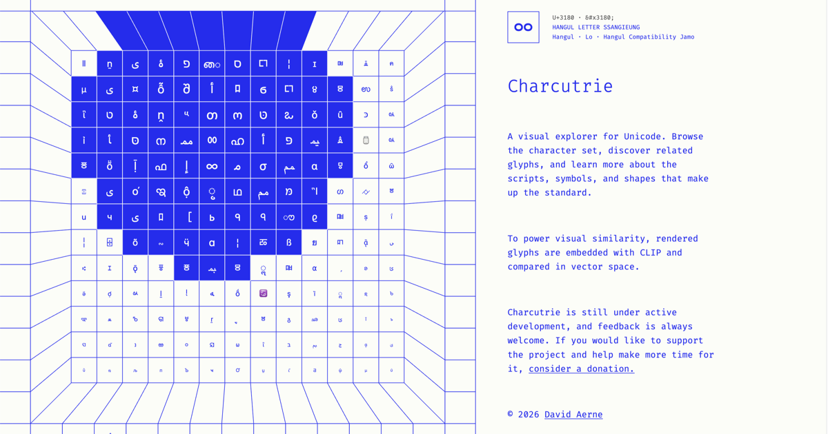
Charcuterie: A Visual Explorer Tool for Unicode Characters and Glyphs
Charcuterie is a visual explorer tool for Unicode that allows users to browse characters, discover related glyphs, and learn about scripts,
 charcuterie.elastiq.ch·1mo ago
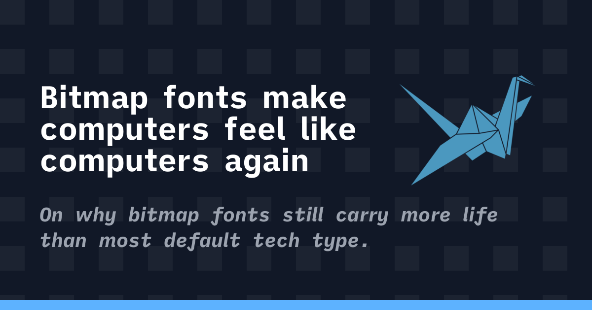
The Enduring Appeal of Bitmap Fonts: How Constraint-Based Design Shapes Digital Aesthetics
The article explores the enduring appeal and significance of bitmap fonts in computing, arguing that they represent a design philosophy born
 korigamik.dev·1mo ago
Letterbox: Create Letters Shaped by Text with Custom Fonts and Colors
Letterbox is a creative typography tool that allows users to create letters shaped by text. Users can pick fonts, choose colors, and watch t
 Product Hunt·1mo ago
Technical Analysis of Microsoft's ClearType Font Collection and Screen Typography Design
This article provides a detailed technical review of Microsoft's ClearType font collection, examining the evolution of screen typography fro