SWC's Louise Sloper on why typography should lead design, not follow it
By
Tom May
Crisp on the outside, thoughtful on the inside. A keeper.
Summary
Louise Sloper, executive creative director of SWC and TypoCircle chair, argues that typography is often treated as an afterthought by designers when it should be a foundational element of art direction. Drawing on 25 years of industry experience and the Bacardi Untameable campaign, she explains why typography is the "body language" of words and shares lessons including when to abandon the grid for more impactful design.
Key quotes
· 3 pulledTypography is such a key part of my approach to art direction.
Words have the power, and to me typography is their body language.
Most designers, if they're honest, treat typography as the bit that happens after the interesting decisions have been made.
You might also wanna read

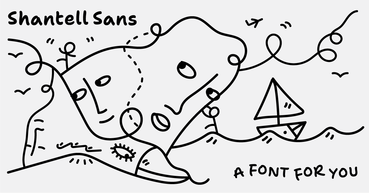
Shantell Sans: A variable typeface blending readability with experimental animation styles
Shantell Sans is a new variable typeface created by artist Shantell Martin that offers multiple adjustable axes including Weight, Italic, In
 shantellsans.com·1d ago
How Production Designer Danny Vermette Brought the 'Backrooms' Liminal Spaces to Life for A24
Article explores how production designer Danny Vermette collaborated with director Kane Parsons to translate the viral 'Backrooms' creepypas
 IndieWire·2d ago
Cherry Merlot: A Vintage Ink Script Typeface by AnMark for Branding and Editorial Design
Cherry Merlot is a vintage ink script typeface designed by AnMark, described as balancing softness and structure, edge and elegance. It is p
 weandthecolor.com·2d ago
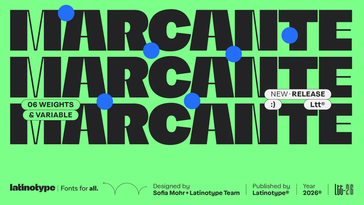
Marcante Font Family: A Bold Display Typeface by Sofia Mohr and Latinotype
The article reviews the Marcante font family by Latinotype, designed by Brazilian type designer Sofia Mohr. It argues that contemporary typo
weandthecolor.com·3d ago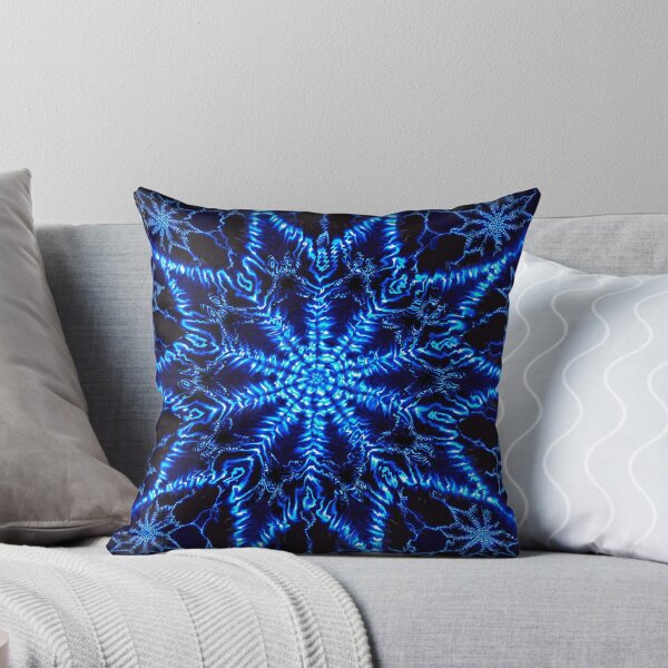
Product Listing: Neon Fractal VI D Pillow by OmarHernandez
A product listing page for a "Neon Fractal VI D" pillow design by artist OmarHernandez, featuring a digitally manipulated fractal image. The
 redbubble.com·5d ago
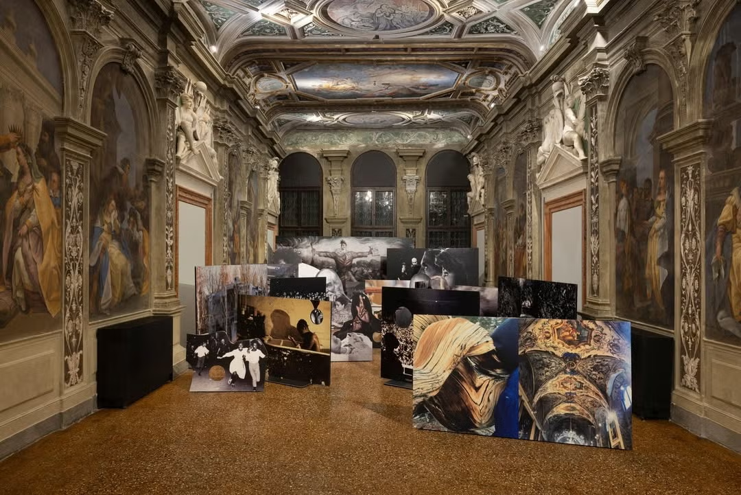
Venice Biennale 2026: Inside the Art, Fashion, and Parties That Defined the Opening Week
 ELLE·7d ago