NAM and Warriors Studio craft deliberately eroded stone typography for International Assembly's 2025 identity
By
Tom May
Pulled from the oven just right. Trustworthy, fact-dense, deeply satisfying.
Summary
The article discusses the bold typographic identity created by NAM (Nam Huynh and Mark Bohle) and Warriors Studio for International Assembly's 2025 conference in Glasgow. The identity features deliberately eroded, barely readable stone typography that pushes the boundaries of legibility, paired with crisp subtitles. The piece explores how questioning traditional notions of 'functional' design can lead to more exciting and thought-provoking creative choices.
Key quotes
· 5 pulledThese massive, pockmarked letterforms look like ancient ruins, all cratered surfaces and eroded edges.
The letters push right up against abstraction, dissolving into sculptural forms.
'Readability' has not been the top priority here.
This identity uses barely readable stone typography as its central element, pairing it with crisp subtitles.
Questioning the meaning of 'functional' can lead to more exciting design choices.
You might also wanna read

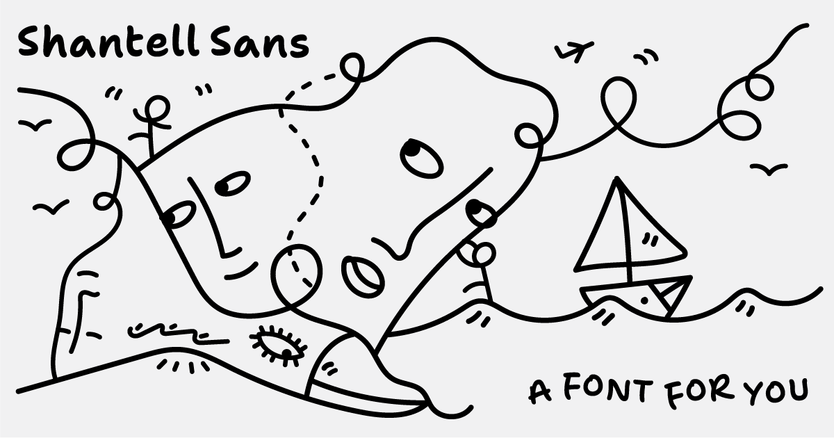
Shantell Sans: A variable typeface blending readability with experimental animation styles
Shantell Sans is a new variable typeface created by artist Shantell Martin that offers multiple adjustable axes including Weight, Italic, In
 shantellsans.com·1d ago
How Production Designer Danny Vermette Brought the 'Backrooms' Liminal Spaces to Life for A24
Article explores how production designer Danny Vermette collaborated with director Kane Parsons to translate the viral 'Backrooms' creepypas
 IndieWire·2d ago
Cherry Merlot: A Vintage Ink Script Typeface by AnMark for Branding and Editorial Design
Cherry Merlot is a vintage ink script typeface designed by AnMark, described as balancing softness and structure, edge and elegance. It is p
 weandthecolor.com·2d ago
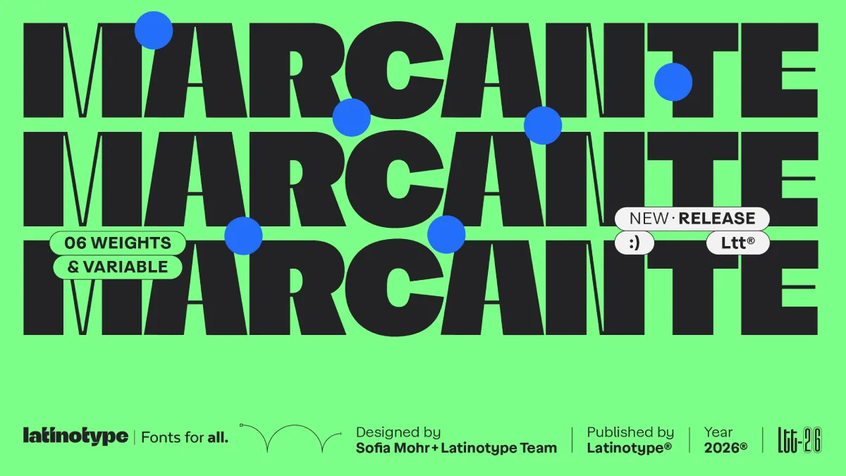
Marcante Font Family: A Bold Display Typeface by Sofia Mohr and Latinotype
The article reviews the Marcante font family by Latinotype, designed by Brazilian type designer Sofia Mohr. It argues that contemporary typo
weandthecolor.com·3d ago
Product Listing: Neon Fractal VI D Pillow by OmarHernandez
A product listing page for a "Neon Fractal VI D" pillow design by artist OmarHernandez, featuring a digitally manipulated fractal image. The
 redbubble.com·5d ago
Venice Biennale 2026: Inside the Art, Fashion, and Parties That Defined the Opening Week
 ELLE·7d ago