Design Guidelines for Improving Notification UX: Timing, Relevance, and User Control
As always in design, timing matters, and so do timely notifications. Let’s explore how we might improve the notifications UX. More design patterns in our Smart Interface Design Patterns, a friendly…
Read the full articleYou might also wanna read


Guidelines for Accessible Notifications and Messages in Digital Interfaces
How to ensure updates and messages are communicated in an inclusive way.
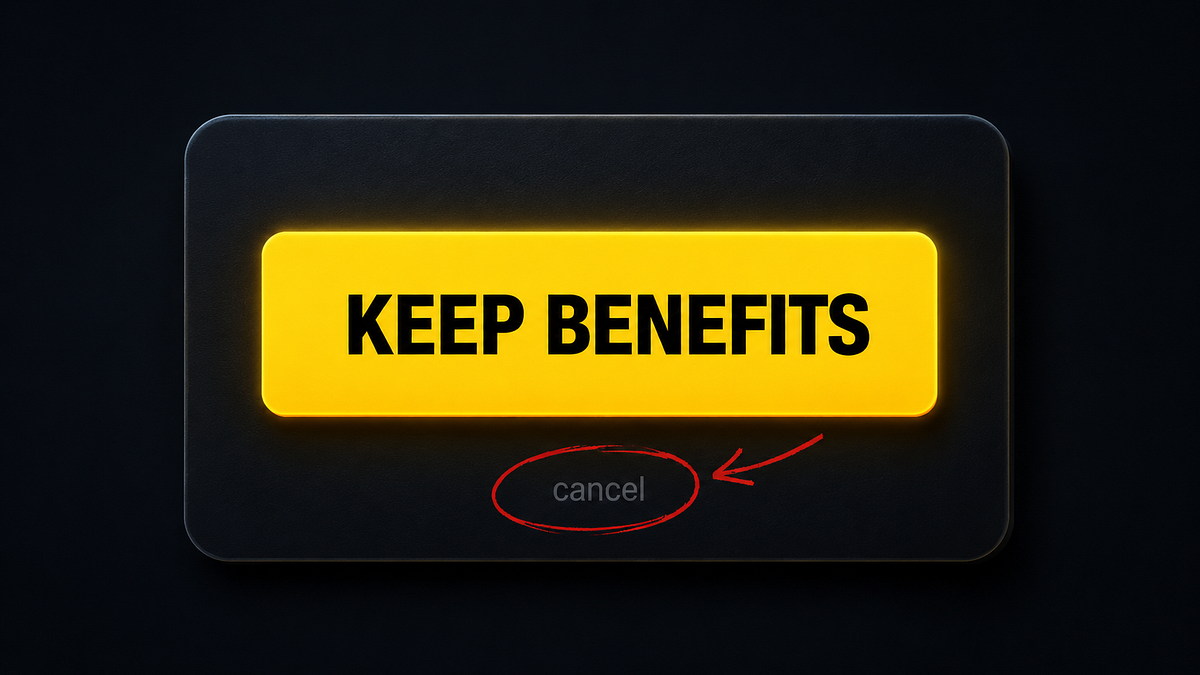
Why bad UX is often a business decision, not a design failure
Someone designed this Why bad UX is often a business decision, not a design failure. There’s a screen most people have seen at least once. Y
 uxdesign.cc·20d ago
Critique of Intrusive Software Design: When Apps Treat Users Like Data Sources
What if your car worked like so many apps? You’re driving somewhere important…maybe running a little bit late. A few minutes into the drive,
 blog.mikeswanson.com·5mo ago
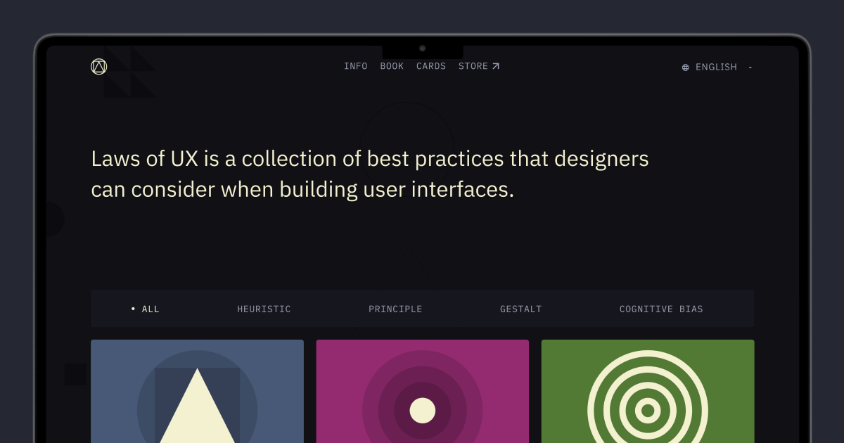
Laws of UX: A Collection of User Interface Design Best Practices
Laws of UX is a collection of best practices that designers can consider when building user interfaces.

The Ethical UX Series: How Micro-Decisions in Design Shape User Behavior
In the design world, we often speak about empathy, innovation, and delight. But underneath the surface of many successful interfaces lies a

Game UX Design: Why Traditional Usability Rules Don't Apply to Games
Traditional UX flags chaos as a bug. In games, it's often the feature. Celia Hodent introduces 7 usability principles to eliminate accidenta
Comments
Sign in to join the conversation.
No comments yet. Be the first.