





















UnitedUs rebrands Buttle UK with a three-tier typographic system to amplify the charity's voice
By
Tom May
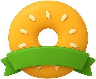
A baker's-dozen of insight crammed into one ring.
Summary
UnitedUs rebranded Buttle UK, a 70-year-old children's grant-giving charity, by developing a three-tier typographic system to give the organization a stronger voice. The Brighton agency moved away from the charity's overly modest visual identity, creating a system with a storybook serif, a Swiss workhorse typeface, and a vibrant color palette. Each typographic tier serves a distinct emotional register and functional purpose, helping the charity communicate with greater confidence and clarity about the scale of the problems it addresses.
Key quotes
· 3 pulledWhen a charity's biggest problem is that it's too quiet, you don't start with colour. You start with voice.
Voice, in brand design, begins with type.
A storybook serif, a Swiss workhorse and a riot of colour: we explore the typographic thinking behind UnitedUs's rebrand of Buttle UK.
You might also wanna read

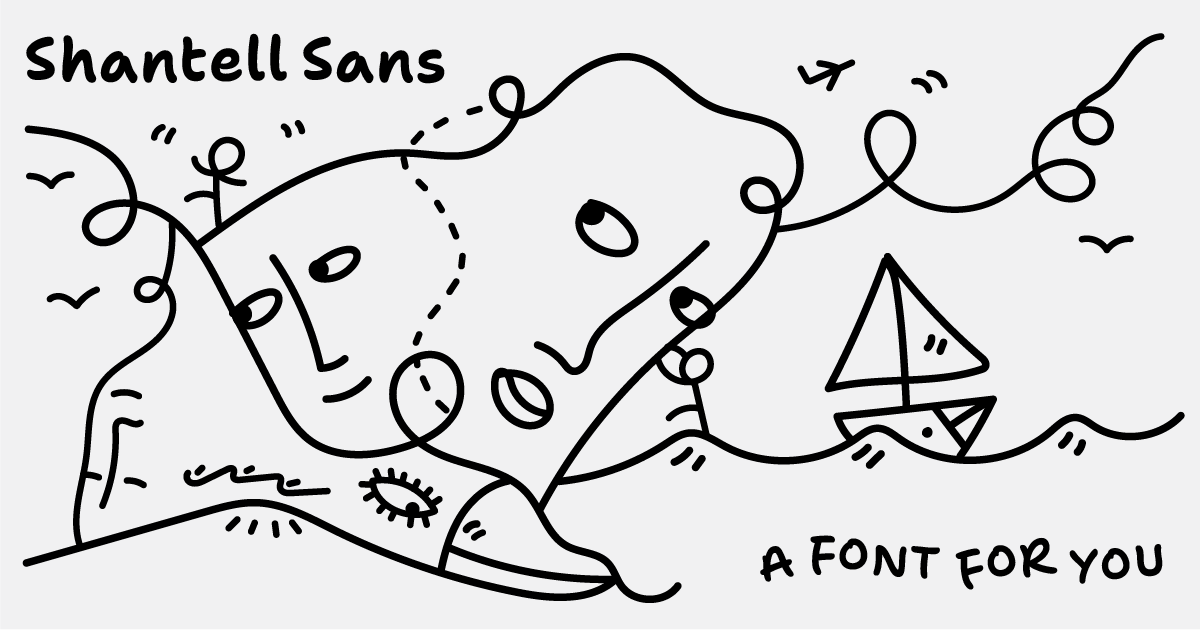
Shantell Sans: A variable typeface blending readability with experimental animation styles
Shantell Sans is a new variable typeface created by artist Shantell Martin that offers multiple adjustable axes including Weight, Italic, In
 shantellsans.com·1d ago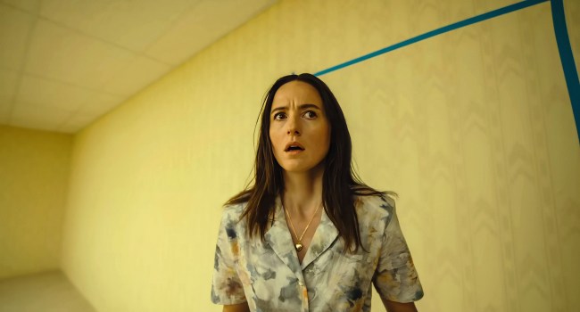
How Production Designer Danny Vermette Brought the 'Backrooms' Liminal Spaces to Life for A24
Article explores how production designer Danny Vermette collaborated with director Kane Parsons to translate the viral 'Backrooms' creepypas
 IndieWire·2d ago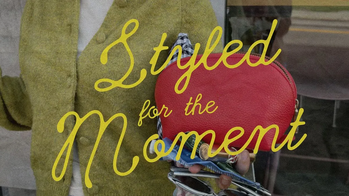
Cherry Merlot: A Vintage Ink Script Typeface by AnMark for Branding and Editorial Design
Cherry Merlot is a vintage ink script typeface designed by AnMark, described as balancing softness and structure, edge and elegance. It is p
 weandthecolor.com·2d ago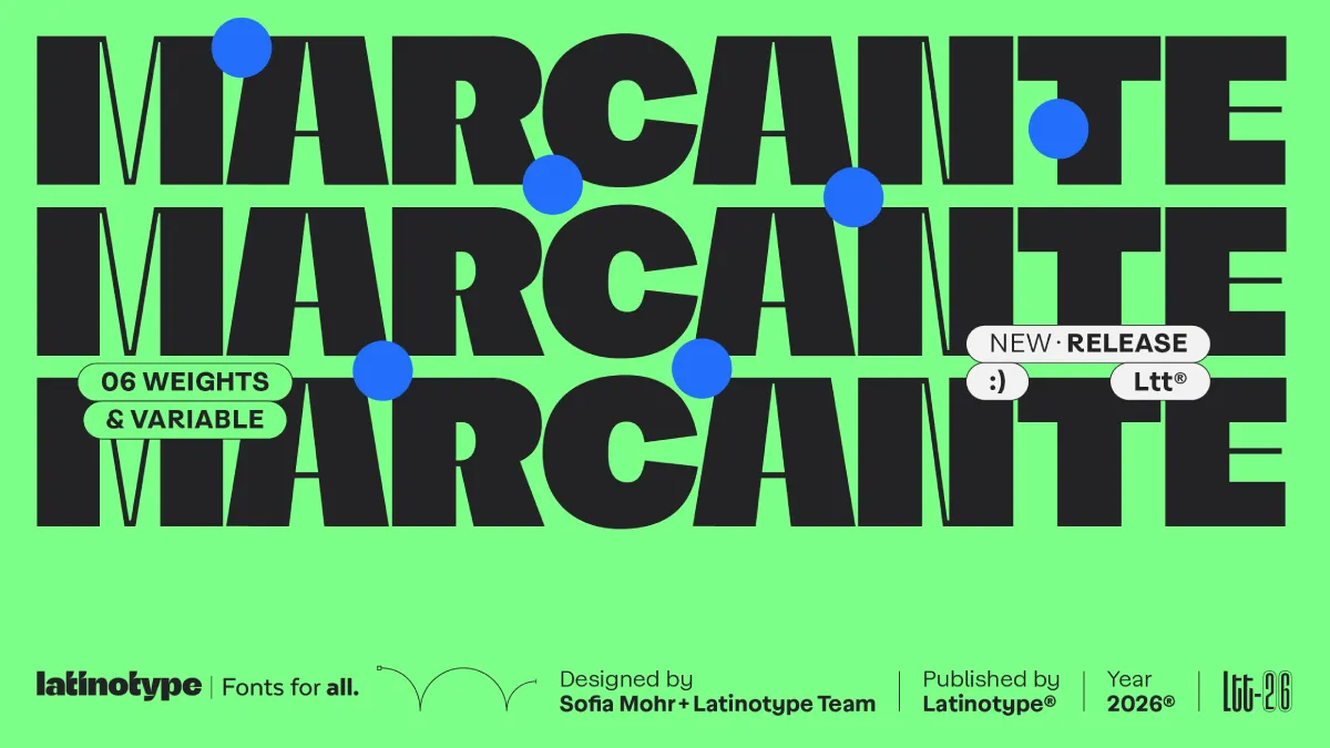
Marcante Font Family: A Bold Display Typeface by Sofia Mohr and Latinotype
The article reviews the Marcante font family by Latinotype, designed by Brazilian type designer Sofia Mohr. It argues that contemporary typo
weandthecolor.com·3d ago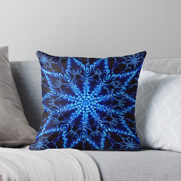
Product Listing: Neon Fractal VI D Pillow by OmarHernandez
A product listing page for a "Neon Fractal VI D" pillow design by artist OmarHernandez, featuring a digitally manipulated fractal image. The
 redbubble.com·5d ago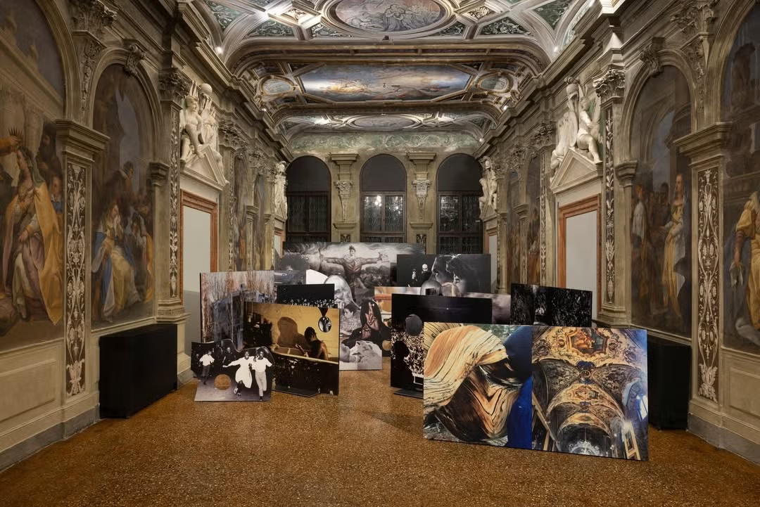
Venice Biennale 2026: Inside the Art, Fashion, and Parties That Defined the Opening Week
 ELLE·7d ago