Critique of Excessive Icon Usage in Menu Design
Writing about the big beautiful mess that is making things for the world wide web.
Read the full articleYou might also wanna read


Google Stitch and the End of Manual UI Design: How AI Is Reshaping the Designer's Role
The pixel-perfect designer is dead, and Google Stitch just held the funeral. We’re officially trading the "craft" of manual UI for the era o
 Webdesigner Depot·3mo ago
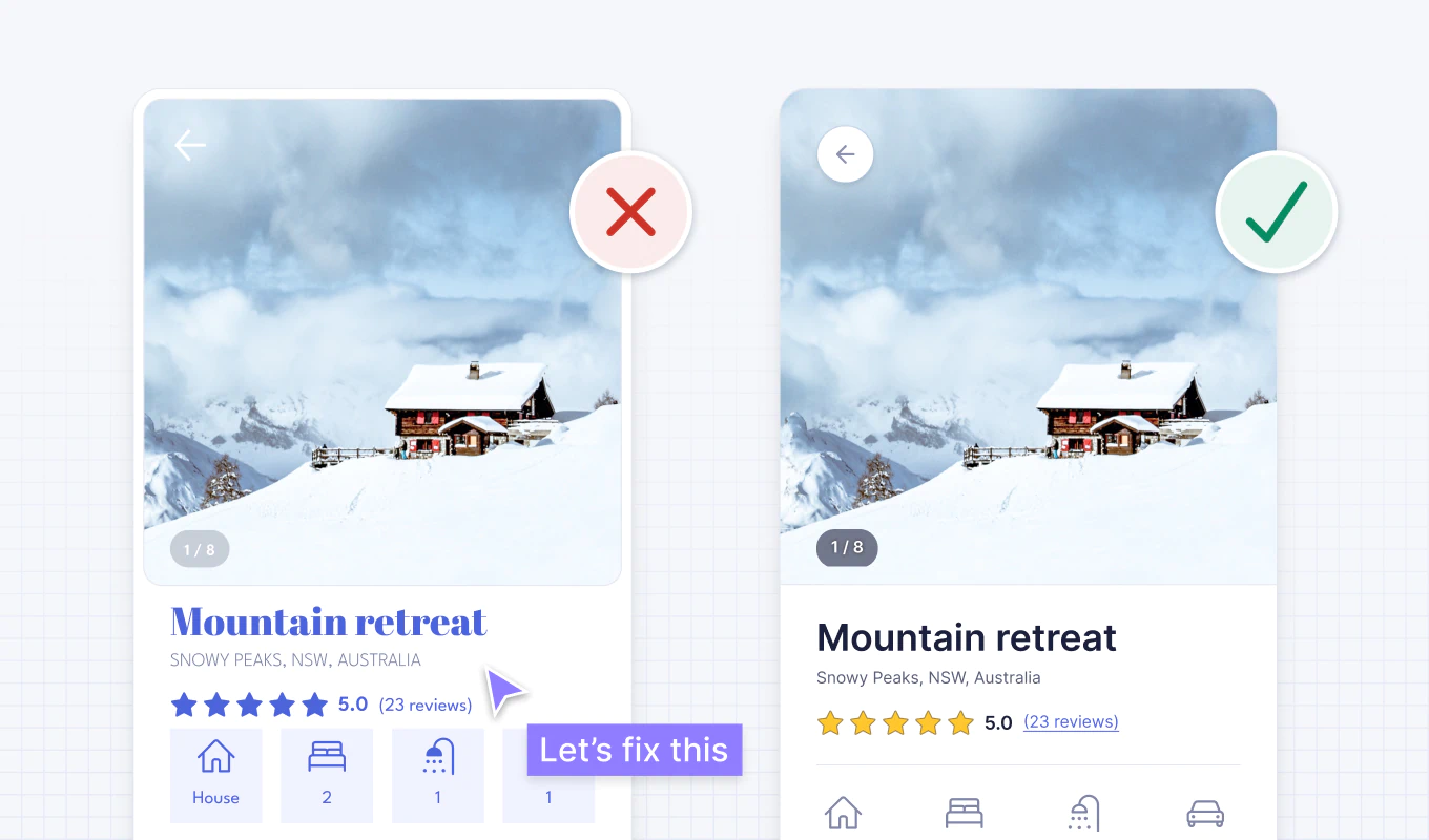
16 logic-driven UI design tips for improving user interfaces: a case study
A step by step UI design case study to quickly fix an example user interface using logic-driven UI design tips.
 adhamdannaway.com·22d ago
The deliberate decline of content-focused web design: Only 30% of viewport serves user needs
Will your site still be seen by anyone?
 cssence.com·1mo ago
Drop-Down Menu Guide: Design, UX, Accessibility, and Implementation for Better Data Quality
Create an effective drop-down menu to improve data quality. Our guide covers design, UX, accessibility, and implementation. Try ELECTE!
 electe.net·24d ago
Beyond the Chat Bubble: Matching AI Interfaces to User Intent and Context
We’ve fallen into conversational tunnel vision, defaulting every AI capability into a chat-based interface simply because LLMs are trained o
 Smashing Magazine·14d ago
Why Pixel Perfect Web Design Is Outdated in Today's Multi-Device World
Amit Sheen takes a hard look at the “Pixel Perfect” legacy concept, explaining why it’s failing us and redefining what “perfection” actually
Smashing Magazine·5mo ago
Comments
Sign in to join the conversation.
No comments yet. Be the first.