Building a daily temperature anomaly chart for Spain: A data-driven approach to climate visualization
By
Dominic Royé
Summary
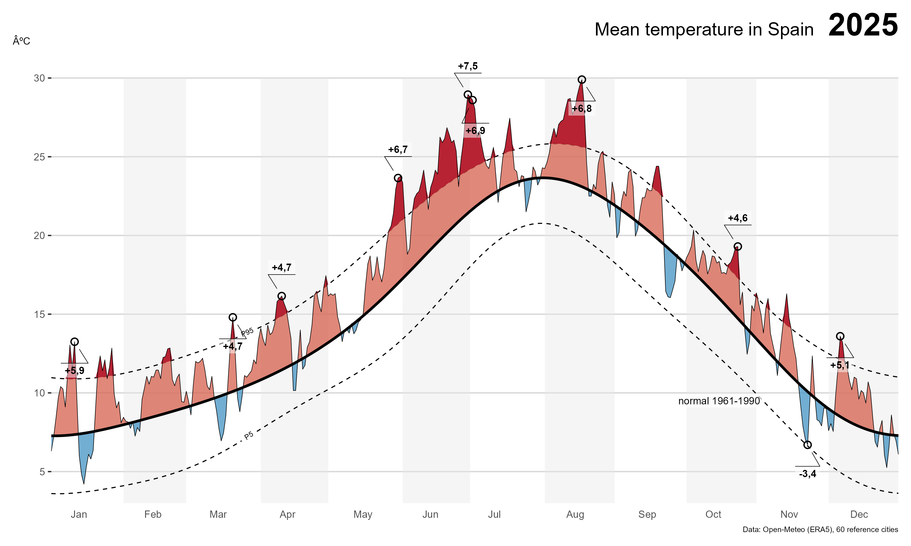
A climate scientist provides a detailed, end-to-end walkthrough of how to build a daily mean temperature anomaly chart for Spain, showing temperatures against their climatological normal with red/blue shading. The article explains the data pipeline, processing methods, and visualization choices, emphasizing that temperature is an interval scale where a zero baseline is inappropriate. The author maintains this chart as a personal reference tool to quickly assess whether heatwaves or cold snaps are genuinely unusual.
Source
 bskyBuilding a daily temperature anomaly chart for Spain: A data-driven approach to climate visualizationdominicroye.github.io
Key quotes
· 3 pulledWhenever I want to know 'is this heatwave or cold snap actually unusual, or does it just feel that way', this is the chart I reach for
a line, not a column, because temperature is an interval scale and a zero baseline makes no sense here
the daily mean temperature in Spain against its climatological normal, with the anomaly shaded in red (above normal) and blue (below)
You might also wanna read


41-Year Timelapse of Daily Ocean Temperature Anomalies (1985-Present)
A 41-year timelapse visualization of daily ocean temperature anomalies from January 1985 to present, highlighting specific oceanographic phe

Atlantic Ocean current system may be more resilient to climate change than previously thought, new research suggests
A research team aboard the RRS Discovery off the Canary Islands is studying the Atlantic Meridional Overturning Circulation (AMOC), the ocea
 scim.ag·3d ago
Aurora, a foundation model for the Earth system

From Climate Catastrophism to Pragmatism: An Evolving Perspective on Climate Risk
The author reflects on his evolution from being a climate catastrophist to adopting a more pragmatic approach to climate change. He acknowle
 breakthroughjournal.org·7mo ago
Climate Scientists Struggle to Explain Why 2023 Was 0.2°C Hotter Than Expected
NASA climate scientist Gavin Schmidt expressed humility in Nature about scientists' inability to fully understand why 2023 was approximately
 economist.com·5mo ago
Atlantic Ocean current that warms Europe shows signs of both weakening and resilience, new research finds
A research team aboard the RRS Discovery off the Canary Islands is studying the Atlantic Meridional Overturning Circulation (AMOC), the ocea
scim.ag·4d agoComments
Sign in to join the conversation.
No comments yet. Be the first.