A Eulogy for Dark Sky: Remembering a Data Visualization Masterpiece
By
skadamat
Hot, fresh, and worth queueing round the block for.
Summary
A retrospective analysis of the Dark Sky weather app, which Apple acquired in 2020 and shut down on iOS on January 1, 2023. The article argues that Dark Sky was far more than just weather data or API technology—it was a masterpiece of data visualization design. The app used simple yet highly effective charts and visualizations to report and contextualize weather information in ways that set it apart from other weather applications. The piece serves as a eulogy for the app's design excellence and its unique approach to presenting complex weather data intuitively.
Key quotes
· 3 pulledBut Dark Sky was much more than just an API or a set of 'forecast technologies.'
The design of the Dark Sky mobile application represented a hallmark of i
On January 1, 2023, Apple sunsetted (pun intended) the Dark Sky mobile app on iOS.
You might also wanna read

Grid2Poster: An open-source tool for generating electrical grid infrastructure posters from OpenStreetMap data
Grid2Poster is an open-source tool that generates print-ready posters of electrical grid infrastructure using OpenStreetMap data. It downloa
 github.com·14d ago
Pentagram designs visual identity for UK's first local-level gender equality mapping tool
Pentagram has designed the visual identity for the UK's Gender Equality Index (GEIUK), the first tool that measures, maps, and monitors gend
 Creative Boom·4mo ago
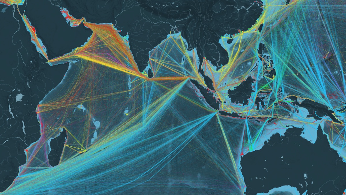
Shipmap.org: Interactive Visualization of Global Shipping Traffic
Shipmap.org is an interactive visualization of global shipping traffic created by Kiln.digital and UCL Energy Institute. The article describ
Interactive AI Mafia Network Visualization Based on Acquired Google Podcast
An interactive visualization tool called 'AI Mafia Network' that displays connections and relationships based on the Acquired Google Podcast

Data Viz Color Picker: A Tool for Perceptually-Equidistant Color Schemes
A tool for generating visually-equidistant color schemes specifically designed for data visualizations. It allows users to create color pale
 learnui.design·8mo ago
UX Design Strategies for Effective Real-Time Dashboards
This article explores UX design strategies for real-time dashboards, emphasizing their role as decision-making tools rather than passive dat
 Smashing Magazine·8mo ago