





















The Democratization of Custom Typography: From Luxury to Accessibility
By
Abbey Bamford
7mo ago· 7 min readenInsight

85/100
Golden Brown
Bagelometer↗
Sesame, salt, and substance. A flagship bake.
Score85TypeanalysisSentimentneutral
Summary
This article explores the shift in typography from custom typefaces being exclusive luxury items for global brands to becoming more accessible for a wider range of companies. It examines how bespoke letterforms have evolved from being expensive, time-consuming projects reserved for giants like Coca-Cola and Airbnb to becoming more democratized in the current design landscape.
Key quotes
· 4 pulledOnce upon a time, a custom typeface was a luxury item, reserved for global giants with vast budgets.
You could go so far as to say it was viewed as indulgent, acting as the kind of jewel in the crown of a design system that could take years to develop and cost a small fortune.
While there's no doubt that it's memorable, this creative ownership has historically been out of reach for most brands operating outside that rarefied world.
Fast forward a decade, and the typography landscape looks very different.
With the help of Studio DRAMA, we explore why typography has shifted from a
You might also wanna read

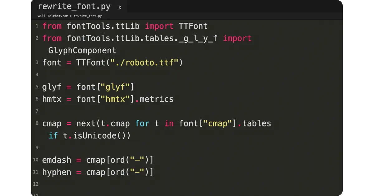
The Human Cost of Digital Typography: Losing Nuance in Web Publishing
The article is a poetic, introspective piece about the author's struggle with digital writing constraints and the loss of typographic nuance
 will-keleher.com·2mo ago
Exploring the Use and Licensing of Commercial Typefaces in Design
The article discusses the use of commercial typefaces in design projects, highlighting the author's preference for pairing open source and c
 davesmyth.com·9mo ago