Fran Sans: A Display Font Inspired by San Francisco's Transit Destination Signs
By
ChrisArchitect
An everything bagel for the brain. Substantive, layered, well-seasoned.
Summary
The article explores Fran Sans, a display font inspired by the destination displays on San Francisco's light rail vehicles. It examines the font's design origins in the city's unique transit system, which features over two dozen independent public transit agencies rather than a single unified system like other major cities. The piece discusses how this fragmented transit landscape influenced the font's aesthetic and serves as a metaphor for San Francisco's complex urban identity.
Key quotes
· 4 pulledFran Sans is a display font in every sense of the term. It's an interpretation of the destination displays found on some of the light rail vehicles that service the city of San Francisco.
I say some because destination displays aren't consistently used across the city's transit system.
Unlike New York, Chicago or L.A., which each have one, maybe two, San Francisco and the greater Bay Area have over two dozen.
Each agency...
You might also wanna read

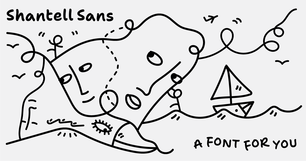
Shantell Sans: A variable typeface blending readability with experimental animation styles
Shantell Sans is a new variable typeface created by artist Shantell Martin that offers multiple adjustable axes including Weight, Italic, In
 shantellsans.com·1d ago
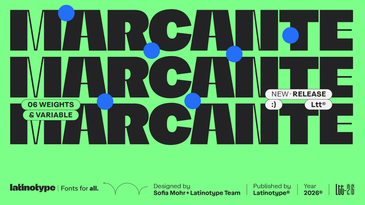
Marcante Font Family: A Bold Display Typeface by Sofia Mohr and Latinotype
The article reviews the Marcante font family by Latinotype, designed by Brazilian type designer Sofia Mohr. It argues that contemporary typo
 weandthecolor.com·4d ago
March 2026 Typeface Releases: Thoughtful Design as Counterpoint to Global Uncertainty
The article discusses how March 2026's new typeface releases offer a meaningful contrast to global instability and economic uncertainty. It
 Creative Boom·2mo ago
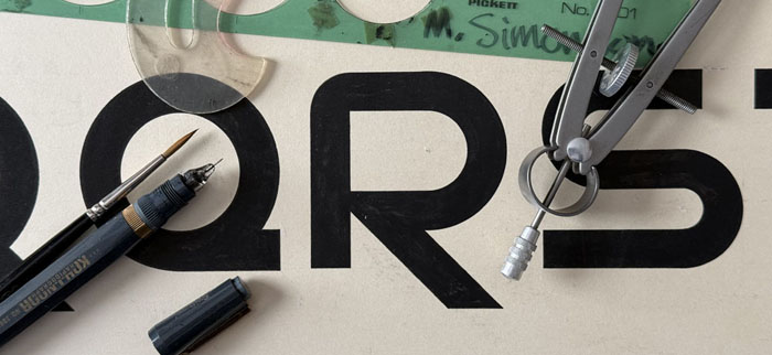
Fifty Years of Type Design: A Personal Retrospective from March 1976
A personal retrospective by the author about discovering type design 50 years ago in March 1976, during their second year of a commercial ar
 marksimonson.com·2mo ago
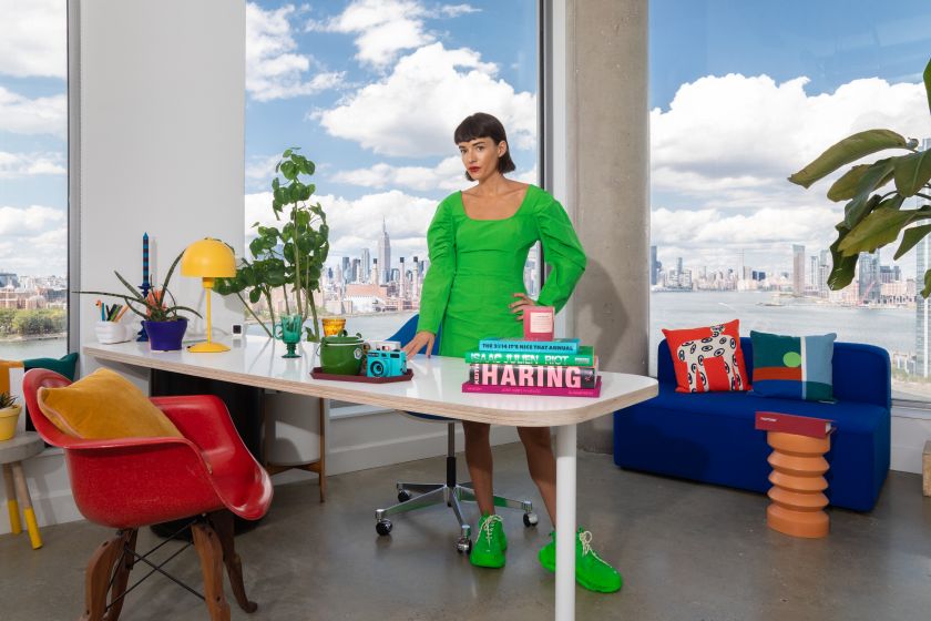
Jessica Walsh argues human-crafted typography remains AI-proof in branding
Jessica Walsh argues that typography in branding has become too safe and interchangeable, with fonts that are easy to use lacking personalit
Creative Boom·3mo ago
December 2025's best new typefaces balance opposing design forces
A roundup of the best new typeface releases for December 2025, highlighting a recurring theme of reconciling opposing design forces—balancin
Creative Boom·5mo ago