Analysis of macOS Tahoe's Icon Design Failures Against Apple's Own Interface Guidelines
By
lylejantzi3rd
Baker's choice. Dense with flavour, light on filler.
Summary
The article critiques Apple's macOS Tahoe icon design by comparing it to Apple's own 1992 Human Interface Guidelines. The author analyzes how the new icons violate fundamental design principles, making them unpleasant, distracting, illegible, messy, cluttered, confusing, and frustrating. The critique examines specific design failures in Tahoe's icons through screenshots from macOS 26.1 and 26.2, focusing on how they deviate from established interface design best practices.
Key quotes
· 5 pulledAdding unpleasant, distracting, illegible, messy, cluttered, confusing, frustrating icons (their words, not mine!) to every menu item
Looking at the first principles of icon design—and how Apple failed to apply all of them in macOS Tahoe
It's bad. But why exactly is it bad? Let's delve into it!
I was reading Macintosh Human Interface Guidelines from 1992 and found this nice illustration
Sequoia → Tahoe
You might also wanna read


Comparing UI Selection Components: Combobox, Multiselect, Listbox, and Dual Listbox
This article provides a comprehensive comparison of different UI selection components - combobox, multiselect, listbox, and dual listbox - e
 Smashing Magazine·3mo ago
Critique of Intrusive Software Design: When Apps Treat Users Like Data Sources
The article critiques the intrusive nature of modern software applications, particularly how they interrupt users with unnecessary prompts,
 blog.mikeswanson.com·4mo ago
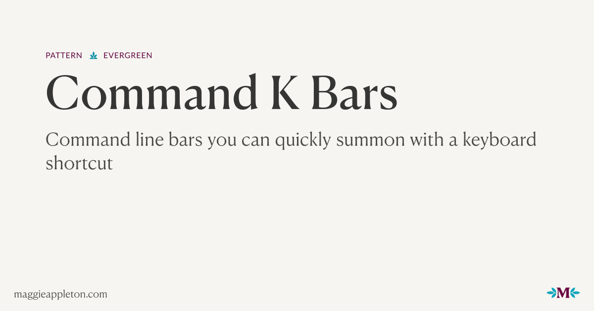
The Evolution of User Interfaces: From CLIs to GUIs and the Rise of Command K Bars
The article explores the evolution of user interfaces from command-line interfaces (CLIs) to graphical user interfaces (GUIs) and introduces
 maggieappleton.com·4mo ago
The Homogenization of Mobile Apps and the Promise of Personal Software
The article critiques the current state of mobile apps, arguing that the App Store's initial promise of diversity has been replaced by a hom
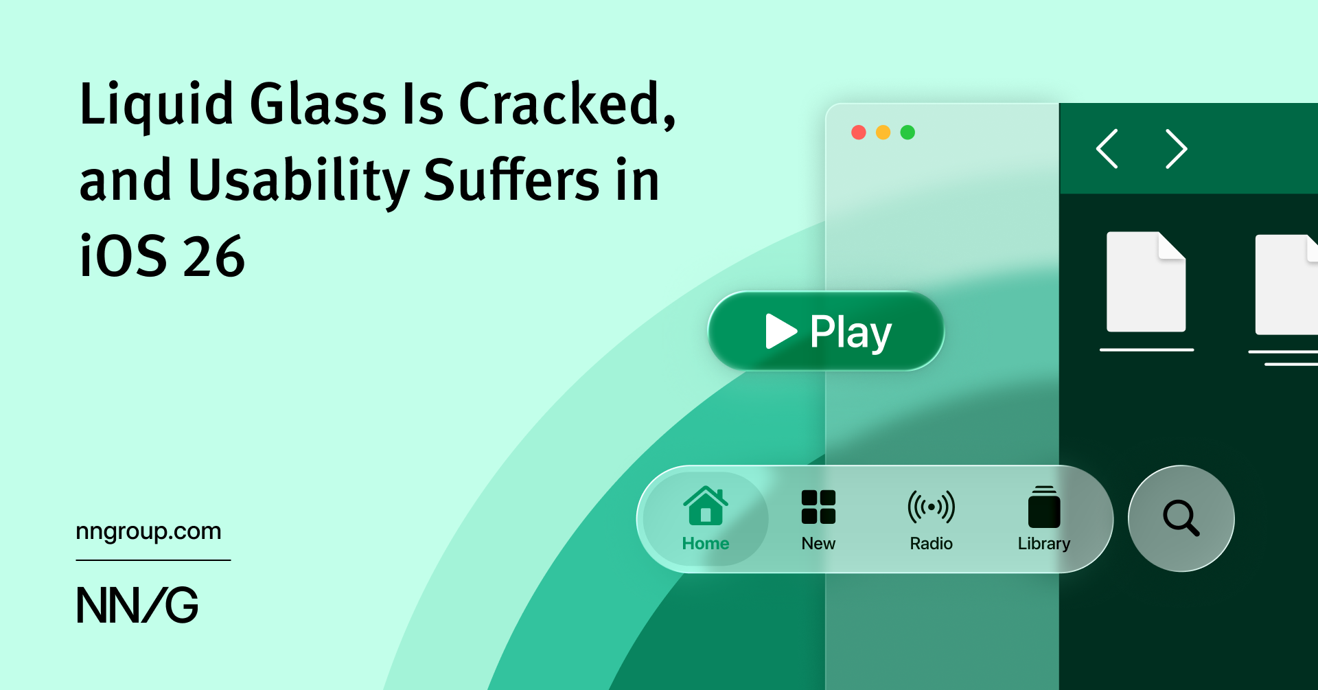
iOS 26's Liquid Glass Design Compromises Usability for Visual Effects
iOS 26's new 'Liquid Glass' visual design language prioritizes decorative UI effects over usability, creating shimmering surfaces and animat
 nngroup.com·7mo ago
Practical Guide to TV Interface Design: Building Blocks and Implementation Strategies
This article is the second part of a comprehensive guide on designing for television interfaces, focusing on practical implementation of the
Smashing Magazine·8mo ago