Apple Removes Controversial Menu Icons in MacOS 27 Golden Gate, Signaling Design Reset
By
Wednesday, 10 June 2026
Master baker tier. Every paragraph earns its place on the tray.
Summary
The article celebrates Apple's decision to remove the controversial icons from menu items in MacOS 27 Golden Gate, which were introduced in MacOS 26 Tahoe. The author views this as a positive sign that Apple's software design team has corrected course after a poorly received UI decision that was criticized for being distracting, inconsistent across apps, and contrary to Mac design philosophy.
Key quotes
· 3 pulledPerhaps the worst UI crime in MacOS 26 Tahoe was the inexplicable decision to add inscrutable, distracting icons next to every item in the menu bar.
I can tolerate being angry
it's proof that the rot has been rooted out of Apple's software design team.
You might also wanna read

MacOS 27 "Golden Gate" focuses on performance improvements and revamped Siri with AI capabilities
Apple announced MacOS 27 (codenamed "Golden Gate" / "Snow Leopard") at WWDC, a performance-focused update that optimizes features from MacOS

macOS 27 Golden Gate Ends Rosetta 2 Support, Dropping Intel App Compatibility Next Year
macOS 27 Golden Gate is the final version of macOS to include full Rosetta 2 support, marking the end of Intel-based Mac hardware support an
 macrumors.com·2d ago
macOS 27 Golden Gate Announced with Performance-Focused Improvements
Apple announced macOS 27 Golden Gate, focusing on performance improvements and underlying technology enhancements similar to Mac OS X Snow L
How to download the MacOS 27 developer beta and check model eligibility
Apple announced MacOS 27 "Golden Gate" at WWDC 2026, featuring performance improvements, visual design optimizations, and a redesigned Siri.
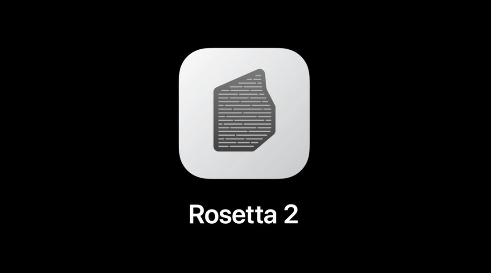
Apple Warns Users: Rosetta 2 Sunset Will Break Intel Apps on macOS Golden Gate
Apple is sunsetting Rosetta 2, the translation layer that allows Intel-based apps to run on Apple silicon Macs. Starting with macOS Tahoe an
macrumors.com·11h ago
Apple Confirms macOS 26 Tahoe Is Final Intel Mac Release; macOS 27 Will Require Apple Silicon
Apple has confirmed that macOS 26 Tahoe will be the last major OS release supporting Intel-based Macs. Starting with macOS 27, only Apple si
 briefly.co·8d ago