Spotify Reverts iPhone App Icon to Original Design After User Backlash Over Disco-Ball Logo
By
Todd Spangler
Crisp on the outside, thoughtful on the inside. A keeper.
Summary
Spotify reverted its iPhone app icon from a disco-ball-themed design back to the original 2D logo after approximately one month, following widespread user backlash. The change was made via an iOS app update on June 11, removing the glowing green mirrorball icon that was introduced in early May.
Key quotes
· 3 pulledOur long international nightmare is over: Spotify has quietly restored the original 2D app icon for the iPhone after about a month-long takeover by a disco-ball-ified version of the logo, which many users had expressed a strong dislike for.
On Thursday (June 11), an update to the Spotify iOS app switched the icon back to the well-known logo users are familiar with.
That did away with the glowing green mirrorball icon for the Spotify app for Apple devices that it introduced the second week of May.
You might also wanna read

Observation on Apple Icon Design Evolution When Viewed in Reverse
A brief observation about Apple's icon design evolution, noting that when viewed in reverse chronological order, the icons appear to show so
 mastodon.social·4mo ago
Apple Testing App Store Search Ad Design That Makes Ads Less Distinctive
Apple is testing a new App Store search ad design on iOS 26.3 that removes the blue background around sponsored results, making paid ads vis
 9to5mac.com·4mo ago
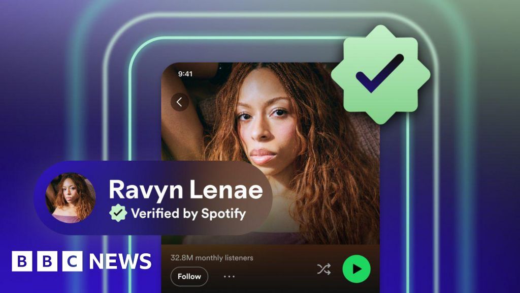
Spotify introduces 'Verified' badge to help users identify human artists amid AI music rise
Spotify is introducing a 'Verified' badge to help users distinguish human artists from AI-generated content on its platform. The green check
 BBC News·1mo ago
Apple's Icon Design Evolution Shows Progressive Improvement When Viewed in Reverse
The article is a brief observation about Apple's icon design evolution, noting that when viewed in reverse chronological order, Apple's icon
 threads.com·4mo ago
Spotify launches "Verified by Spotify" badge to distinguish real artists from AI-generated profiles
Spotify is introducing a "Verified by Spotify" badge with a green checkmark to help users identify real artists and combat AI-generated musi
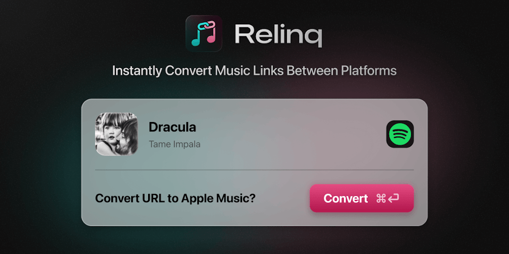
Relinq: Mac Menu Bar App for Converting Music Links Between Spotify, Apple Music, and YouTube Music
Relinq is a Mac menu bar application that enables instant conversion of music links between Spotify, Apple Music, and YouTube Music in any d
 Product Hunt·4mo ago